Branding and designing logos for a food or beverage-related business is more than just picking a font and some nice colors. Great designers are worth their weight in gold because they also think about all of the physical and virtual manifestations of their work, which include business cards. Since business cards are designed to be held, touched and stored in a wallet or on someone’s desk, there’s an additional layer of tactile decisions that can be made, like with thickness, texture, weight, durability, edge color to make it stand out in a pile, and more.
We interviewed four designers and marketers who know a thing or two about using business cards to represent food and beverage businesses.
They are:
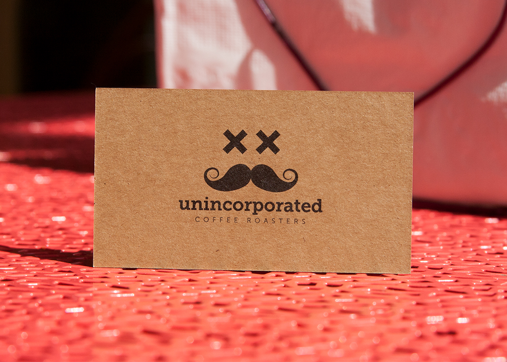
Arthur Sohrabian, Co-Owner of Unincorporated Coffee
Shannon Ecke, Creative Director for Whidbey Island Ice Cream Co.
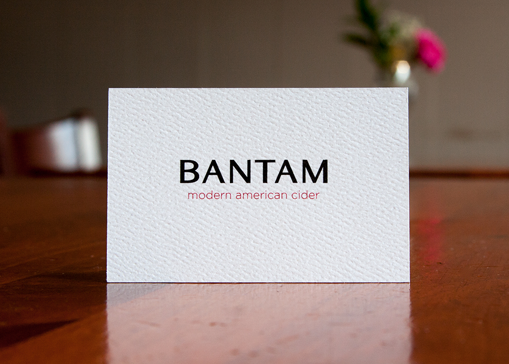
Karsen Eckweiler, Taproom & Event Manager at Bantam Cider Company
Connie Roberts, Co-Owner of Toutant Buffalo
Here’s what they had to say, mixed with real-life examples of their cards printed by THikit. If you’re curious about how THikit cards are different from any others, you can see for yourself for free. Request a free sample kit today!
Touch and Feel Matter
Arthur (Unincorporated Coffee): We print everything on kraft paper, our invoices are kraft, that’s where it started. We pay attention to the senses, so that first touch is a big deal. That’s why we use thick, kraft cards. It creates an impact and shows that we care about every part of our business. (Note: We recently spotlighted eight beautiful kraft paper business card designs on our blog.)
Connie (Toutant Buffalo): I love heavy duty business cards. Anything that’s a touch item for us is important… from silverware to the paper of the menu, people love to feel things. That’s where I like to spend my money. If our customer is touching it, I want to spend money on it. We use kraft paper for our menus, so I wanted it to be consistent on our business card.
Sweat the Details

Connie (Toutant Buffalo): People love the thickness of the cards and the edge color. People notice the little details. The cards sit on our host stands, and we have a ledge going up the stairs where I put the cards out, and I have to refill them every couple of days.
Karsen (Bantam Cider): Bantam is small and mighty. It’s a metaphor for being based in Boston, being a woman-operated business in a male-dominated industry. To set us apart from the competitors, it’s all in the details. We need our card to stand out, so we went pretty thick.
Match the Product
Shannon (Whidbey Island Ice Cream): I developed the new brand at Whidbey Island Ice Cream Co. We wanted to make their packaging look like kraft paper, but it needed to be printed on a coded sheet so the ice cream doesn’t leak. Instead of using actual kraft paper, we used a picture of kraft to simulate that look.
When it came to the business cards, we could use real kraft paper, so I thought it would be the perfect opportunity to use white ink on the kraft paper. They had desert storm kraft paper, which perfectly matches what we’re doing with the brand, so we went ahead and ordered some. I’ve always wanted to use white ink on kraft paper, so it was a great bucket list item for my design porfolio.
The client loved it, because it goes perfectly with the packaging.
Consider Telling a Story
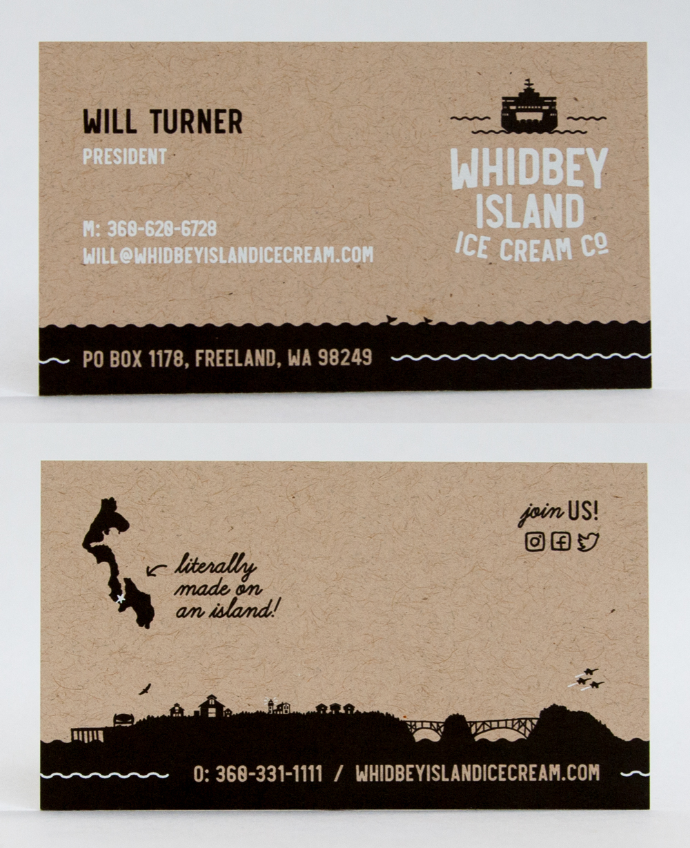
Shannon (Whidbey Island Ice Cream): We’re trying to tell the story of Whidbey Island, and what you would see when you get there. There’s a custom illustration that goes around the bottom of the pint that shows the landscape of the island, the dock, the lighthouse, the air force base, etc. It’s about telling the story of the brand and a nod to how locally made the ice cream is. If you look on the back of the card you see the illustration of the island. One of the things they want to show is that it’s literally made on the island.
Connie (Toutant): Our tagline is grassroots cuisine, so I tied in some cat tails in the logo. We also have chicken wire on the front of the card, which matches that southern-inspired, earthy, comfortable feeling that we’re trying to have with our restaurant.
Arthur (Unincorporated Coffee): Coffee is more complex than wine, it’s about bringing that quality forward to customers so they can enjoy it and have fun. We have a more fun, playful approach, so the image is fun and represents someone loving coffee and passing out.
Start a Conversation With the Card
Karsen: We already had a design for the cards, so the question was really what kind of card stock we were going to use. We give the card out at restaurants, liquor stores and grocery stores with samples of our product. People take the card and say, “oh no, you gave us two cards.” It makes an extra impression because the card has so much weight to it.
Arthur: The card is an important part of starting a relationship. On first touch, everyone has a quick reaction, like “whoa, these are nice.”
All of the cards shown in this blog post were printed by THikit, a premium printer of business cards, postcards, and wedding invitations based in New York’s Hudson Valley. If you’re a designer, marketer or entrepreneur looking to stand out, request a free sample kit of our work!