A thick business card stands out, but thick postcards are even rarer as a differentiating mark of quality and attention to detail. We talk a lot about business cards on our website, but a considerable part of our business revolves around larger pieces like postcards and wedding invitations. Pretty much anything we can do with business cards, like paper stocks, white ink, edge color, and thickness, we can also apply for larger jobs.
Our sample kit includes examples of larger pieces that we’ve done. Request a free kit today!
1. Finding Home Farms

Business owner: Laura Putnam
Background (from website):
Finding Home Farms started as a decorating and DIY blog in 2010. In 2013, FHF began selling homemade items like maple syrup, cocktail kits, soy candles, and other home decor and holiday items.
How they’re using thick printing:
As we move into retail spaces, we are doing in-store signage with THikit. We ship it along with a simple wooden holder. It’s really simple and easy for our customers to put up in their stores!
The choices they made to produce the piece:
A really important thing is the quality of the printing and paper. We were always very focused on that, and it has to be easy as easy as possible for the customer to use it. We didn’t want anything with any gloss or shine, but we wanted a really clean, simple matte finish to it. As for the thickness, it has to be able to stand up on its own.
How people are reacting:
We want each piece to be photographed and Instagrammable. If you’re putting together your display or a bar cart you want it to be part of it.
2. Miro Made This by Mimi O Chun
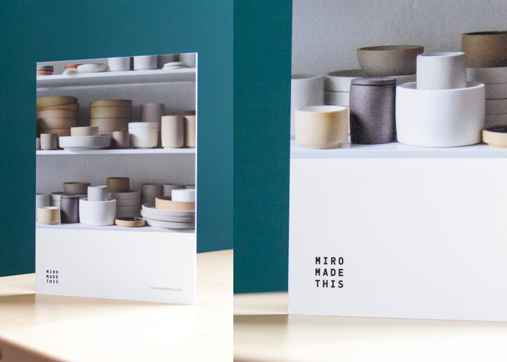
Names: Miro Chun, Artist, and Mimi O Chun, Graphic Designer (interviewed)
Background:
I’ve been in New York on and off since 1995. I’ve done brand and product development, and also maintain a fine art practice on the side. Three or four years ago, my sister decided to pursue ceramics full time. She’s an architect by training, but had studied ceramics for about seven or eight years before she felt ready to make it a full-time thing and sell her work.
About Miro’s brand:
A big part of her architectural training went into her approach with ceramics. She’s very materials based: she uses porcelain, stoneware, clay bodies that have some texture to them. She’s a functionalist, so she’s interested in how—through years of use—a clay might wear over time, or there might be coffee stains or tea stains that develop a patina on the objects themselves.
I helped her with the visual identity from the start. Her brand name, Miro Made This, called for a monospaced font. Ceramicists who produce tableware often will use a stamp while it’s still wet… I made an identity system where the letterspacing can scale for each application.
We did shopping bags for her where it’s a much more bold version of her logo. The typeface stays the same, but the spacing between letterforms varies across each application. It’s very similar to how my sister thinks about space; it’s as much about the relationships between objects on a table as it is about the objects themselves.
I set her brand standards, I did the logo, I did her typographic palette, but my sister does her own photography, writing, and social media. She takes #shelfies that show what she’s working on every day.
Translating the brand to a card:
With her materials, I knew I wanted to do something where the paper stock has some heft to it, some materiality. THikit was a great choice for us; we chose to print on a Mohawk Superfine eggshell finish, which has a texture not unlike some of her pieces. Today in 2018, where so many ways in which we encounter design is based on screens or printed off of an inkjet printer, it’s nice to have the opportunity to produce pieces that have some material integrity. That’s what made THikit a really good fit for us.
We didn’t use any edge color… if you look at a lot of her work in her store, she will typically glaze interiors but not exteriors. Similarly with the postcard, we chose not to finish the edges.
How people are responding:
People tend to respond to the heft and quality of the printing.
3. Westport Yacht Charters by Superyacht Creative
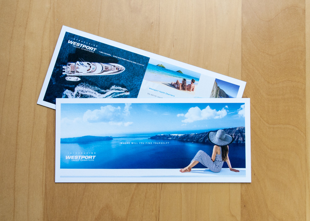
Name:
Richard Taranto, Creative Director at Superyacht Creative
About Superyacht:
Superyacht Creative is a boutique agency run by my wife and myself. We have a background in publishing and have worked in the yachting industry for the last 15 years. We met working for a luxury superyacht magazine, actually. She was the editor, I was the art director. We gained a lot of experience in those roles and eventually formed a business to serve that very niche industry.
About Westport Yacht Charters:
Westport Yachts is a yacht builder based in the Pacific Northwest. They’ve been building yachts for over 50 years and just this year branched into offering a charter division. The new division offers charter yachts to clients who wish to charter – or rent – yachts, but also serves owners of Westport-built yachts who wish to offer their boats for charter.
About the brand:
The Westport Yachts brand underscores quality production yachts that are made in America. The builder offers a series of production, composite-built yachts in several sizes: 112ft, 125ft, 130ft and 164ft. They are well received with American owners but have definitely begun to gain some attention worldwide in the last decade. The international owners appreciate the build quality, the fact the yard will deliver the yacht on time and on budget, and the options for semi-customization.
Westport Yachts are practical but stylish yachts that give their owners access to the world’s best cruising destinations.
About the project:
Imagine, you and four other couples want to take a week-long vacation on a yacht. You can all chip in and get a yacht for a week and cruise the Mediterranean. Or, you’re a yacht owner, you own a Westport yacht and have developed a relationship with the builder and the brand over the years. You want to offer your yacht for charter but aren’t comfortable with the service provided by some of the yacht charter companies. Now Westport can handle the logistics of offering your yacht for charter as well.
That’s what Westport is offering. What we needed to do with this piece is make an announcement to the industry, and leverage Westport’s current client base, and let them know Westport is now offering yacht charters.
What I wanted to do is develop a nice postcard that can be dropped off or easily mailed in a letter envelope. We wanted a nice “want to be there” image with a simple but compelling tagline “Where will you find yourself?” to underscore the limitless possibilities of yacht charter.
We’re in a luxury industry, so it’s unacceptable to use flimsy paper stock in any of our print projects. Clients in our industry really appreciate production values, so we went for the thick stock. It makes an impression. We also have been incorporating the colored edges on many of our print pieces; for this one we did a brilliant blue which adds to the uniqueness of the piece.
How people are reacting:
The client is very happy and I know they’ve gotten some feedback as well that it’s a nice piece.
4. Pace Prints
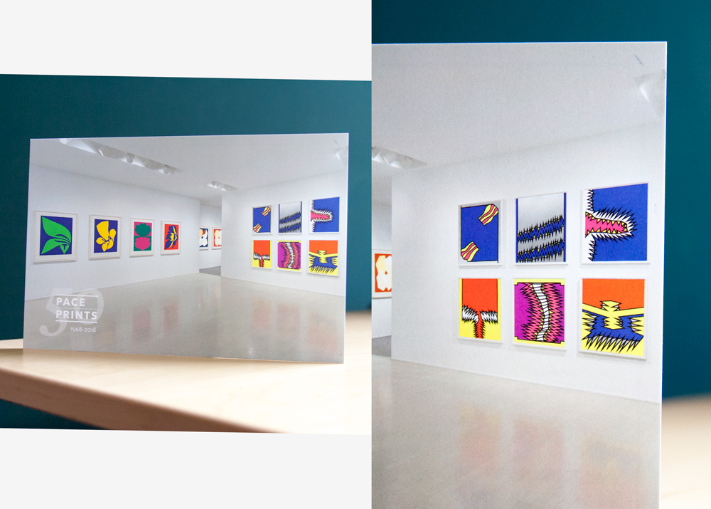
The designer: Austin Kennedy, Design Director
About the designer:
Long story short, I came to this job by teaching myself in college and the early part of my career to design websites. I studied photography in school, but the way that I got jobs early on was knowing how to make websites. This was in the early 2000s, when it was more uncommon. That’s how I got into graphic design, and then I got into print design and worked my way up to being in charge of the entire graphic identity of Pace Editions.
About the company:
Pace Gallery, which we are affiliated with, is one of the largest, most established galleries in the United States. It was founded in Boston in 1960 and has been based in New York since 1963. In 1968, when Pace Gallery wanted to publish a complex artist book with Lucas Samaras, the gallery had to set up a separate operation to execute that. That became Pace Editions, and we’ve been publishing prints and editions by Pace Gallery artists and others since then. We also operate three gallery spaces and an exhibition program under the name Pace Prints.
About the brand:
I had been with Pace Editions since 2005, but in 2011, when I began in my current position, my mandate was to rebuild our identity and expand our reach digitally at the same time. We were really thinking about how we were positioning ourselves online and on social media. It was right around the time Instagram was taking over as the main forum for people to share their visual interests. I did a rebrand in 2011 and it’s the same identity we’re working with today. Since 2011, when a website and a couple of social media accounts was most of what we were doing online, we’ve joined many new platforms who are exploring how art can be integrated into the online marketplace. This year, we’re in the process of building a new web platform to expand what we’re doing even further.
About the project:
This is an interesting project. Welcome Back is part of our 50th anniversary celebration, and that show is literally the first half dozen or so projects that we did as a print publisher. It was an interesting challenge; because of the cyclical nature of the art world, things come back into style periodically. That graphic, poppy aesthetic that was very popular in the late ’60s and early ’70s is very in right now. Some of the artists were huge at the time, but are less well known to young audiences today. For example, Earnest Trova was one of the the most famous artists in the world in the early ’70s, and very few people know his name today. It’s interesting in that respect: we’re working with material that is very relevant, but where the artist’s names need a little bit of a refresher. This show exhibits the work in a way that connects it to the current generation of contemporary artists and collectors.
Creating a piece with THikit:
Both the challenge and strength of printing on an digital press is getting a color palette that pops on that press, getting the art to really pop off the page. I’ve had a lot of success with THikit in terms of maximizing what a digital press can do. I’ve worked with dozens of conventional offset printers and digital printing at this point; we keep coming back to THikit because they’ve curated a selection of stocks that they really know how to work with. When you stray and change stock on a project like this, you get completely different results. They’ve curated a selection of stocks that are very thick and tactile that are very good quality, and they’ve profiled them properly. I know THikit can give me the quality that I want, and put it on a stock that still reads luxury and fine art, instead of looking like a postcard. Well, it is a postcard, but it’s a really nice postcard. The reason we’ve stuck with THikit is that they’re bridging a gap between quickie online inexpensive printing, and high-end custom offset printing, which is very expensive. They’ve positioned themselves in a very smart place between those two markets. It offers a slightly more expensive option than a generic online print service to people who have a demanding sense of what they want, at a price point that is far more accessible than an offset printer.
How people are reacting:
I have clients colleagues ask us all the time where we print our jobs. We don’t all of our work with THikit, but the ones that we do get lots of compliments and attention. The number one thing people comment on is the stock, and that’s where they’ve made a smart decision. Curating a selection of paper products that’s right for a high end creative business like ours.
5. Captive Audio
Name: Sarah Benkendorfer, Marketing Coordinator at Captive Audio
About the designer:
I started interning for Captive in college, and when I graduated I moved down to Austin to work for them. I’ve been here with them for about 1.5 years. I put together their marketing material, the website, plan events, things like that.
About the brand:
When I started, there wasn’t really a brand. I’ve created a brand for Captive Audi, as well as Captive Lighting, which is what the postcard is; it’s a branch that focuses on outdoor lighting.
We just wanted to keep it simple; we have a certain font we use for Captive Audio. It’s cursive, and we want it to be a little elegant but with room to do cool stuff like black and white features.
About the project:
We’re a high-end company, we have high-end products, so everything we do is completely customizable. We’re trying to appeal to that upper echelon of customer. We’re here with you past the project completion, and we’re focused on building relationships with our clients. We’ll install your lighting and av system; we replace it, we upgrade it.
We’re sending out a series of hand-written postcards to customers to talk about Captive Lighting, and we’re getting a great response.
Creating a piece with THikit:
There are three cards, which are all 8×8. We send out about a hundred a month, and there’s a series that happens; people get all three cards and come to us and say, ok, this is cool.
We spent a lot of time on paper choice; we wanted it to be a little rough and not as glamorous. We wanted it to be thick, to set it apart from something that you’d get from somewhere else. We try to err on the side of thicker.
How people are responding:
It’s been so great; we’ve definitely paid for these cards over and over, our clients think it’s a really cool idea.
6. Wickham Solid Wood Studio
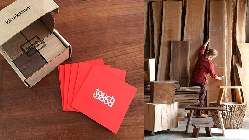
We talked to Jessica Wickham a few months ago in a piece we did highlighting some local designers who are printing thick. This piece was designed by Randall Martin in Beacon, NY. In Jessica’s words:
” [This] is a targeted promotional campaign that we are sending to architects and interior designers. Its a box of four hardwood cubes, with a two sided card in a deep orange color (I love orange!). Designers are a tough audience – so all the details of the piece had to be right. Randall Martin came up with the concept of a playful puzzle — using the logo on one face of the cubes – its great!”