Our customers are always pushing the limits of what a business card can do. And with a thick business card, there’s additional space for creating three-dimensional visual interest from every possible angle, with painted edges.
Painted edge business cards are a great way to stand out from the rest of the crowd, whether your card is by itself or in a stack. Today, we’re spotlighting eight business cards that we’ve printed that feature either standard or custom red edge color.
Are you thinking about designing your own thick business card with custom edge color? Request a free sample kit from THikit! It’s the best way to see what we can do.
1. Broward
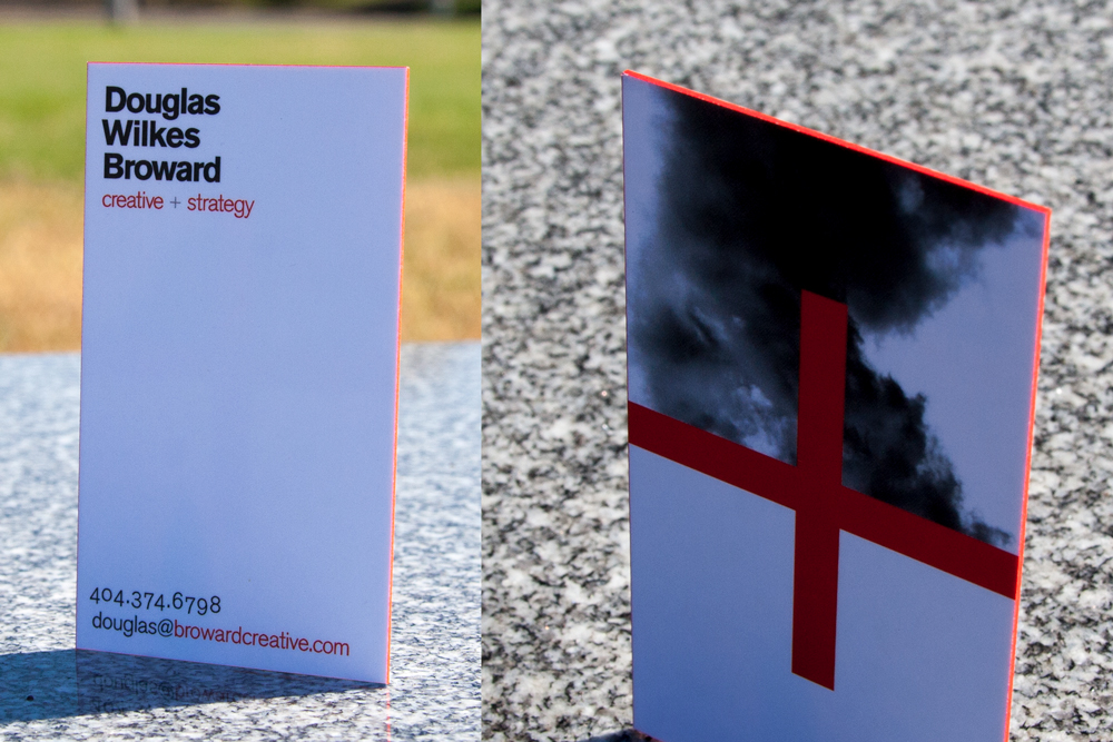
Business Owner/Designer: Douglas Broward, Broward Creative
Background:
I’ve been involved in advertising and marketing for two decades now. I’ve been a designer and copywriter and migrated to a creative director role. For the last seven years, I’ve been doing it for a group of companies… they just got purchased, and that led me to figure out what I want to do next. The card was an inevitable outcome of that.
Creating a personal brand:
I wish I could be definitive and crisp. I wanted to reconsider what I like doing and what do I want to do. It was a chance to re-brand myself. You get kind of smeared out after years of doing things for other people. I had to say ok, what am I, what is my value, and feel comfortable offering to people.
If I wanted to re-enter the market, what would I say? How do you encapsulate decades of legitimate business value, in the most immediate and forthright way possible, in a way that I would feel comfortable with? “Yeah, that’s me, those are my principles on a basic level.”
We’re obviously in a tumultuous time in what the value of what creative is, especially as algorithms crowd more and more. But I want to say that there’s still room to recognize and articulate value, and that’s what creatives do. It’s about functionality, immediacy and intrigue. It’s something that immediately tries to explain itself.
Translating the brand to a business card:
It’s incredibly utilitarian, but it’s also a signature object. It has some structural elements to say I combine the known and unknown in a way that’s recognizable for businesspeople. It’s pretty tall order for a piece of cardboard that you hand somebody.
Red has been there since cave paintings. It means a lot of things, but it’s been pretty stable. It means life, and revolution, and thought, and intrigue and interest. It’s an active color that demands attention. If you’re presenting yourself as a verbal or visual articular of meaning, an obvious choice. Using other colors that might represent other emotions, are all well and good, but I kind of want to wave a flag here. and what better to do that than red.
(After requesting a free sample kit from THikit) I liked the tactility of the sample book. I’m a fairly modest person, but the card let me represent myself as someone more forthright but not arrogant, maybe more extroverted. It was thick, it was meaty, it made a difference. As we get more and more digital, if you’re using a tactile object, take advantage of the qualities like dimension. It’s not just a place for information, but it carries meaning in the way it was built.
How are people reacting to the card?
As a creative, clients want you to put everything on every channel, and that tends to defeat the purpose of having different channels. The card is good at eliciting interest, and that’s what it does, I just wanted to say “Hey, this is where I’m at in my career. I can hopefully make things, or make things better as a creative professional.”
Other designers get it and what I’m trying to do. I had someone tell me they appreciated all the white space so they can write stuff down. The soft touch texture is still really interesting to people. I handed out a few at a photography exhibit, and they were playing with it. They were, for lack of a better term, they were fondling it, and that really pleased me. You want to engage the muscle memory. I worked in TV and trade shows, and it’s all about eyeballs and catching people interacting with your stuff. The functional or practical level was yeah that works.
THikit did a great job in terms of customer service, they were very generous about letting me fix it and do better with it next time. I was very impressed with it.
2. MFG Analytic
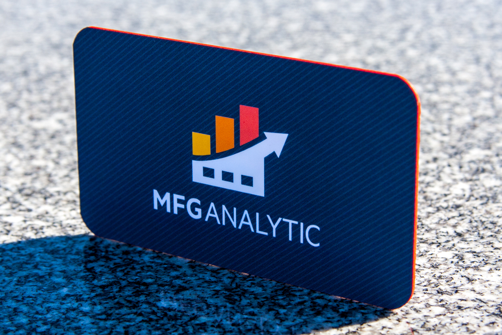
Designer: Lauren Jay
About the designer:
I came here after working at JLL, a commercial real estate company and then HP before that. I have a bachelors in design and a masters in marketing, so I was looking for something that would allow me to use both of these skills. I also wanted a change from the big corporations I had worked at. It’s been a blast ever since.
I’m technically the creative director, but I wear a lot of hats! I’m responsible for graphics and all the marketing. I had to shape the brand since we didn’t have anything.
About the business:
We provide a combination of consulting and real-time data analysis for manufacturing companies. We assess their plants and operations, and compile the data and our recommendations into an online platform that is integrated into their ERP.
The platform is really cool because it allows our clients to play out “what if” games with their global business – What if they invested more in EU markets or built a new plant in Brazil? What are their customers or competitors doing? What can they do to improve employee happiness or their environmental impact? It’s almost like a game that helps people optimize their business but with real world data. We want to give them everything they need to measure their success and move them towards the Factory of the Future.
About the brand:
MFG is very thorough. We’re very honest, very experienced. We’ve got guys who spent 30 years at Dow, Koch, our CEO was a senior economist engineer at Exxon for quite a few years. These guys, they know their stuff.
Translating the brand to a card:
The business card is actually our new look. It’s definitely more modern, and not quite so illustrative. We wanted to make the most professional business card we could. You see so many flimsy cards and they just don’t leave the same impression that a thick, quality business card does.
My goal was to keep it simple and clean, but also bold and sharp. The pertinent information is on there, and it doesn’t take away from the design. I chose a custom red edge because I wanted something unusual and it was a key color in our palate.
How people are reacting to the card:
Every time they touch it, they say something. I get so many compliments on how sharp they look. They love the texture, they love the red edge.
3. Coral Protocol
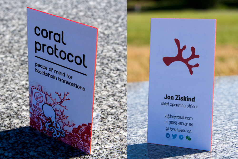
Designer: Jenny Guan, Co-Founder, Coral Protocol
About the designer:
I’m a former architect. I was an architect for about ten years. I stumbled on this group of people who are working on a practical, much-needed product on the blockchain. It’s unusual that a tech company has a designer on board as a co-founder.
About the company:
Blockchain is an industry that’s slowly maturing. There are definitely some crazy stories out there, not just about the industry, but the mass adoption of the technology.
We do payment protection for blockchain transactions. We work with other crypto platforms to prevent fraud, like money laundering, which is pretty rampant. We’re cutting down on that by providing a solution that keeps users anonymous but tracks fraudulent activity. We’re trying to become synonymous with trust and safety.
About the brand:
Our image is of a trustworthy company. We’re stable and secure, and want to look unique from most blockchain companies. The standard is a bunch of nodes, WebGL, gradients. I want to give it more of a tactile, analog look. All of our branding has hands on coral and our octopus mascot.
Hey, we’re solid. You can trust us.
Translating the brand to a card:
The red edge color goes with our brand. Red is a very prominent color, and we wanted everything to pop. I was kind of fighting with my co-founders; not everything can be coral colored.
It’s not very standard in San Francisco to have business cards. It’s actually kind of different from early stage startups here. I wanted to bring a little bit of the tactile and physical to this industry, so we wanted them to feel substantial.
We also wanted to keep a little bit of the more traditional financial industry side in it, so they have the basic contact info and phone numbers on them.
How people are reacting to the cards:
They love it. It definitely makes a difference. They feel substantial, and then other people are like, “Here’s my flimsy card.”
People have such a great reaction to it. I even got a LinkedIn message from someone I met at a conference. They said, “I don’t usually keep cards that I get, but I’m keeping yours because it’s so nice of an object.” That’s a really demonstrable ROI there. Branding and marketing-wise, it’s such a good idea.
4. ArcticFX
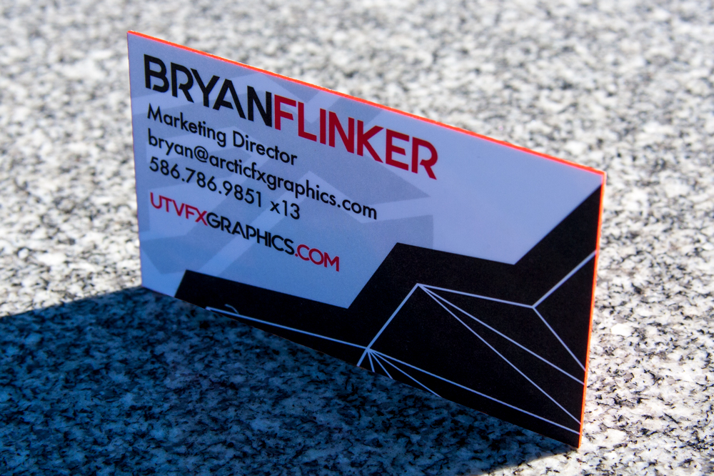
Name: Bryan Flinker, Marketing Director
About the designer:
I went off to college, came back, and saw ArcticFX on a job board. It’s a cool company to work for. I applied and got in a few weeks later. I’ve been here about five and a half years now.
About the company:
The company formed around 2004 or 2005, as a side job by our owner. He already worked a full-time job, but he started doing custom sled wrap graphics on the side, and it became a full-time thing. By the time I started, it was already a well-established brand, and it’s kind of grown over five years.
About the brand:
Before I got here, they were kind of winging it, but this year we did a re-brand, simplifying our icon and logos and sticking with that going forward. We have a few brands under one umbrella, so we wanted something simple and clean that could unify all three brands. In terms of the quality, we want that monster “M” look that’s recognizable everywhere. That FX is the recognized part of our brand.
Translating the brand to a card:
We do some tradeshows and events and stuff. As a marketing person, I give them a lot of cards to contacts, higher-end clients, people at shows, things like that. We needed a card with our new branding on it. We’re a pretty high-quality brand with a high-end product, so I wanted a card with a high-end feel and memorable.
For this brand, red is our color. I wanted edge color, which gave it an extra little pop.
I was looking around, and we got a sample kit. Some cards in the sample kit had a red edge on that matched our brand color. A really bright red can be hard to hit sometimes.
How people are reacting to the cards:
The people I’ve given it to, the first thing they notice is how thick it is. The thickness goes a long way toward conveying quality. Most cards you get are super thin and cheap. Even though thick cards aren’t the easiest thing to carry around in a wallet, the initial impact is that they appreciate the quality.
5. National Information Solutions Cooperative
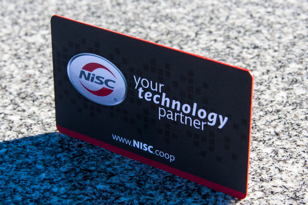
The designer: Todd Moore, Creative/Interactive Project Manager
About the designer:
I’ve been designing for a little over 20 years. I worked for a lot of big name companies like Boeing, Worldcom and Anheuser-Busch. I work now for a smaller software company (1200 employees). I’m the lead designer. When I got here, I was the only designer, but now we have a team.
About the company:
We do software for cooperative utility and telecomm companies. We’re a cooperative ourselves; our members own us. We actually split the profits and give money back to them. For example, my electric comes from a co-op too, so I get a check for $40 or $50 back every year. It’s kind of what drove me to this company. In a co-operative business model, your shareholders are your members. We have members coming to the advisory committee meetings because they’re invested in making the software better.
About the brand:
There was an existing brand, but they didn’t know what their official red or grey were. The first thing I had to do: get a PMS color and a red that everyone had to abide by and kind of be the brand police for a while. It was years before you didn’t see an email signature with the wrong logo.
Since then, I’ve created dozens of logos within the company. We’re actually getting ready to go through a rebrand right now.
As a tech company, we wanted something kind of edgy and fresh. We have a tagline of “your technology partner.”
Translating the brand to a card:
I go to trade shows and see a lot of trendy stuff for business cards. The thing that always caught my eye were thick cards with colored egdes. I like the soft touch that THikit offers. Your fingers kind of grab onto the card. I think the ideal business card is thick with colored edges and soft touch. It’s not cheap, but it grabs your attention when someone hands it to you.
I’ve worked with a couple of companies that do edge color, but we always need a custom edge color. I need that specific red that matches our brand. Not everybody offers it, and they’ll fight you on it, but THikit does a really good job of doing that exact color.
How people are reacting to the cards:
Everybody that touches it seems to love it. The the thickness gets a “wow.” That’s the first word you hear; most people have never felt a business card that thick before. It’s a 35 point, pretty thick, so that’s usually the first comment you get.
That’s the whole point of a business card: you want them to remember you.
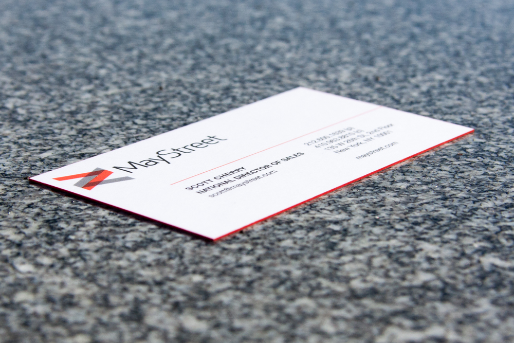
6. Maystreet
About the designer: Pa Thao, Office Manager
About the designer:
I’ve worked in the healthcare industry, but I wanted to work in tech. I wanted to do a little coding, and I said, “why don’t I get my foot in the door with this company?”
It’s kind of starting at the bottom, being exposed to the tech industry, coding, the business altogether.
About the business (from their website):
Maystreet offers “next-generation technology for capital markets insight.”
Translating the business to a card:
I pretty much took a look at their old business cards, and re-imagined and restructured them in some ways.
I’ve known of THikit for a while. I’ve ordered a bunch of cards for personal things. My initial thought was that business cards are kind of on the edge of being very antiquated. Yet, they’re still very important. How do I kind of balance the feeling of, “oh it’s another card,” with “oh, it’s a card but it’s a cool card?”
I’m a huge paper connoisseur. I ordered the sample kit and heard from my bosses about on how thick they want them to be. They said they wanted it to be unique, so that’s where the idea of the red edge came in. It was something different
Our sales team that when they hand out cards, it’s specifically the red edge that they comment on. We didn’t get a very thick card, it was by request, in the past they’d had really thick cards, like 36 point, and they couldn’t fit them in my wallet. I need something where i can fit five or six in my wallet, so we got the less thick card. They love the cards, they’re really professional looking. I think it has to do with that red edge color.
I love THikit for personal projects in the past, they were my first choice for business cards.
7. Express Car Wash
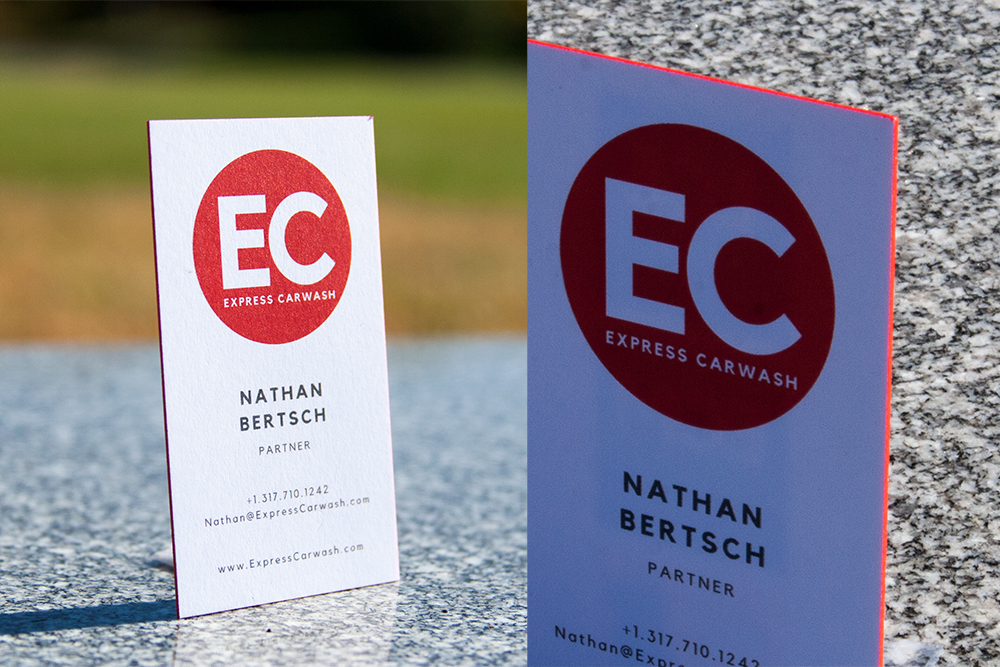
Designer: Jamilyn Bertsch
About the designer:
I’m helping them think through their training, development, some marketing and branding. I was an elementary school principal for a long time, and a teacher, but my husband is a partner with this company. I’m a doctoral student, and we decided to move to be with our partners. I decided to take some time to help with consulting while I finish my doctorate program.
About the company:
We were a originally a family-run carwash company, but now we’re growing. We now have more carwarshes, we support others who are building carwashes, and we offer equipment distribution. My husband has traveled the world helping people set up their carwashes, ensuring there’s an alignment of equipment, chemicals, operations and management all working in sync.
Express Carwash is the umbrella company that supports all aspects of the company.
About the brand:
We want to show strength, dependability and knowledge. We do that with a simplicity in design, with red as a primary color in our branding and carwashes. We didn’t want to have to spend lots of time matching with uniforms and signage, so we went with a basic red color.
Translating the brand to a card:
We were looking for a card that represents the durability and strength. A lot of people get into the carwash industry and find it more complicated than expected.
The red color in our branding came in handy, because we were able to use the default red that THikit makes available as an option.
We don’t use cards a lot except at trade shows. We wanted a card that would stick out in people’s stack when they got home, and give them that feeling of reliability.
How people are reacting to the cards:
I’ve ordered cards from other places before, and there have been flaws or you’ve had to toss cards because they weren’t quite right. this was a great fit.
8. Envoy There
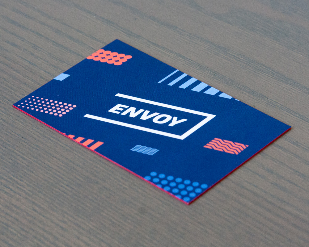
We covered Envoy There last year in a blog post about thick geometric business card designs.
Still reading this? If you haven’t experienced THikit’s cards yet, what are you waiting for? Request a sample kit today.