Our thick business card printing startup moved to the old IBM campus known as Tech City in Kingston in 2015. Locating upstate was far more than a financial decision; it was about quality of life. While our business has grown by working with graphic designers and brands from across the entire country, we’re also grateful for a strong design community right here in the Hudson Valley that tries to shop local whenever possible.
If business cards or printing are important to you and you’re in the Hudson Valley, request a free sample kit from us and join the party! As you’ll see in this article, a thick business card with edge color can make a huge impression: for yourself, your business and your clients.
1. Rabe & Company
Location: Beacon, NY
Designer: Ken Rabe
About the business:
I grew up in the area, in Fishkill, and I kind of came full circle. I went to school in NYC, and lived and worked there for 15 years, then moved back up to the area about 5 years ago.
I met my partner, Liz Birch, at an ad agency called Lowe, and we just worked really well together. She was a project manager, I was a designer. We had this dream that we would leave the agency world and start a design studio, and that’s exactly what we did. We were able to do that because I had a long list of clients that I was freelancing with, I felt we would be busy enough as a company.
We moved it up to Beacon a year into running our business, working from home at first, but just opened an office on Main Street, which we’re super excited about.
Design philosophy:
We always say that we don’t necessarily deliver mind-blowing conceptual work. There’s not a lot of ego with us, we just try to do very straightforward, hard-working graphic design with minimal amounts of typefaces, limited colors. Within that you can do some really beautiful stuff.
I was trained as a print designer, and I still pride myself as that. We do web, but a strong sense of editorial layout and simplicity is important no matter what the medium is. And when it does come to print, picking good paper stock that feels really good paper stock is still very important. When we’re finishing up the logo mark, we need to explore how it’s actually going to live in the world, so the first thing that we like to apply it to is a business card and letterhead. We always try and make sure that the paper stock is heavy… it’s got to feel good. Soft touch is requested a lot, colored edges, too.
About the project:
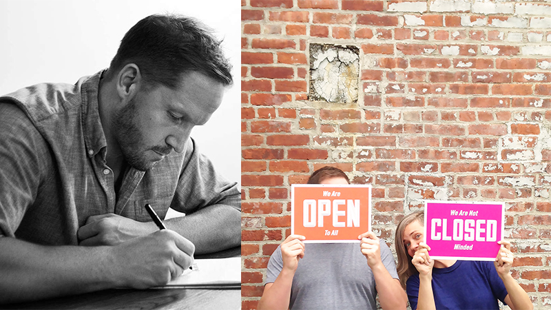
People were really stressed out about what was going on in town after the election, so we decided to do a really simple twist on open and closed signs for local businesses. In smaller type it says “We are OPEN to all,” and if you flip it, it says “We are not CLOSED minded.” And really small, at the bottom, it says “Be a Beacon of Love.” We walked them all around town and gave them to businesses for free, and even businesses outside of Beacon wanted one. It was a sweet, simple message, everyone seemed really open to it.
THikit printed about 100 of them, and they came out beautifully. They also donated part of the cost, they were so supportive of the project. We were so grateful.
How people react to your business cards:
If I give out my card, it’s kind of funny; people will hand me their card and start apologizing for it.
Funny Story:
When we first started Rabe & Co., I was still living in Astoria, Queens, and we first started working with Chris and Frank of Thikit when they were still based in Long Island City. Liz and I would walk down to their building from my apartment to look at a proof. It’s just so incredible now that we all jumped that ship and chose to make the Hudson Valley our home. We were overjoyed when we heard Thikit was moving up to Kingston. We love Kingston!
2. Baxter (designed by Rabe & Co.)
Location: Poughkeepsie, NY
Designer: Ken Rabe (interviewed)
Business Owners: Amanda & Eric Baxter
About the project:
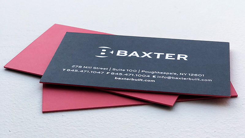
Baxter is a super busy development, construction and real estate management company in Poughkeepsie that wanted to refresh their brand and feel a bit more modern, and look as multi-faceted as they are. Because of this, for their cards, we didn’t want something that would fold in your fingertips, we wanted something pretty rigid and durable. And then it’s funny, owner Amanda Baxter asked about thickness, multiple colors, and a colored edge, and at first we recommended that that all might feel like too much, but she and THikit both are ahead of the curve, now everyone wants that! Ultimately it was a perfect solution. The cards are clean and simple, but bold. It’s a business card where you can stack two together and use as a ruler if you want to draw a straight line.
3. Wickham Solid Wood Studio (designed by Randall Martin)
Location: Beacon, NY
Designer: Randall Martin
Owner: Jessica Wickham (interviewed)
About the business:
We build custom furniture. It’s a very niche market — our clients are people who get excited about the integrities of solid wood and also who appreciate the connection to the Hudson Valley. We have a sawmill and produce gorgeous live edge slabs from local hardwood trees – a very labor-intensive process. Our work is not inexpensive, I look at it as an investment in something meaningful, designed to last for generations.
We’ve been in business since 2004 but things took off in 2009 after we moved to Beacon. We came to town smack in the middle of the recession and sort of grew out of that. The creative community in Beacon runs deep and we have collaborated with many artisans and designers in town. Our work on the Roundhouse (which is across the street from us) was a springboard to many other projects. We recently completed a large project at Duke University, working with architect David Burke, who lives in Beacon.
(Read more about Wickham in this 2015 CNBC piece).
About the brand:
Our work celebrates the materiality of solid wood and I have worked hard to build a brand that reflects that… its about substance and integrity, attention to detail and careful craftsmanship. Design is at the center of it all. I met graphic designer Randall Martin (who is a genius) right after moving to Beacon and we have forged a “visual identity” that is very strong. Randall designed our logo – based on the traditional Japanese “hanko” name stamp – a hat tip to time that I spent living in Japan.
Translating the brand to a card:
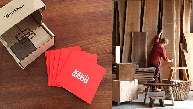
I learned about THikit when Rabe & Co. distributed those wonderful Open/Closed signs around town after the presidential election. I’ve been following the THikit Instagram since then and basically have fallen in love with the thick card format. That solid color edge communicates so much! The substance of it really makes sense for our brand.
I decided to use the thick cards as part of a targeted promotional campaign that we are sending to architects and interior designers. Its a box of four hardwood cubes, with a two sided card in a deep orange color (I love orange!). Designers are a tough audience – so all the details of the piece had to be right. Randall Martin came up with the concept of a playful puzzle — using the logo on one face of the cubes – its great!
For the language on the card, I worked with Andrea Kahn at DesignCONCEPT in NYC. She is amazing. It was a crazy process to whittle down our message into two paragraphs – took about six weeks of back and forth and I’m really proud of it.
Selecting the photograph for one side of the card was another adventure — we didn’t want the image to be too literal, it wasn’t a product shot. We wanted to convey gorgeous material, meticulous craftsmanship and a little bit of mystery.
The final step was selecting the orange color. Turns out that it is no simple thing to print orange! We made a grid of about 12 different shades to get exactly what we wanted — THikit was so helpful. It was a very positive experience.
How people are reacting:
I’ll tell you soon! We will be sending the promotion out next month. My hope is that people will fall in love with the cards – and the message “touch wood” – and be compelled to hold on to them… the card itself is too beautiful to dispose of!
4. Hilary Davis Design
Location: Beacon, NY
Designer/Owner: Hilary Davis
About the designer:
I went to college for design communications and did just traditional graphic design, print work and catalogs for a few years. I’m from Minneapolis, and it’s a great advertising and design city. It’s a small enough community where everyone knows each other. I got into fashion, and ended up at an agency there, art directing photoshoots and broadcast productions for clients like Tresemmé. When the economy tanked, the agency pretty much closed, and I made the move to New York.
I got a job with Saatchi, and worked with them for companies like JC Penney, then freelanced at Ann Taylor and Avon. I had a really fun experience in NYC, but my boyfriend and I would escape the city every weekend. We started playing with the idea that a mortgage up here was the same as our rent; we wanted to be close enough to have access to friends, play in bands, and come in for work. He was freelancing, it was a viable option, so we made the plunge to Beacon.
About the brand:
I think I have a broader range in terms of doing both graphic design and photo art direction. In both of those areas, I want to show a style that’s clean, modern, but has a lot of energy. I love to use two-dimensional geometric shapes, play with patterns, black and white with color, and keep things really poppy and fun. Most of my clients are fun, friendly and attainable, like JC Penny or Ann Taylor, brands that people know and love already.
I’m brought in to refresh a brand, to reflect a more modern energy. I’ve also been in bands my whole career, I play electric violin, so I design for my band and my friends’ bands. I need a little bit of an edginess too.
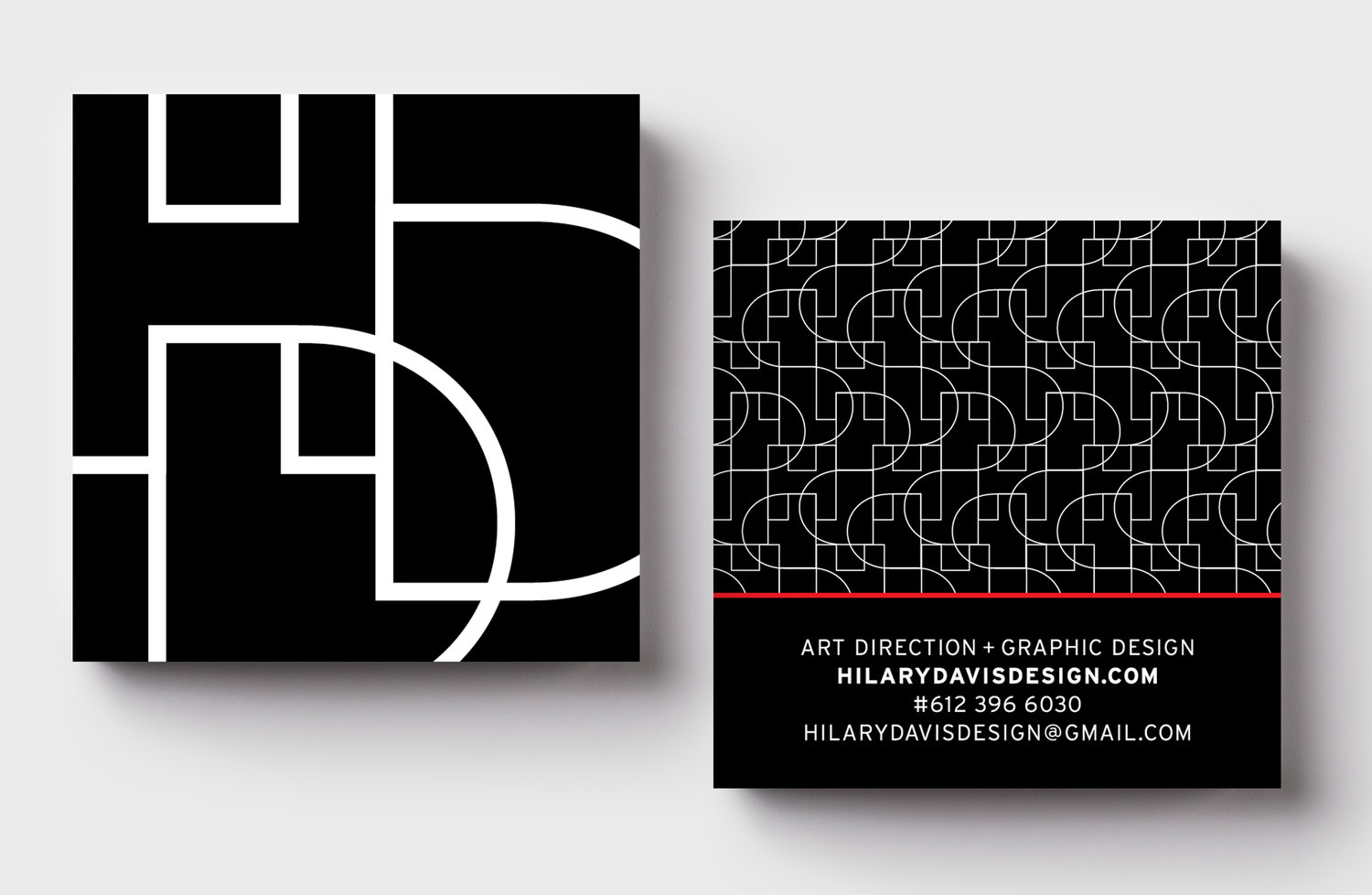
I don’t have a clever name for my company because it’s really just me. I can manage a project, or I can be a gun for hire. I’ve used my initials to create a logo, which is very abstract… black and white and red is my favorite color combo, it’s bauhaus, it’s every punk band, it’s a classic cool combination.
Translating the brand to a card:
 My card is black and white with a red edge. It’s like an “HDD” logo with overlapping letters. That logo/style is like something I’d create for a fashion brand or a band, it kind of applies to both. I enjoy that tension between being a little edgy and a little fun too. The card has that rubbery coating, having soft touch was huge.
With thin line in white reversed on black, I knew that the pattern on the back of the cards could end up looking grey, and it was a tricky print job. Designers are always trying to push it with printers, asking “can we do this?” THikit offered to do a test, and they printed it up and mailed it to me so I could see the comparison. It was awesome to be able to actually speak with someone and ask questions.
How people are reacting to the card:
Oh my god, people love it. When you design for yourself, it’s like ahhh. It’s hard to separate yourself from your brand, to have some perspective on your own design. I ordered the cards in time to go to Likeminds, this design conference upstate, and I went with these brand new cards. I was giving them to pretty cool people, like the guy who founded Ghostly International, all of these cool designers. I felt really confident and proud because of how they were printed. They looked really upscale, everybody commented on them, rubbed them, one person even rubbed it on their cheek, everybody thought it was so cool. It was a conversation starter as well, and I was proud to say I got them printed locally upstate. I literally sent the THikit link to everyone.
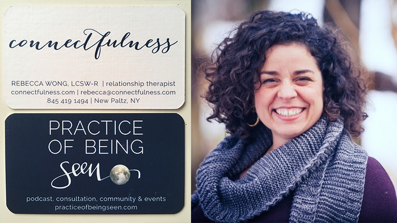
5. Connectfulness/Rebecca Wong
Location: New Paltz, NY
Owner: Rebecca Wong, LCSW-R
Designers: Aral Design, This Unscripted Life, Treeo Design, Blue Rabbit Studios
About the business:
I have two businesses: primarily, I’m a relationship therapist that works with both individuals and couples. I also mentor other therapists and host retreats for the general public as well as therapists.
About the brand:
If there is a secret to sustaining happy relationships it’s that it requires a practice. And that’s exactly what Connectfulness is. It’s a relational practice that helps you deepen your awareness to seeing your own patterns, both in how you treat yourself and how you treat others, and then helps you transform your relationship patterns so that everyone feels seen, safe, and heard.
The Practice Of Being Seen, is the first phase of the practice, and it’s where I dive in with the podcast. We peer into the shadowy, darker parts of ourselves, the parts where we’re not comfortable looking, and begin to find some peace with ourselves and more peace in our connections. I can’t mentor my clients through their own repatterning work until they start looking inward and seeing all the components at play.
Translating the brand to a card:
My original designer, who designed my Connectfulness logo, was based out in Colorado, and had used THikit before. When I found out they were in Kingston, I got really excited. Most recently, I wanted to have the cards speak to both aspect of my work when I was out networking so we designed two-sided cards.
I love the thickness of the card, the solidness of them. I’ve played around with a few different kinds of paper, and each time I try to do something different. I am a former art school grad, so I like changing up design elements.
How people are reacting:
I mostly use these cards when I’m at networking events; I’ve used them at big conferences where I’ve had the opportunity to meet some wonderful podcast guests. The cards have worked well. They feel substantial. I’m down to my last 15 so it’s time to put in a new order.
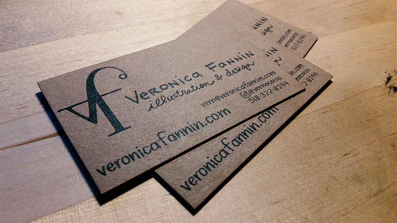
6. A is for Asparagoose: A Plant + Animal ABC Book
Location: High Falls, NY
Designer: Veronica Fannin
About the designer:
I am an illustrator and a graphic designer. I’ve been living in the Hudson Valley for about seven years or so. It’s a windy path. I originally thought I was going to be an interior designer. I went to graduate school for that, but I started doing graphic design for a couple of local people, and it sort of took off that way.
I got a gig doing a book layout for a friend of mine, and did mostly graphic design for random people. In the last three or four years I started on a project with my partner in life, an alphabet book. I also co-teach an online course on botanical illustration, and I do illustration and signage for a local music festival called the Hoot.
Being able to walk out the front door and go hiking is amazing; I can see the Shawangunk Ridge out my window, it feels just right. The arts community is super supportive around here.
About the brand:
I have a sort of crisp and typographical logo. I try to convey a hand-written, minimal, clean vibe. A lot of my stuff is just black on white, hand-drawn, definitely not perfect.
Translating the brand to cards:
The reason I got these business cards recently is that I finished a Kickstarter project for publishing a book that I wrote and illustrated. I got some cards made to send out to backers. I hand-lettered all of the information on the front.
I ended up going with all black ink, thinking it would look nice on kraft paper. I thought about edge color, but I sort of wanted to keep it simple and accessible to people. I didn’t want it to feel too super-fancy. I asked about white ink on kraft paper when I first submitted (editors note: White ink on kraft paper is coming soon!)
How people are reacting to the cards:
People definitely do a double-take. They flip it over and they’re like wow, this is substantial. People touch it and flip it and say “Ooh, ok.”
7. BayPro Property Solutions (designed by Isaac Terronez)
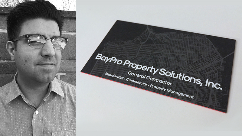
Business Location: Sausalito, CA
Designer Location: Port Ewen, NY
Designer: Isaac Terronez
About the designer:
I wear a lot of hats as a freelancer. Half of it is me doing film video post production and all sorts of design disciplines. The other half is IT consulting for creative shops, architectural, interior design etc. This past October, I went out to Apple’s campus for a meeting, and one of my friend’s family members let me stay with them for a day. We got to talking about design, and he said, “Let’s just start with business cards.”
About the brand:
It’s basically a general contractor and property management company. He showed me what he had for cards, and it was one of those jobbies from [name of other business card printing company]. We talked holistically about what his brand is, he said he wanted to come across as modern, but not artisinal or carpenter shop, and functioning in a metropolitan area. People are pretty proud to live in San Francisco, so he doesn’t want to look like a tourist.
There are a ton of contractors in Silicon Valley; everyone is building or remodeling, so he really wanted to elevate his image in the local scene. They’re some hearty people but they know how to steer a ship from a visual perspective too, which is going to translate into the actual project.
Translating the brand to a card:
In my line of work, I’ve probably given away, like, ten business cards. But he told me that he’s often competing against other contractors for a job, and it gets narrowed down to three, and there’s a meeting with the decision maker, and right from the go he wanted that indication that says it’s going to be different working with them.
I told my wife (Liz) about this project, and she said said, “You know what would be good for this: a THikit card.” She’s really tactile, way better at these tangible things than I am. She said since it’s a construction company, maybe square cardboard would have that tangible feel, and have a design element that hits you.
I was like oh man, this is going to be money.
I pitched it to him, shipped him some samples (request your own sample kit here!), and I went to town with the design. He really liked the soft touch, 34 point thickness. The upper echoleon of his company got the soft touch premium cards, while some of the other workers got classics, which are a little more inexpensive.
Step one was clarity; the card that they already had has all the information but it’s cluttered and not a consistent format.
We went through a number of type options, and the art ended up as a topographic view of San Francisco, a really nice vector thing, and we were going with this blueprint vibe and a rich charcoal color. We ended up with a really popping red edge color because it harmonizes well.
Translating the brand to a card:
When we received proofs, I shot him some photos, and he was like, I’m sold, let’s just order them. They’re on the way out there now, and I’m anticipating nothing less than some “oh, wow!” reactions.
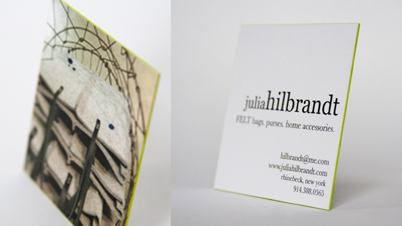
8. Julia Hilbrandt
Location: Rhinebeck, NY
Designer/Owner: Julia Hilbrandt
About the designer:
I make purses, totes and home accessories from industrial felt. I like wool and I like bags, so the two came together. I do not have a degree in fashion, but rather drawing and printmaking. I have worked with many artisans – a jeweler, fashion designer, at a hat company and for a furniture designer. It is sort of a blend of all of the processes I learned over the years. The material came to me by chance, it was not a plan. I sell the bags at sheep&wool festivals, craft shows, and on-line. I do not make the felt, but I design, sew and do everything else.
I did grow up in the Hudson Valley, and have been in Rhinebeck for five years now.
About the brand:
It’s really all about the texture of felt. It has a strong appeal to knitters. I want to have really clean design, straightforward, simplicity and texture.
Translating the brand to a card:
My first business cards had a piece of felt glued on to them, this became pretty time consuming but it was tactile, and people remembered what the card was from. It was textural and tactile and helped people to remember the product. Over the years, it’s developed, (because you can only glue so many pieces of felt onto printed business cards) but this latest THikit incarnation is my favorite.
The design was really just looking for the perfect photo. I had round business cards for a long time but went to square. With this card, I like the thickness of the paper. It’s sort of reminiscent of the felt, and there’s the green edge color. The lime-green has always been a part of any branding I have done.
How people are reacting:
People love the cards, they try to separate them, and they see the green edging and say they love my business card.
9. Moonfarmer (designed by Shauna Keating)
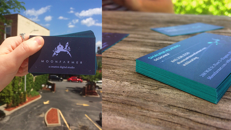
Location: Kingston, NY
Designer: Shauna Keating (interviewed)
Business Owners: Dan Stone & Kale Kaposhilin
About the designer:
I got into design when I was a kid, and spent most of my time drawing, learning the Adobe Suite from online tutorials, and getting a portfolio together to apply to college. I relocated to the Hudson Valley from northern New Jersey to attend SUNY New Paltz to pursue my BFA in Graphic Design. I knew I wanted to go more in the direction of web design, and while I was in college, I found the field of UX (user experience) design and front end web development. My academic program was more general-graphic design and typography focused, so I built up my coding and prototyping skills on my own time and through internships at studios, including Moonfarmer.
About the brand:
We are a creative studio that primarily builds websites and apps. It’s kind of a unique name. It’s informed by the agricultural history of the Hudson Valley, while also depicting exploration of the unknown and engagement with technology and bringing those together, while having the creative/making things part of it.
Translating the brand to a card:
The artwork with the astronauts is cool. We had the artwork made for the website when we initially released it. We kind of picked a couple of those that were eligible to be on the business card. They were initially made for digital, so ended up having our artist Andre draw a custom one for it. We had the option of two different pieces of artwork on the cards for employees to pick from.
On the website we use this really bright sea green color for glowing plants… part of the reason we went with THikit was their option for edge colors, they were using these really poppy spot colors and we were really drawn to that. We got to use that really bright sea-green that you see on the website and applied it to the cards.
We actually went pretty thin on the cards because we wanted them to fit in our wallets. I went over the THikit facility, and they let me pick out as many sample business cards in their collection that I wanted them to do. We showed them what we wanted to do and what was possible, and it opened up a lot of ideas for me creatively.
How people are reacting:
People really like them. The edge color really makes them stand out.
10. McGrath Cheese (designed by Kyle Perry)
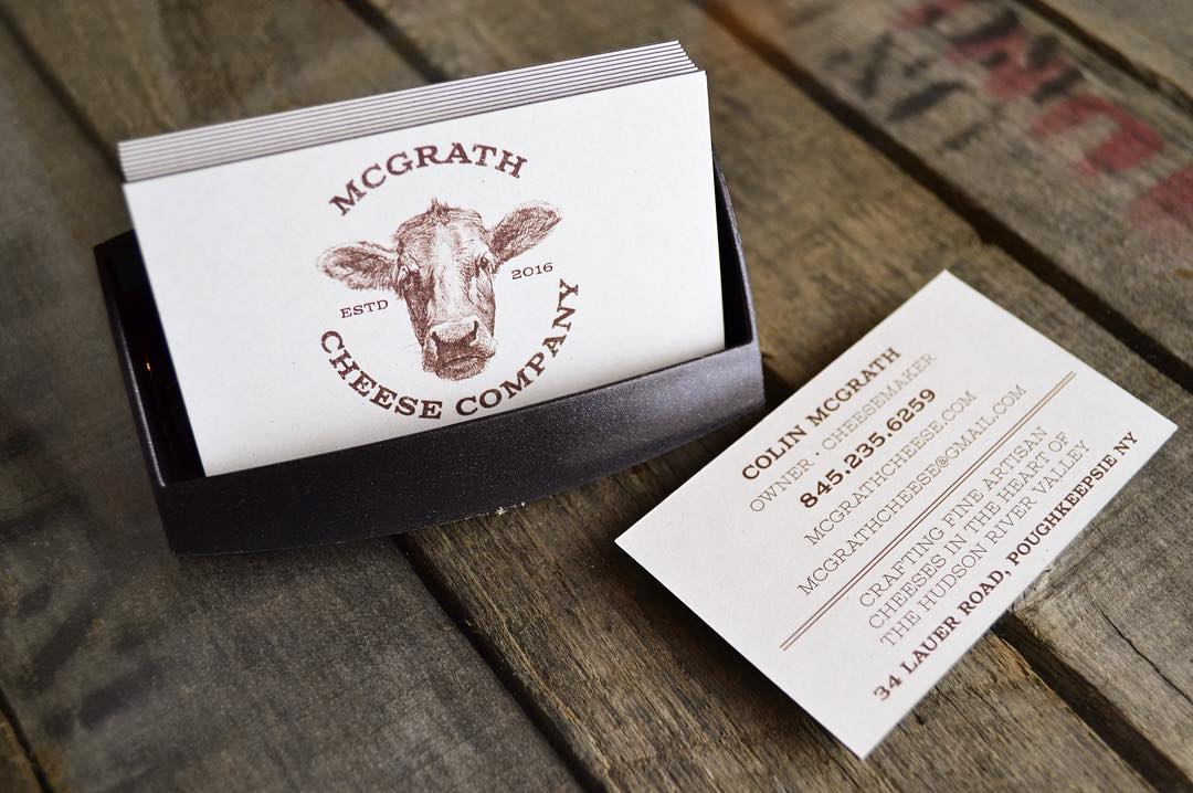
Location: Hudson, NY
Designer: Kyle Perry
Business Owner: Colin McGrath (interviewed)
About the company:
We’re a fairly new company, we’re only in our second year. I’ve personally been making cheese for the last 12 years, and it finally came into fruition last year. I craft cow’s milk cheeses primarily, with multiple varieties ranging from soft and fresh to hard and long-aged. The milk is sourced only from the Hudson Valley.
It’s me and one other person that pull milk from a bulk tank into 100 pound cans, put in a cheese vat, and just make it into cheese all day long, salting it, aging it, delivering it and selling it. I’m always in the cheese vat, in the cage. It’s what I love to do.
About the brand:
It goes with the theme of what I do wholesome, one of a kind, hand crafted. when I put the brand together, I wanted something that had a rustic but elegant feel to it.
Translating the brand to a card:
The graphic designer was like,”Really, you want them that thick?”
For some reason, I wanted them really thick. I’ve worked with so many different people, and I have so many business cards. When I meet with someone from a really good company, and they’ll hand me a Microsoft Word-looking business card, you just remember the bad impression. I wanted to make a business card that when I handed it to people they would know it was quality, which goes in line with what I do. I really wanted to not skimp on it, basically.
It goes along with the cheese that I make. It’s something that I love to do, and I want the materials that I hand out to match the passion that I put into my product.
Keeping it local with THikit was a huge bonus, it was a gamechanger. I was very shocked to find that it was in Kingston. Being a small local producer myself, those are the people that I would choose over anybody. My t-shirts and labels are made in Poughkeepsie, and all of my promo materials and packaging are local.
How people are reacting:
Truly I can’t tell you how many comments I’ve received about my cards. They’re not cheap, and everyone tries to take them apart, because they think they’re five different cards in one.
People usually try to take it apart because they think it’s four business cards stuck together. They’ll always compliment with, “wow, this is a solid card.” People will look at it front and back, kind of feel it and remember. It helps me represent myself and my company in a good way.
11. Loj Architecture & Building Science (designed by Carla Rozman Graphic Design)
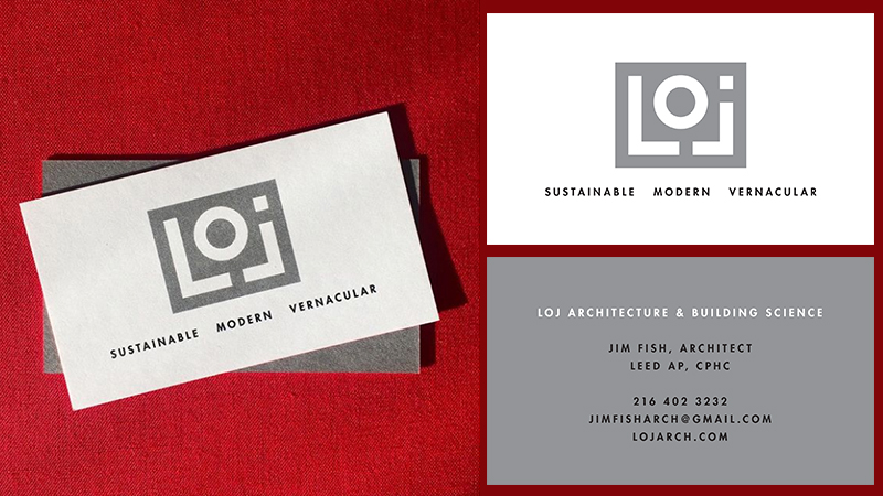
Location: Kingston, NY
Designer: Carla Rozman (interviewed)
Business Owner: Jim Fish
About the designer:
I grew up in the Hudson Valley. My parents were designers, starting Hudson Valley magazine and an ad agency, so I was introduced to art and design at an early age. Becoming a graphic designer seemed natural.
My studio is in Uptown Kingston. We design print and web projects for clients both in the Hudson Valley and nationally.
About the project:
This was a business card design for Loj Architecture & Building Science. The client drew the logo, which I rendered and digitized.
Transferring the brand to a card:
Jim had an existing card which I reimagined, organizing the information in a clean and simple way. Per his request, we included the firm attributes under the logo on the front of the card. When the card is flipped, “Loj Architecture & Building Science” is reversed on a field of grey, making it pop.
We used a red edge color to accent the the minimal design.
How people are reacting:
Jim: As a architect, it can be be important to make a strong first impression with potential clients and consultants. My new business cards do just that; they are bold, memorable, and have been inducing reactions such as “Wow, so professional!” and “This is beautiful!”. The colored edge is a great touch.