In the competitive world of real estate, agents are always searching for that little extra something to put them over the top. The industry has become more focused on design and aesthetics; visually balanced property listings, art-directed property shots, and tastefully curated interior design can all help differentiate both real estate agents and help their listings sell faster and at higher prices. We’ve also seen a new trend; high-end real estate agents are printing thicker and thicker business cards that have more bells and whistles; instead of ordering thousands of cheap, thin cards, they’re ordering smaller batches of premium cards that feature design notes like edge-color, foil, and white ink.
We interviewed six graphic designers who either have real estate agents as clients or are in-house at real estate firms themselves to find out their tips and tricks for making their business card designs stand out.
For these designers, it all started out with ordering a free sample pack from THikit; it shows our capabilities for thick printing, edge color, white ink printing, and our overall commitment to quality. Request one today!
1. Turk McGee/Avenue Properties
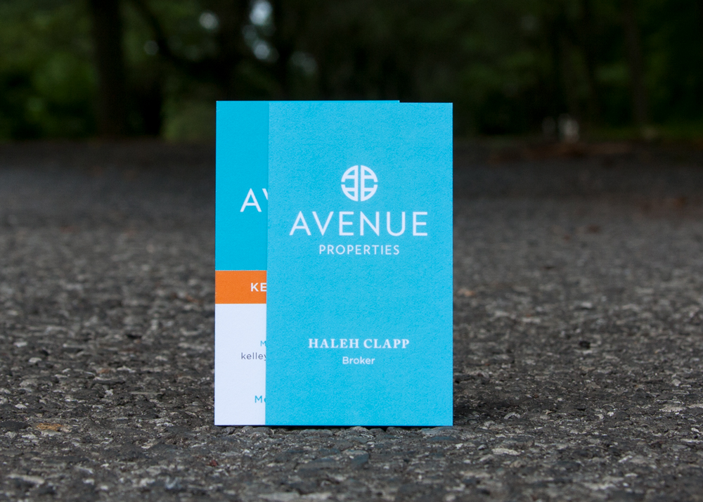
Designer Name: Marc McGee & Alyssa Turk
Background:
Everything we do, design-wise, is a tandem effort, how we approach stuff. Sometimes she’s the designer and I’m the technical person, and sometimes vice-versa, so we’re a pretty integrated team.
About the client (from website):
In February of 2016, six of the [Seattle] region’s top producers banded together to form a boutique brokerage called Avenue Properties. With the shared vision of a brokerage built for agents by agents, our founding members … have a unique perspective on the industry and what it takes to truly be successful in today’s rapidly evolving marketplace.
About the brand:
I think they were looking for something that was modern, kind of fashion-forward. They wanted it to have an impact as being something of a new era in real estate. Then it was a matter of exploring different designs, different approaches to solving the riddle, so to speak.
Alyssa came up with the concept of Avenue, it had the dual meaning of being a physical, tangible thing as in a street, and it’s also kind of a metaphorical path that you would be on. People areo n a path, they’re on a journey wherever their avenue is going to lead them. Everyone has a different one, and you’re either selling and taking a different avenue, or buying and taking that new avenue. It fit very well into what we were trying to build for them.
The avenue blue was a color that had already kind of been put in use with some things they had done in the desert. Two of the founding members really liked that avenue blue color. We just kind of took that and ran with it, and found an orange that went with it. We brought in greys, we wanted to stay away from doing the predictable color of dark brown, because it’s kind of a light turquoise color. We wanted to avoid doing a dark brown or a black. We wanted to keep it light and bright.
Translating the brand to a business card:
Whenever we’ve done business cards for any clients, whether they’re retail, law firms, a linen designer, we’ve always wanted it to have an impact. Very heavy stock, #1 grade paper, and we’ve always done an uncoated, thick stock.
When it came time to do cards for them, we had a vendor who was showing me some stock that was thick and could be done digitally, but it wasn’t thick enough. That put us on a path to finding THikit. We printed a couple of cards for the founders, as a little treat for them, but they freaked out and loved them, and everybody else at the company wanted to get them. They served as a real conversation piece and a leavebehind for the agents, which was the goal to begin with. Something that makes an impact, that’s memorable, that looks like you took some time to put it together. Everybody has been very happy with them. And the experience with THikit has been exceptional,
Adopting the card across the company:
Avenue has 145 agents and various support staff, and there are many instances where someone has a custom logo and you’ve got to integrate it into the look. Most of the cards end up being fairly close to one another. You’re working with each agent to give them a little bit of their own custom branding. Everyone gets their own set of comps, as opposed to having an online interface where people just enter their name and phone number and get 500 cards in two days.
One thing is that they’re not putting photos on their cards, and they have minimal information. I struggle with a few agents who want to put tons of licenses, certifications. We’re kind of working our way through some of that. The goal is for most of the cards to be open and bright and clean, easily accessible.
I just want one phone number, and I want to know that I’m going to get you when I call. That was kind of our mindset.
2. Hawthorne Branding/Tim Singer & Associates
Designer Name: Brandon Hawthorne
Background:
I grew up in the business. My parents started an ad agency in Fort Lauderdale, FL in 1968 that grew steadily until their retirement a few decades later. I worked for the family business, then as VP of B2B Markets for a leading South Florida ad agency (working in account management alongside peers that had come from leading global branding firms including Landor and Interbrand). I eventually figured out that what I enjoy most is working on my own and focusing on branding and design. I started my own firm, Hawthorne Branding, in 2004.
I’ve had an interesting mix of clients representing a broad swath of industries. Much of my time now is spent working for Shula’s Restaurants (a national restaurant group), Southern Glazer’s Wine and Spirits (a liquor distributor ranked by Forbes Magazine as the 17th largest privately held company in America), Marie Brizard Wine & Spirits (a French-based wine and spirits company founded in 1755), and a variety of other clients in real estate, healthcare, non-profit, home furnishings, and other sectors.
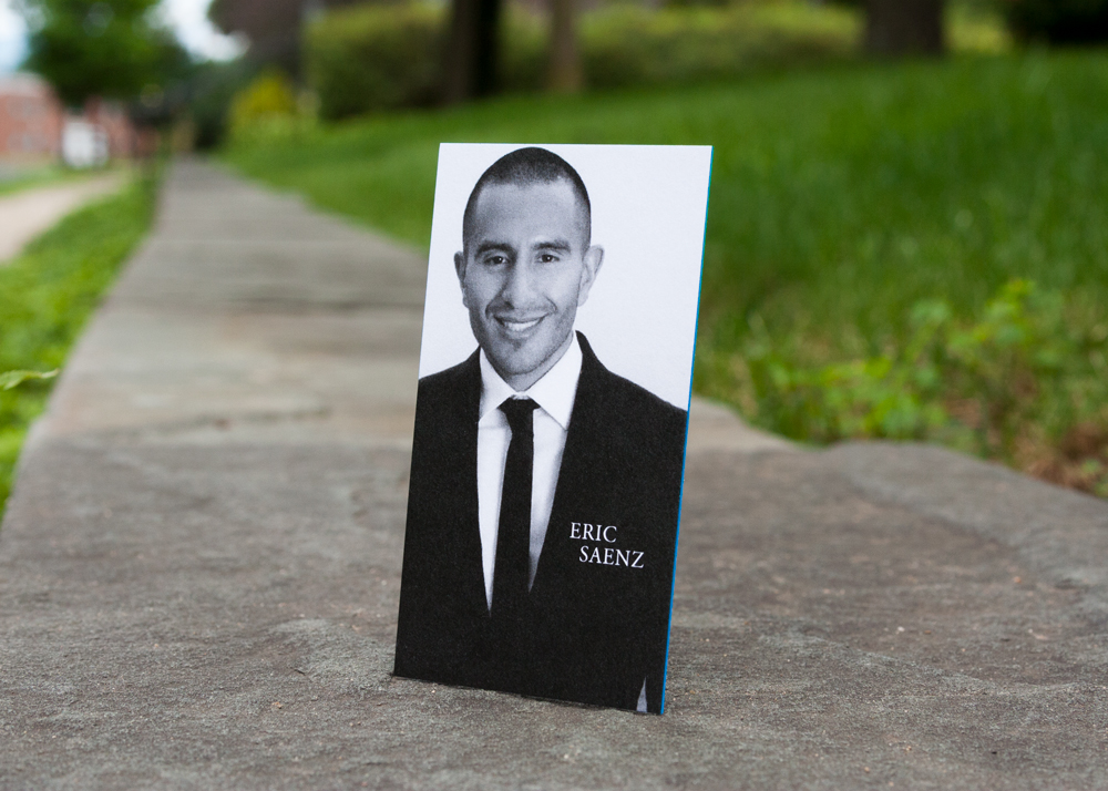
About the client:
Tim Singer & Associates is a well-established real estate firm in Fort Lauderdale that concentrates on the affluent and historic neighborhoods in the downtown and coastal areas. As a Coldwell Banker Global Luxury office (the luxury arm of Coldwell Banker), they focus on prestige homes and estates typically priced over $1 million. They also serve as exclusive sales representatives for developers of single family homes and multi-family projects (most of which involve brand development).
About the brand:
I did the original branding in 2004 and they were among my first clients when I started my own firm in 2004. Their brand has remained mostly the same except for the subtle evolutions of Coldwell Banker’s own branding over the years. Tim Singer and his partner Richard Cascarelli are (and I’m not just saying this because they’re clients) two of the nicest, most likeable people you could ever want to do business with – which is a major part of their success. When developing the branding, we chose a loose script font to convey the friendly and personable vibe of the firm. At the time, I considered using custom hand lettering (which I would have outsourced), but the font that was chosen (Scriptina) worked will with the Caldwell Banker branding and we ultimately decided to go with it.
Translating the brand to a business card:
With their business cards, out goal was to make them elegant, high-end, and unique. Thikit’s paper selection and thickness was ideal. We decided to feature each agent’s photo on one side in black and white because the primary brand color for Caldwell Banker Global Luxury is black and because the black and white photos have a more understated look, especially on an uncoated stock. While Tim Singer & Associates is a Caldwell Banker Global Luxury office, they are still part of the main Caldwell Banker network, which uses blue as its primary brand color. As kind of a wink to that brand, we made the edges of the business cards blue.
Adapting the card across the company:
All of the cards are consistent in design and follow the same format. Team members cannot alter the format of their cards or customize them in any way. When a new agent joins the team, the business card artwork is set up by me and the Thikit printing order is placed by me so that all cards adhere to the same approved design.
Final thoughts:
The client loves them and the reactions have been positive. They usually get a “nice card” comment, which is exactly the reaction everyone wants when handing their business card to a customer or prospect.
3. Jan Young @ RE/MAX Gold

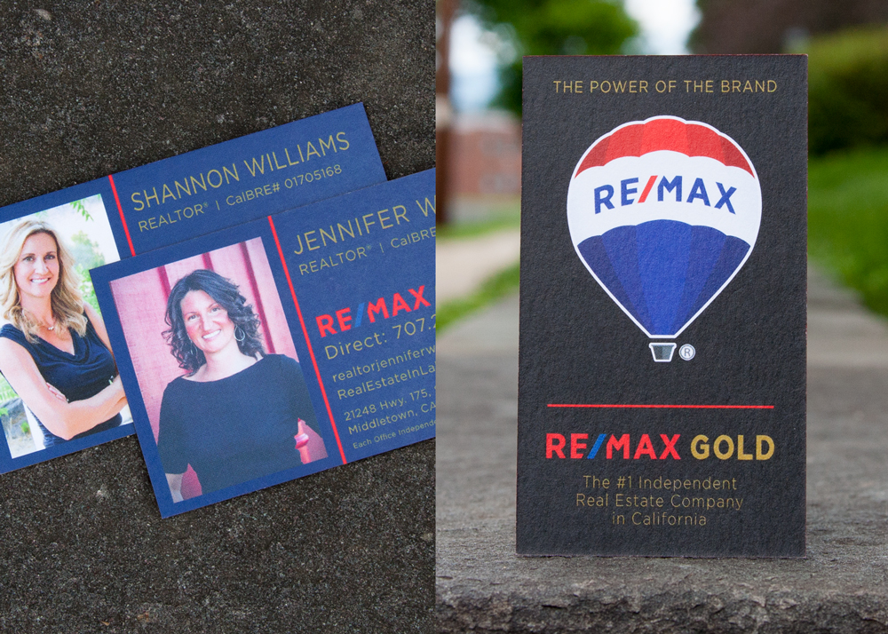
Background:
Jan is the Director of Marketing at RE/MAX Gold, which spans 66 locations and 1,350 agents in California. RE/MAX already had a well-established brand, so it’s Jan’s job to propagate it across all of the various forms of marketing and collateral the company uses.
What elements of the cards are standardized across the company? Which are unique?
Some cards, all of the content is unique. Others are more templated: contact info, licensure, photo, logos, industry logos, office address (we have 66 offices throughout California, 1400+ agents).
What card features are you opting for most often?
We love ordering thick cards with edge color and we also like the new ‘velvet’ feel cards.
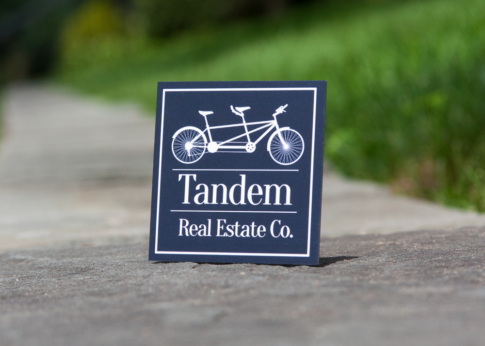
4. Paul Ugenti/Tandem Bicycle
Background:
It’s a real estate development and brokerage company. I started off in brokerage right out of college and quickly transitioned into entitlements and development projects, and then branched off and did some private projects. My wife was in asset management, and about five years ago we got married and started our company. There was a lot of synergy between our two skill sets.
About the brand:
Oddly enough it has dual meaning to us. We are partners in life and business and treat our clients like family. When you think of real estate, you want someone who is going to carry you across the finish line. It’s the foundation we built our business on.
Translating the brand to a card:
The reality was, I wanted the simplicity of our logo and our card to reflect the many sectors of real estate that we service. We primarily focus on commercial and mixed use development, but over the years we have expanded our services to wrap our arms around single family residential properties. We didn’t want a busy logo or busy sign. When you get that square card, we want it to reflect the wide spectrum of our services.
It is simple clean colors, it’s a blue and white contrast, and the silver gave it a little pop with edge color. But really, it just reflected kind of the basic color schemes that we’ve been operating off of for a while. The square card was unique and helps clients visualize Tandem Real Estate Co. listing their property.
Final thoughts:
We have received amazing feedback on our cards from clients. They like the texture, the size is easy to manage, it’s more unique, and that’s the best feedback that we’ve gotten.
5. Leland Sandberg/Susan B. Meyers, Realtor, M.Ed
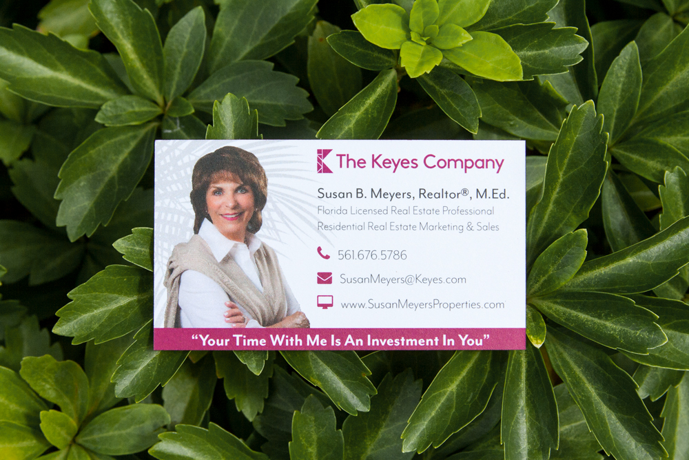
Background:
I started a creative marketing company in South Florida about five years ago, and I have a real estate marketing company. We work with about 70 of the top 100 real estate agents in Florida, probably.
About the client:
My client is one member of a three person real estate team, focused on Jupiter, Florida. They’re under a brokerage which is the Keyes Company. Their branding is finite, it comes with strict guidelines. I don’t think we had anything specific for their sub-brand, so it’s really just matching what the brokerage’s design rules.
Translating the brand to a card:
They wanted to do something kind of tropical feeling, there are some watermarks of palms on the back. They wanted something that is a very classy, high-end card. They wanted to keep some element of Florida and a tropical design to it.
We kicked around a couple of different vendors while looking for edge color. One of the things that sold us on THikit was the ability to color match the edge. It was going to cost $150 extra.
My client asked if it was what I personally would do. I suggested we spend the extra $150. That’s one of the things that THikit does better than anybody, the color match edge color just just hammers home that branding. When you have those options to do custom CMYK edge color, that’s a versatility you’re not getting from any other vendor.
Final thoughts:
Specifically, in real estate, we find that quality really speaks volumes. When people are getting these commissions, it’s amazing that 90% of these agents aren’t willing to spend 10% more on business cards. But when you have clients who understand the value of quality, they should have a well-designed business card with a nice paper stock.
6. Jacques Gates/The Adam Team

Background:
Marjorie is actually my sister and real estate partner. She started the business about 24 years ago, and I joined her about 18 years ago. My perspective has always been very artistic, and I joined her to add some artistic flair.
Back then in the real estate world, photography was kind of secondary, the realtors’ materials were pretty bad. Cards, logos, ads, everything. So, I wanted to make sure we really worked on graphic identity over these last few years, because I believe these marketing pieces have an impact beyond our services. The quality of the piece speaks to your ability to market, how you feel about art and design.
About The Adam Team Brand:
Over time, marketing and design matter. I felt we really needed to focus on that, to properly represent the clients, and make sure each piece we do has something to say about us. The image quality indicates that we spend time on it, and we care about the representations we send out. Having a personal photographer capture a little bit of what we’re like, you can look at the card and you get a sense of if we’re approachable or not.
Translating the brand to the card:
Most companies will have team colors or company colors. I thought that edge color really jumps out. It’s very cool, you can put a neutral color on the back, that grey, it really pops on the edge. Again, the thickness of the cards to me, it’s quality, it’s attention to detail, it’s permanence, it’s solid, unbreakable. It’s what we want associated with us, and then with a photo on the front.
It seems like it makes sense to leave something behind that has a strong impact.
Final thoughts:
I think it’s strong, and we’ve gotten a nice reaction from folks. The edge color and the thickness are just different for people. They look at it, they hold it, the tactile sense, and they look at it at least double what they’d look at another card.
People are starting to be able to not get away with bad marketing, in terms of listing agents. We thought that THikit was a great company to work with.