At a conference or networking event, it’s possible for attendees to walk away with a thick stack of business cards. Giving out a square business card in this scenario is a surefire way to stand out; the card will literally stick out in the stack of cards. Thick square business cards also are a fun way to subvert the expectations of a business card; if the square shape doesn’t invite interest and curiosity from the recipient, a thick card stock might spark a conversation.
If you’re curious about the possibilities of our thick square business cards (and a whole bunch of our other printing options), request a free sample kit today!
1. DasMod

Location: Encinitas, CA
Cardholder: Sven Simon
About the business:
About four years ago or so, I was doing small real estate projects on my own. Then I was connected with another developer through a mutual friend who was doing similar things in San Diego. We started meeting up and really connected on all levels, and decided to do a project together. It went really well, so we kept going.
Next thing you know, we were doing all projects exclusively together, and it turned into doing really high-end custom big commercial properties. We own a hotel now, we have a co-working space, we’re developing restaurant space, vacant lot developments and doing very high-end custom development on the coast or on the sand.
About the brand:
Our brand is to be design forward. If you walk into our homes, people are just blown away. People are constantly asking “where’s this light fixture from, where’s this flooring from?” We’re trying to be very custom and really push the design in all kinds of different ways.
Design has been our differentiator in our business to help us push the prices as well. People can’t just buy what we put on the market.
We’re trying to be very unique and special. That translates into modern, plain, design-forward thinking
Translating the brand into a card:
I was researching business card companies and I was like, I really like THikit’s logo. I can still picture it, the logo stood out to me. I wanted my card to look a little different. You’re constrained with business cards without spending a crazy amount of money, but I was very conscientious about money as well. I didn’t want to spend a fortune to have people throw them in the trash; I wanted them to stand out. I saw the square shapes and really liked them.
The second thing was finding better quality paper. I didn’t a really thick one, but something in the middle.
Finally, there was the design: the charcoal black and the teal really stands out, not a lot of companies have that color combo.
How people are reacting:
People look at it and say it looks better, it feels better, it comes across as higher quality. People say oh wow, this is cool. The shape, the paper quality, the colors for our brand and for our logo. It just really stands out. My intent was for it to land on the table and stand out.
People love the card, literally. I go to a bunch of different conferences, and everybody there is getting a lot of business cards in a short time. Our card still gets compliments; they comment about either the shape, the quality of the card, or how it stands out.
2. Haven
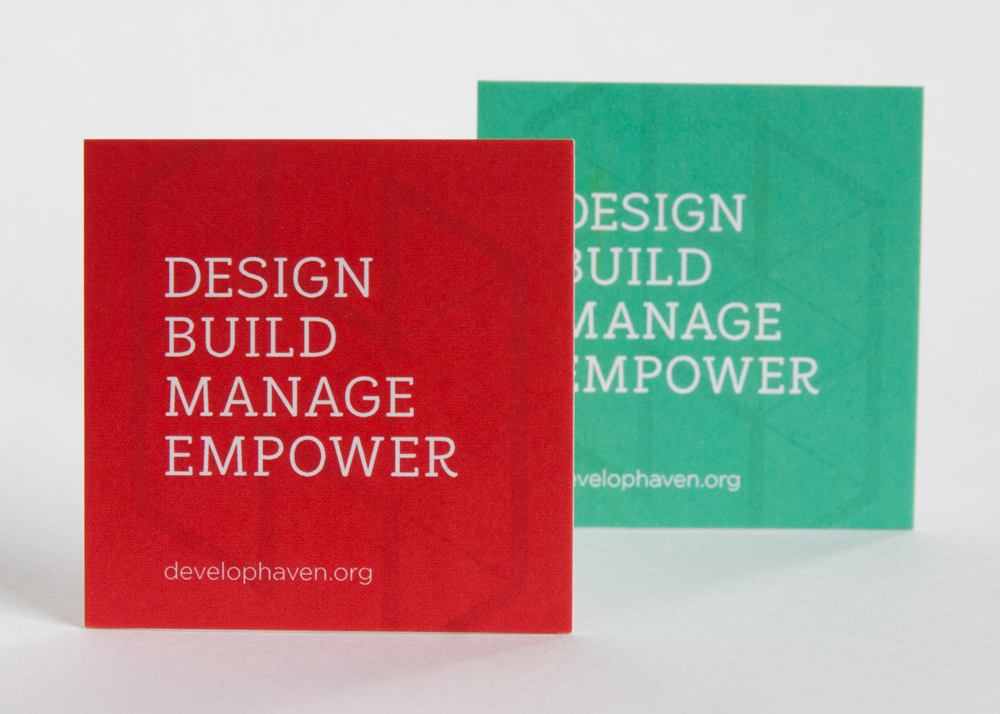
Location: Durham, NC
Cardholder: Zachary Sunderland
Designer: Emily Sunderland
About the business:
I (Zachary Sunderland) am the architect and general contractor. We started about a year and a half ago, and are based in Durham, North Carolina. We design and build affordable housing and real estate development projects, and we also do design/build for other clients. We have a full-time crew on the construction side, we have staff on the architect side, primarily doing housing all around The Triangle, Durham, Chapel Hill. We also do property management.
The last bit about Haven is empowerment, which is our catch-all term for special projects. We’re going to be doing that a lot. Durham is booming with real estate development, but we’re diving in where there are underserved populations. Our vision is to work our way to the point where everyone has decent affordable housing.
About the brand:
My wife is a freelance graphic designer, so we worked with her trying to establish the brand. We’re trying to have a broad approach to our projects, even though we’re in multiple different industries: construction design, real estate development and management. We’re working with investors, we’re working with municipalities to get approval and support, we’re interacting with the architecture students so we can interview them for hiring and appealing with our design sensibilities.
We’re trying to have a stable and formal business look across all of our industries, so when an investor looks they can be assured about our put-together brand, while also communicating a high sensibility for design. We’re also trying to communicate that our construction services have a high level of craft.
Our aesthetic is, as much as it can be, contemporary because we’re not going after classical architecture, but much more of the contemporary design and dipping into some modern design. Those are our criteria, so we pulled a lot of imegary from architecture that we wanted to reflect with our colors and our fonts.
My business partners are in finance and construction, and they were able to input more on those ends, and my wife as a graphic designer, she had a hand in what the logo would turn out to be, especially in our colors and typography
Translating the brand to a card:
We wanted a thick card, for the sense of durability due to paper weight. We went with square because the square stands out. It doesn’t fit in a pile of other cards. When someone picks up the whole pile of cards, and it sticks out an eighth of an inch, it might bother them, but at least it stands out.
[Another major card printing company] has square cards as well, but they’re just way too big. We didn’t like the inch and a half, it stood out too much, we just wanted it to be slightly bigger than a standard card. Pretty sure we did an inch and a quarter. That way it stands out, people get poked on the hand when they pick up the card.
The different colors of our cards represent the different companies. I’m primarily the person whose interacting with business development. Every card leads to our website which has all of our businesses described in one place. I’ll go to different events and want to communicate different aspects of our business. I’ll bring a different card based on what the emphasis is; I’ll bring my real estate development card if I think I’ll be interacting with people who are interested in that. Potentially I might end up giving someone both cards at one point, and they’ll get to see the branding is consistent.
How people are reacting:
Almost 100% of the time people comment on it. People look at it and say, “oh, that’s a cool card.” They definitely notice it… if everyone knows it’s at least their most unique card, that counts for something for our business.
3. Blueprint Collaborative
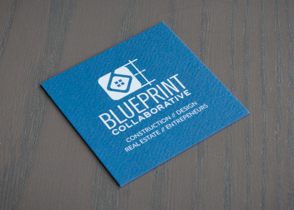
Location: Grand Rapids, Michigan
Cardholder: Brent Gibson
Designer: Germination Labs
About the business:
I’m a commercial construction professional. I worked at a big firm for 15+ years, and was a VP there in my later years. I realized the industry is very old, archaic, stuck in their ways. I’m always trying to find a better way, and I wanted to create a new way of approaching construction.
My company is Construction Simplified, it’s the next evolution of a construction services company. It’s a challenge in an old, established industry to be taken seriously. In order to market the company in a unique way, I started a side hustle called the Blueprint Collaborative. As an incubator and co-working space for professionals and entrepreneurs in the real estate industry, we provide a great way to collaborate with other people in the same line of work.
About the brand:
Our logo invites you to come in and become a part of something. There’s a collaborative nature. A blueprint is where most construction and design stuff starts; we’re rooted in that history. We’re also forward thiking in how we collaborate. That was a big influencing aspect in our development. One point of entry, a circle around four individuals. The logo encompasses four individuals, highlighting collaboration, with a point of entry, welcoming others to join the movement.
Translating the brand to a card:
The whole business card model is: I get a card, I get the information and I throw it away. Working with Germination Labs, we wanted to take that moment and turn it into a strong handshake opportunity.
Blue is our primary brand color, and such a strong part of our company name, so having the ability to have the custom color edges really allowed our brand to stand out. We are proud to hand these out to anyone and everyone we meet!
You only have one chance to make a massive dent in somebody’s memory of who you are. The card does that for us, especially from THikit. The squareness of it, the texture, the logo just pops. It just wins people over and helps them remember you.
These cards help to set us apart, and are well worth the investment!
How people are reacting:
9/10 times, people take their time feeling the texture, flipping it over, looking at the colors on the side. People say, “where did you get this, I’ve never seen a square card,” and they always try peeling it apart which is hilarious. It’s a strong first impression that says we’re a quality company, and that we think about the smallest things, the details that matter.
4. Lobro
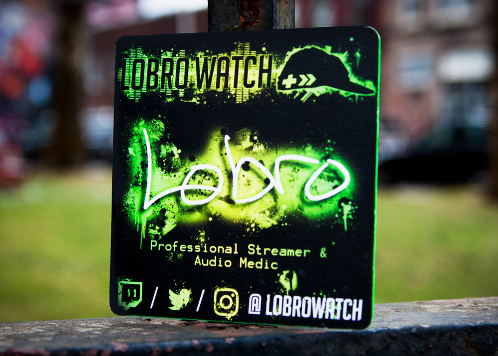
Location: Arizona
Cardholder: Lobro
Designer: Max Williams
About the business:
For the last nine months, I’ve been streaming video games online. I consider myself someone who spreads a lot of positivity. Typically I’ll play games like Dead Cells, Dead by Daylight or Celeste while I’m interacting and communicating with my community.
I have two other jobs on top of this. I typically stream at least four days a week: Mondays, Wednesday night, Thursday and Saturday.
About the brand:
I was inspired by Lucio from Overwatch. He’s my favorite character from any game, and he’s also super positive and upbeat. A lot of my aesthetic was inspired by the 80s as well. I love good, upbeat 80s music, and my designer took that and ran with it.
Translating the brand to a card:
I don’t do anything half-assed, so I wanted something nice. I knew I wanted to be different, I didn’t want it to be the same as everyone else, to be thrown away and ignored. I decided that if I’m buying business cards, I’m going to get something that won’t fit in a typical wallet. It won’t end up where everyone else’s card ends up. I chose THikit because the cards looked super high quality and I could tell that from the photos.
How people are reacting:
Every single people at conventions has been like, “whoa.” I made an impression on every single person I met at TwitchCon. A lot of those people ended up following me and contacting me later. It was unreal, it was a really good number.
I do send it to my diehard fans. My fans who are like, how can I help you, I send them some business cards to hand out, if they want to help evangelize. If they want to share my brand with people, I’m fine with sending them ten bucks of business cards, that’s fine. Because of those business cards, a family happened to find out that their kids are watching the stream, and their parents started watching me, they all bought my shirts!
5. Olivia Perillo
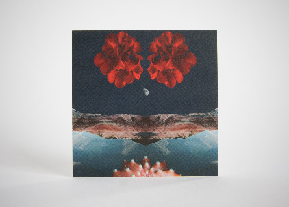
Location: Lafayette, Louisiana
About the person:
I am a photographer and artist located in South Louisiana. I’ve been photographing since 2010 with an attention towards botany, landscapes and most currently intimate portraits of artists. I’m known in my city for my sensitivity in capturing the desert during my many journeys out west and I began a retail brand, Indigo Light Studio, in 2016. Through my small business, I’m able to broaden the spectrum of my work while reaching many with my photography, collages, and designs.
About the brand:
Indigo Light Studio is a brand that fuses the American Southwest with a contemporary perspective. It creates a bridge between places with photography, drawings and jewelry design. All products are attentive to the spiritual and natural elements of plants, places, and people, allowing others to connect with the earth around them that is often overlooked or taken for granted. Indigo Light Studio offers a window into a world that is alive, and inspires those to be here now.
Translating the brand to a card:
I chose a square composition to better encompass my use of symmetry in design. A square layout has a contemporary feel in reference to a calling card, and is enticing to individuals as a smaller, more intimate card. The image on the back translates as a mini art print and the front remains very minimal in design while still communicating my information effectively.
How people are reacting:
People see them at markets so artfully done that they become surprised that it’s my business card, and free to take. They often ask to take more than one if I have a couple of designs out.
6. The Foundation for Tomorrow
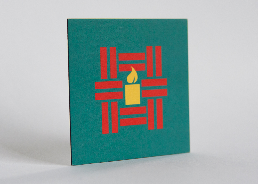
Location: Charlotte, North Carolina
Designer: Tuttle Design Studios (Peggy K. Tuttle) / Meghann Gunderman Seahorn
About the organization:
We are an access to education-based organization. We really focus from a standpoint of supporting students and teachers in the educational system in Tanzania. We began when our Executive Director and founder went to Tanzania and met these triplets who were not able to get the schooling they deserved and needed.
This first interaction led to something much bigger over the last 12 years. It’s turned into supporting a hundred scholars, and supporting the leadership of hundreds of teachers, and helping the kids thrive both emotionally and in the classroom. It includes the whole child: their academic performance, counseling, youth camps and other opportunities within their community.
About the brand:
We are looking to showcase that we are truly about the power that education can have. We want to show that we’re not just a sponsorship program, or just paying for kids to go to school, but we’re about whole child development, educator development, and empowering others. Our goal is to look at the whole person we’re looking at, and their future. We’re trying to show that in our intertwining brand and logos.
Translating the brand to a card:
The reason we like the square business cards is that our logo is a little square. It’s square and similar to the card size, so we really liked it from that standpoint. Knowing how to connect with us on social media was important, knowing to get in contact with us. We had gone through a couple of things of should we include our phone numbers, how much writing should be on there, etc. We realized simple was better.
How people are reacting:
We’re getting really positive reactions.
It just fits us better as an organization. It’s not just a sales pitch, it’s an organization doing impactful work, and to have something stand out in this way was really cool, especially the back. With the back being so unique it makes a different impression that just a regular business card.
THikit is a family-owned company of print specialists, artisans, problem solvers and creative professionals with a sharp focus on offering top quality 4-color printing on a wide variety of extra-thick paper stocks. Curious about what we can do? Request a free sample kit today.