One of the biggest joys of specializing in printing for creative professionals is showing designers what some of the high-end possibilities of printing can be. We get it; designers are in an increasingly competitive and fast-paced world, and don’t always have time to look at every single possible option that is available. Hidden in those options is that last extra push that can elevate work to new levels and get “wow” reactions from clients.
In this blog post, we’re sharing options, tricks and general tips that can help your business card and wedding invitation designs shine, and interviewed five designers who shed some light on the subject.
Note: Many of the designers reference our free sample kit, which you should definitely take advantage of to see the possibilities of thick printing!
 1. Kimberly Winters – I live in Philadelphia, went to Penn State for my undergrad, and I’m a grad student at Savannah College of Art and Design. I started doing this in high school, and I realized I was kind of good at this, so I majored in it and fell in love with it. I’ve had multiple internships with branding agencies and worked in New York for a year and a half after college. I was doing projects for Mastercard and Jameson and the Olympics. When I decided to pursue my Master’s degree and resign from my job, I started freelancing.
 2. Sydney Newsom – I’ve been designing and freelancing for about eight years. I’ve done a lot of brand identity projects in the last five years. Books, catalogs, annual reports, things like that. I’m in Birmingham, Alabama, and have a space at Make Birmingham, which is mostly used by makers. There’s a woodworking shop, a ceramics shop, a wood studio and architects. It’s mainly me, but I have other people I collaborate with who help me with social media for clients and things like that.

3. Colleen Kranz – I studied graphic design in college, finally landing as an art director at a promotional brand marketing agency, followed by a couple years at a package design firm. I evolved into doing invitations for weddings and events for friends in my spare time. That eventually lead to opening a stationery shop with a with a partner in Greenwich, Connecticut – where I designed invitations for about seven years. We focused on high-end custom work. Four years ago, I split away from the retail end of things, to shift focus on creating my own design studio. I’ve maintained my Greenwich and Manhattan clients & it’s going well!
 4. Megan Dusenberry – Back in high school, I developed a love for art in general. I had my art teacher help me… he gave me good insights about the design world. I ended up picking the Art Institute of Pittsburgh, and went and got my bachelor’s degree in graphic design. I moved to Baltimore with my boyfriend, so now I’m doing freelance pretty much full-time, but still looking for a design position.
 5. Ryan Lewis – I’ve just been naturally inclined to drawing and creativity and imagination. I ended up pursuing graphic design over mathematics in college, and took to it really well. Design was the perfect thing for me, it really clicked. I graduated from College of New Jersey, and started right away pursuing my own freelance. I worked as a contractor for some bigger companies and agencies before doing my own thing taking on my own clients and getting really networked with people across the world. I really love branding, and I pursue complete redesigns and branding projects.
1. Consider Thicker Business Cards
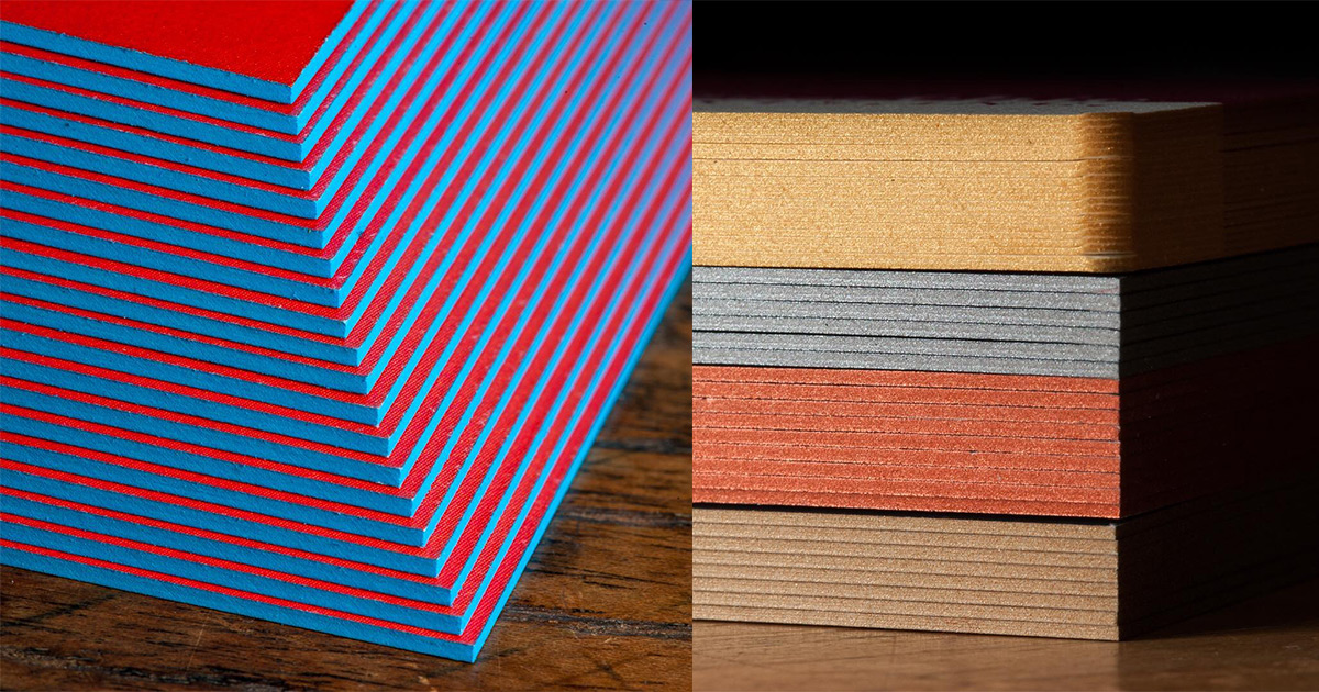
Kimberly: The thickness of the card can be the first thing that stands out on a design. Every single person I’ve ever given my business card to has commented on the weight of it, and been like, “This feels so awesome, this is so professional.” It’s a rewarding feeling; I wanted my business cards to have an impact on people. It makes it a lot more memorable. You can feel an obvious difference when you’re holding the business card in your hand. It adds a lot of value to the card.
Colleen: I normally use THikit’s extra thick cards, which definitely give a higher quality look and feel. You always get that wow factor, when you hand something to someone that actually feels like something substantial. It’s not that bendy sheet of cover that tends to be the norm.
Megan: Everyone was very impressed with a recent thick business card that I designed, and how it stood out from the rest of the cards they had. Thin cards just don’t stand out anymore.
Sydney: Occasionally I’ll have a client who wants their clients to be able to put the business card in their wallet. If that is the thing, sometimes they want a lighter weight paper. But it doesn’t seem to come up too much anymore.
Ryan: The reason for thick cards for me are for perceived value. For me, unless the delicacy of a thin card is part of your appeal, I generally associate more value with a more substantial card stock. Thick business cards give that first impression of weight and thickness. They’re also super durable, because the cards have to make it home so people can follow up.
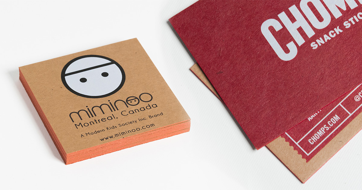
2. Add Edge Color

Kimberly: The last time I printed with THikit, I used bronze trim on my card. When I opened up the box when the cards got delivered to me, I knew right away that it was a good decision to make. The edge color makes my card stand out from every angle.
Ryan: I loved the first time I saw a painted or pressed edge. Again, it’s the richness or value thing. It’s cool because you see someone’s attention to detail with that.
3. Don’t Be Afraid to Use Color
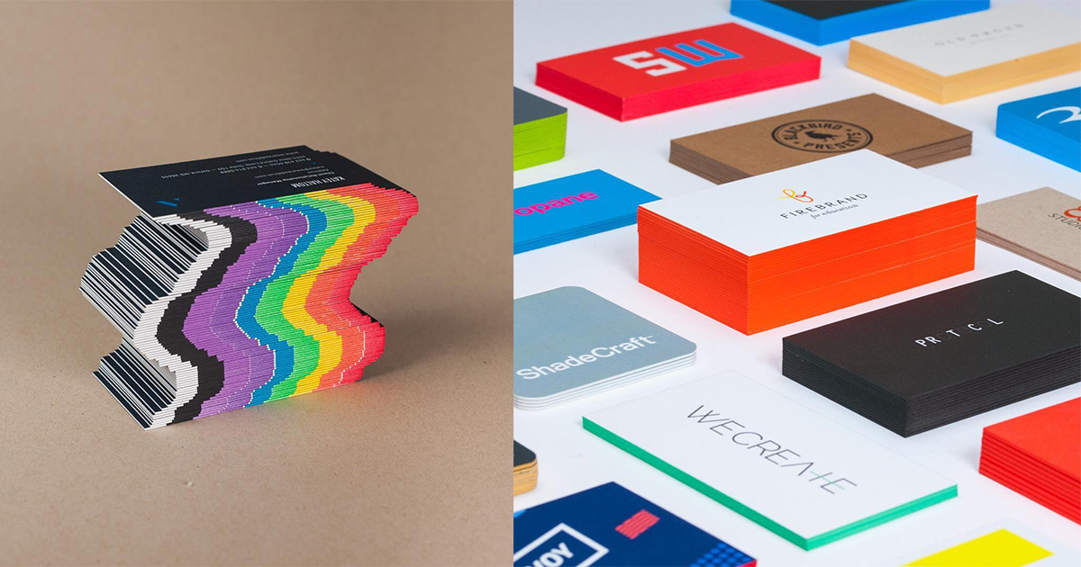
Kimberly: I think that it’s really important that a business card represents your brand. Obviously I started with a logo for myself before designing a business card. You want something recognizable that people will be able to remember. I took the letter forms that make up my initials and deconstructed them so they’re legible. I complemented that with a color scheme that reflects my personality. People sometimes get trapped in the mindset that a card has to be black and white or super clean. I don’t have a very black and white personality, so why would I use that to represent myself?
Ryan: For certain clients I’d go cleaner than I do for myself, but as a brand artist, I want to have some more flash or pizzazz for mine. I incorporate more color on my cards than I would for a client. It really depends on the nature of the business. If it’s a lawyer or a doctor, you want it to be really clean and professional. But a tattoo artist or a brand designer or a muralist, you want to really feel their flavor or style, which can be important for that service or profession.
4. Find the Right Paper Texture
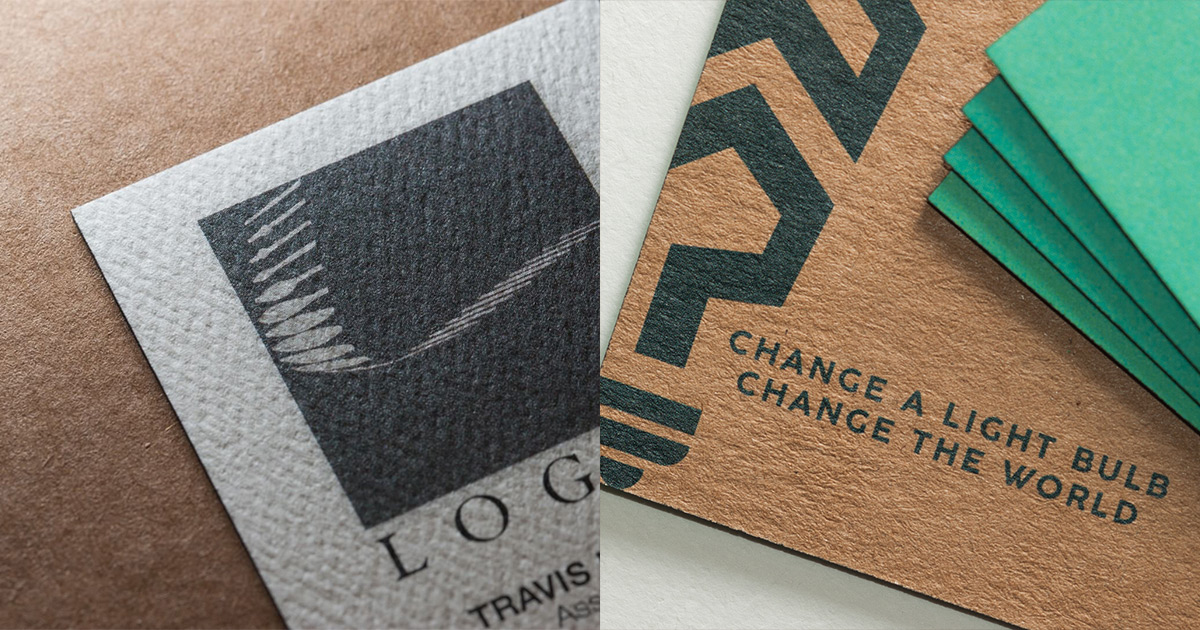
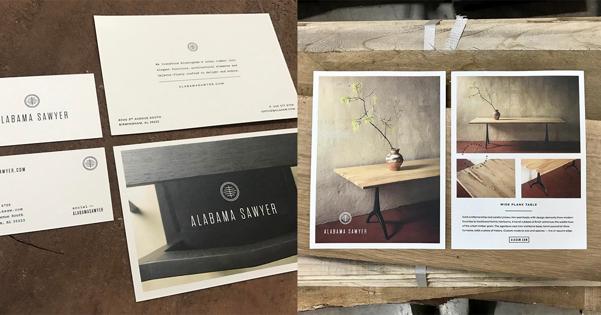
Sydney: Paper is something important to consider. With THikit, you have such a broad range of papers. One of my clients is Alabama Sawyer; all of all of their furniture comes from salvaged trees that have fallen down around the community. The environment comes into play there, so we were able to use Neenah’s recycled paper as an option that tied in really well.
Colleen: Instead of printing on the ‘expected’ smooth white stock, THikit offers more options – – printing on a metallic shimmer paper gives more life and dimension when printing a photo on a card. Printing on a textured felt paper elevates the look and gives great tactile feel. I’ve had a lot of good luck with the linen papers they offer as well — my clients are always looking for something ‘different’.
Ryan: It’s a subtlety of the design process; I can see me as a designer for varying clients making use of a broad range of textures depending on the feel we’re going for.
5. Meet in Person With Samples and Examples

Sydney: I meet with new clients with a sample kit and some finished examples of things I’ve done, including work that is also letter-pressed or embossed. People tend to like flipping through something with a wide range of the edge colors and different weights and thicknesses. There’s everything from clean and simple cards to fun and more playful kinds, and my clients love seeing those samples. They actually put their hand on those samples, so it’s good for them to have access to it.
Megan: I’ll show them what’s out there, and I’ll show them the cards that I’ve done in the past. I’ll have them look through all the cards I design, and if they like something, I can tell them how we’re going to accomplish it. We go through the paper types, square, shapes, big or small. We sit there and feel the paper, and I’ll provide them with some feedback; i.e., you should go with a rounded business card because your brand is more soft.
6. Don’t Make the Font too Big
Megan: Whenever people do business cards, sometimes people want to load up a lot of information, or make the font really big. I really want to help my clients avoid that, because smaller text, less text, is more eye-catching, it’s not cluttered, and it lets the paper type stand out in a random conversation. They can remember that card because it’s so thick and has a nice texture to it, because it’ll stand out from the rest of them.
Sydney: I tend to want the print size to be really small, just a designer thing, but sometimes the client wants it to a little more readable, so it’s finding that balance between being guaranteed to be able read it but small enough to still look good. Sometimes you want to make the type really large. I’ll print off previews of the cards over and over until it’s just right. If you don’t, you may get the cards in and say “oh, I really wish that i made the name a little bit larger or a little bit smaller.”
7. White Ink on Kraft Paper
This is a new offering for us; we are now offering white ink on kraft paper! Simply select White Ink + on your order as an option during checkout.
Closing Thoughts
Colleen: Building trust is really important. I’ve been lucky enough to have clients who trust me for whatever their needs are. If I have good reasoning of what my thoughts are (on a unique printing option), they’re going to go with it. Thikit does a great job, and holds my trust and confidence in printing – – so I always feel comfortable sending my jobs their way.
Kimberly: I showed a non-profit my THikit business cards and how much I paid for them, and their jaws dropped. I said yeah, really good quality doesn’t cost that much more than regular business cards. It’s really important that the business card makes an impression from the moment you hand it to someone.
Sydney: We have a furniture client where their offerings and products are changing rapidly. Instead of doing a catalog, we did cards. 6 x 8 cards. They clip together, they can add to the cards, and they can take away as they have new products that they add to the line. It’s a catalog of items that they can show to interior designers and architects.
Megan: That little card can make you stand out in the long run. Business cards are still very very relevant. Even though people are getting away from print, you see cards being used everywhere.
Ryan: What’s cool about THikit is the number of options and versatility and what they’ll offer. They have all of the base options, corner shape, paper stock and quality and color, double-sided printing, painted edge, but they work beyond those things and do custom jobs. They’re open to everything. To designers, I’d say, since these resources are available like THikit, don’t get locked into “your thing.” I only work with round colors, or linen papers. Realize that if you’re working with a broad range of clients, all of these things can have their place and use, because everybody’s job and brand is way different. Tailor it more to the client than to your own personal flavor sometimes.