Business cards don’t have to be just another expense; by exploring creative possibilities in design and craftsmanship, you can actually make them into a powerful real-life extension of your brand. Providing a tactile, real-life experience can help you stand out in a crowd.
As print specialists who produce lots of unique business cards on super thick paper stock, we’ve had the pleasure of seeing thousands upon thousands of creative designs come through our shop. Today, we’re featuring 12 of them which feature bold, typographic designs; and talked to the designers and business owners who ordered them.
1. Signature Creative
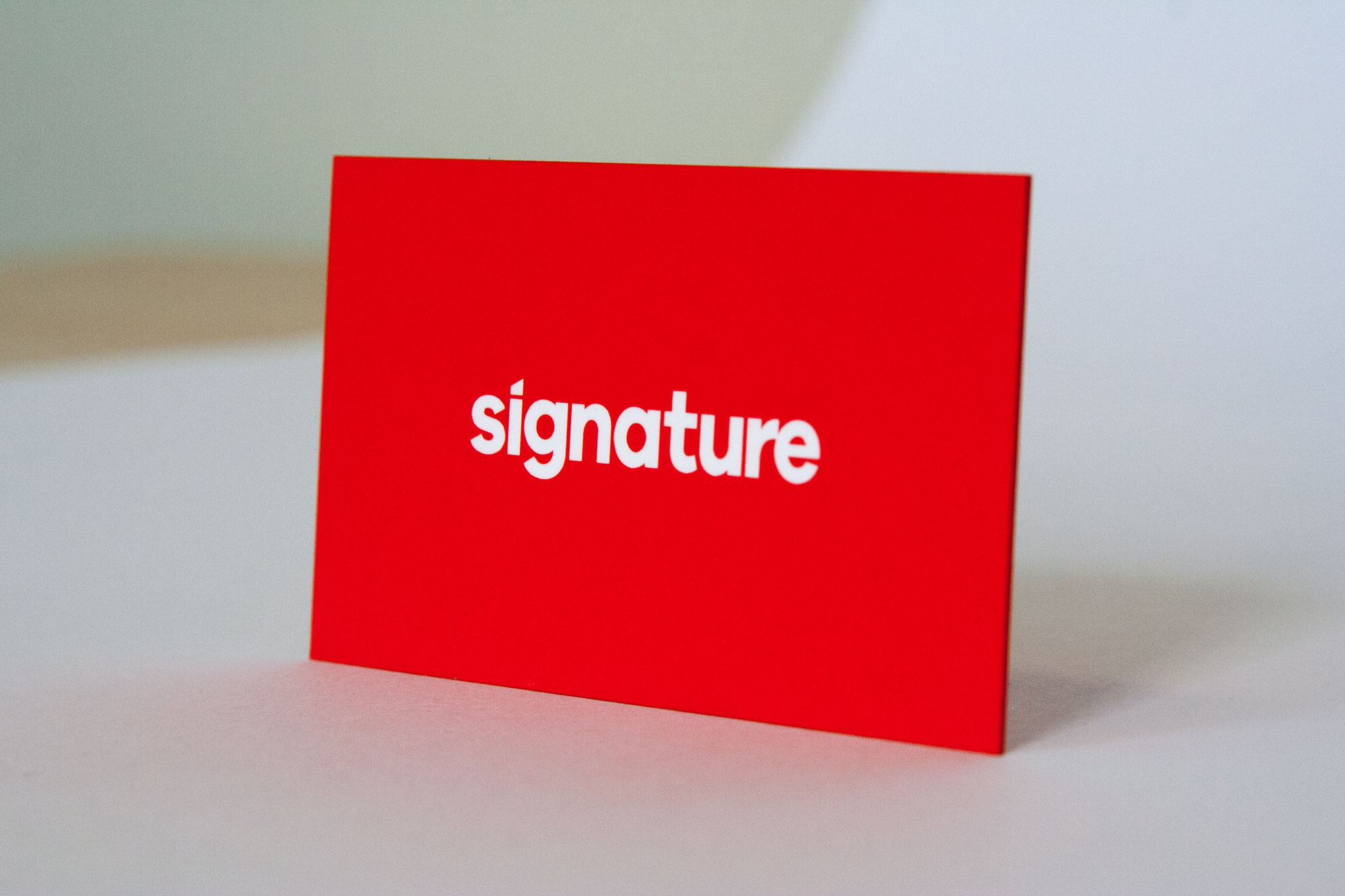
Cardholder: John Gheur, President of Signature Creative (interviewed)
Designer: Antje Zelli, Art Director of Signature Creative
About the business:
Born in 2004 as a digital innovation agency helping brands and customers figure out what to do with online, tech, apps and the likes. Since then we’ve worked with clients ranging from the MTV, Disney, Mattel, Sony, Pepsico, SalesForce, Qualcomm, United Health to tech startups. Our specialty is humanizing technology, launching products with delightful customer experiences, strategy and ground breaking innovations.
What’s being communicated:
Fundamentally, we wanted to communicate our physical presence to speak to the level of craftsmanship and top-tier services that we provide in a digital and technology landscape.
Translating to a card:
It literally took years to find a card that communicated that. I was always looking for business cards to have a sense of presence, quality and weight… the sense of touch needed to be hyper-refined and seductive. Thikit kind of fell into our lap, sort of 🙂 via Facebook, and we were keen on pursuing the samples.
How people like them:
Every time I hand a card out, I get incredible compliments and memorable feedback.
2. Melea Designs
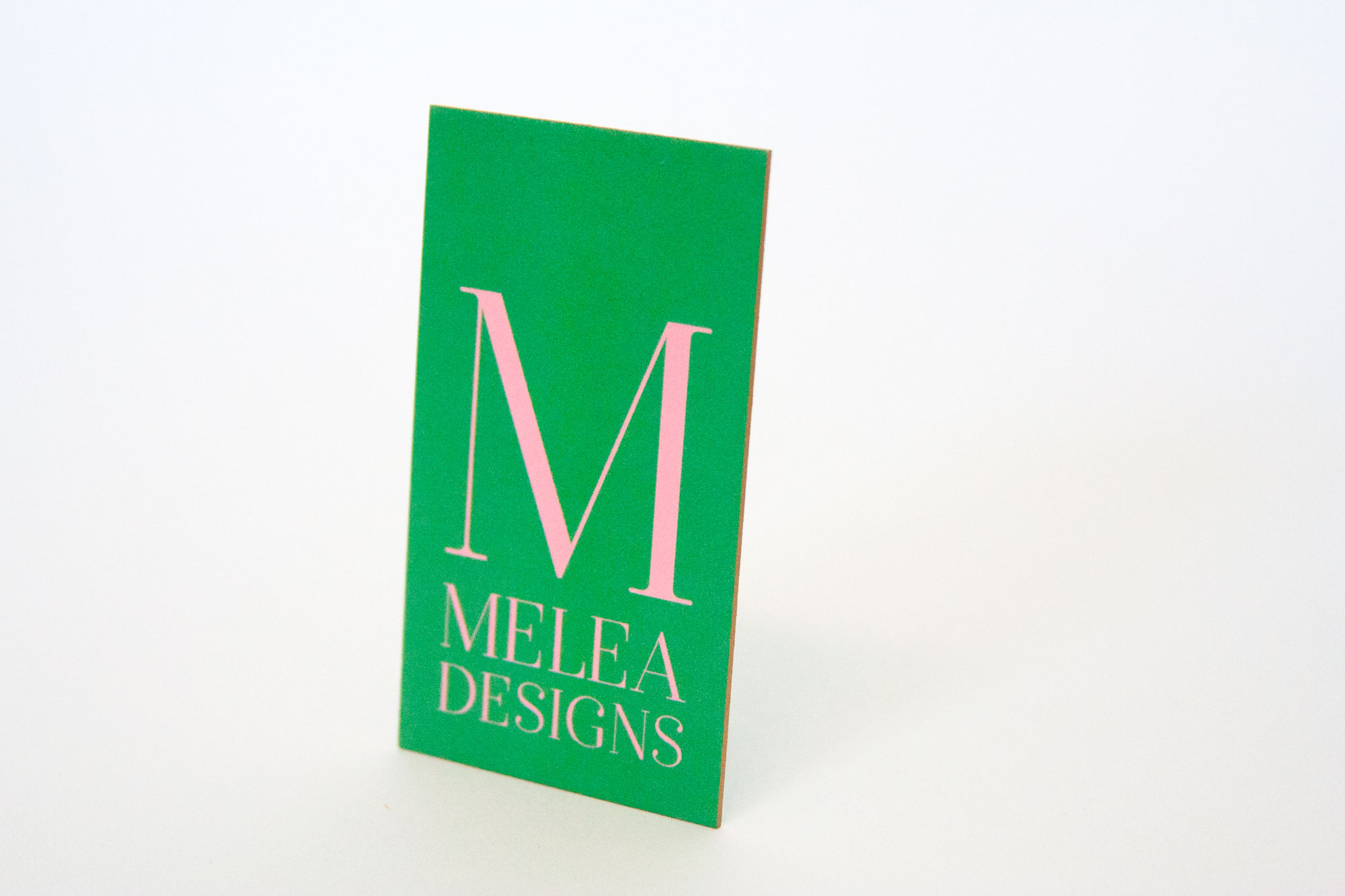
Cardholder: Melissa Sylvester, Interior Designer at Melea Designs
Designer: Kristina Petrilli, Owner, Teal Door Stationery
About the Business:
Kristina: Melissa is a friend of mine who came to me to ask to design a logo and branding for her interior design business, Melea Designs.
About the Designer:
Kristina: I graduated from the University of Rhode Island with a BFA in 2007. I work full-time in higher education marketing and have a graphic design freelance business where I work with a small number of clients. My work ranges from branding for small businesses to invitations and paper details for weddings and events.
What is being communicated:
Melissa: My branding colors are inspired by my visit to Monet’s garden- pink and green, but I also wanted a hint of vintage Palm Beach gold metallic mixed with it.
Kristina: She loves the Parisian aesthetic.
Finding that in card:
Kristina: Melissa originally wanted a gold foil embossed M for Melea Designs; I suggested tdhat instead, we incorporate a gold edge to go with the green and the Parisian pink on the card. I had recently printed my sister in law’s wedding invitation suite with Thikit, which had the same gold edging to it that this card has. This card was printed on 45 pt. Fluorescent Cranes Lettra and Melissa loved the feel of it. The tooth of the paper helped to achieve the right textured green that she was looking for.
How people like them:
Melissa: So far, everyone has absolutely loved my cards. They are an impressive first impression to potential clients!
3. Hello Poolside

Cardholder: Jayson Miller, Co-Founder, Hello Poolside
Designer: Rachel Rodriguez, Co-Founder, Market Creative Agency
About the business:
Jayson: My wife and I lived in Hawaii for a number of years, and we both grew up in the Southeast. We moved back to Florida, and the impetus for the business was to bring back a little bit of what we loved about being in Hawaii, to bring back products that would remind us and others of times that they had there. Our focus is on beach, bath and home goods, and our launch line will be a set of Turkish towels.
About the designer:
Rachel: My husband and I started Creative Pile in 2011; we are now Market Creative Agency, a full-service creative agency in Cave Creek, Arizona.
What is being communicated:
Jayson: We really wanted a simple, and elegant refined beach aesthetic. Something that was minimalist, kind of clean, and clear, but also elevated the brand from being a day-to-day value-oriented brand. That drove us to the brand decisions we made: we chose a color palette that was a bit sophisticated, kind of a deeper blue. With the logo, we’re blending that sophisticated color palette with something a little more novel. It implies a certain level of accessibility, but it’s still unique and nice.
Rachel: When they explained their brand to us, they told us that they want people to find a little luxury in everyday things that they do.
Finding that in card:
Jayson: We wanted the card to be not too over the top (because that contrasts with accessibility), but we also wanted a premium look and feel to capture that luxury component. The thicker business cards with metallic silver edges helped us find that unique middle point: distinctive, unique and being a more quality brand.
Rachel: We wanted something that would make people say, “wow, this is a cool card!” It starts a conversation and shows the quality. Our existing printer didn’t have anything higher than 15 point cardstock, so we ordered a sample pack from Thikit. We printed our own business cards on them too, and wanted to get a feel for the quality and get the feedback from our own clients handing them out.
How people like them:
Rachel: We printed our own business cards on Thikit, and I always get a “wow” because of the thickness and quality.
4. Death Wish Coffee
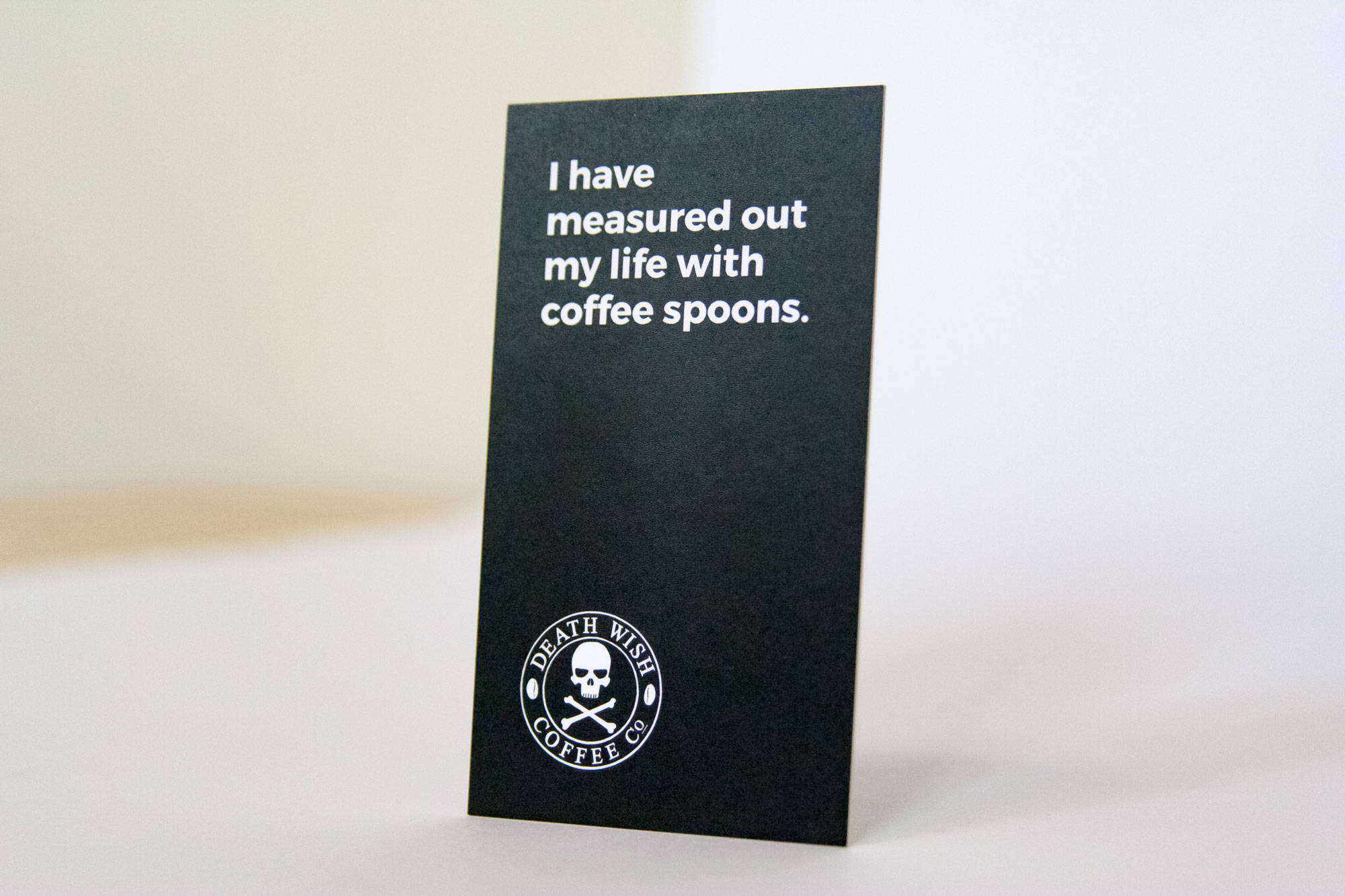
Designer/Cardholder: Thomas Dragonette, Art Director, Death Wish Coffee
About the Business:
Death Wish was started by a coffeeshop owner named Mike Brown… he had a little shop in Saratoga Springs, NY. He wanted to supplement the income from the coffee shop, and a ton of his customers were requesting stronger coffee. He wasn’t sure if they meant by flavor or caffeine content, but he did some research and found there wasn’t a stronger coffee in either category. He came up with this formula that tasted really good that also gives you an extra boost in the morning. It’s been growing rapidly as a startup.
About the Designer:
Death Wish had been featured on Good Morning America in 2012, and then in 2015 they won a Super Bowl ad contest. It was like winning the lottery, like $6M was being handed to us. But a lot of branding decisions hadn’t been made yet, so I came onboard almost two years ago as a designer, and started working on our overall brand identity, sculpting everything into what it is now, from product design to photography.”
What is being communicated:
When you look at any coffee shelf in any grocery store, it’s like a barf of colors. There’s a million different logos and fonts. Just colors everywhere. Some boxes have 20 different colors on them. We are the complete opposite. A black hole, absent of color, drawing your eye in; the blackest of coffee. We are bold, strong and simple, with one ingredient: just coffee.
Translating that into a card:
First, there are the quotes on the front. We had a lot of success with doing these exact sort of things on our Facebook page: meme-style, coffee and funny quotes, coffee quotes that were kind of dark. I thought, let’s just take those small little tidbits to show who we are as a brand, it’s almost like a fortune cookie but about coffee.
Technically we have an edge color of white. By making the card black, we got to have edge color without paying for it. The thickness of the card was also important. We didn’t want a weak, flimsy little card. If we’re going to represent ourselves as the world’s strongest coffee, the card has to reflect that.
How people like them:
99% of people get it. A lot of people say they save them or put them their desk. The quote can relate to anyone, it doesn’t necessarily relate to the person on the back of the card. Mine says “let’s just not talk until we’ve both had our coffee.” I’ll meet people at events, and they’re like “Oh man, that’s so true.” It’s a conversation starter.
5 & 6. Redwood West/Forty4 Concierge Service
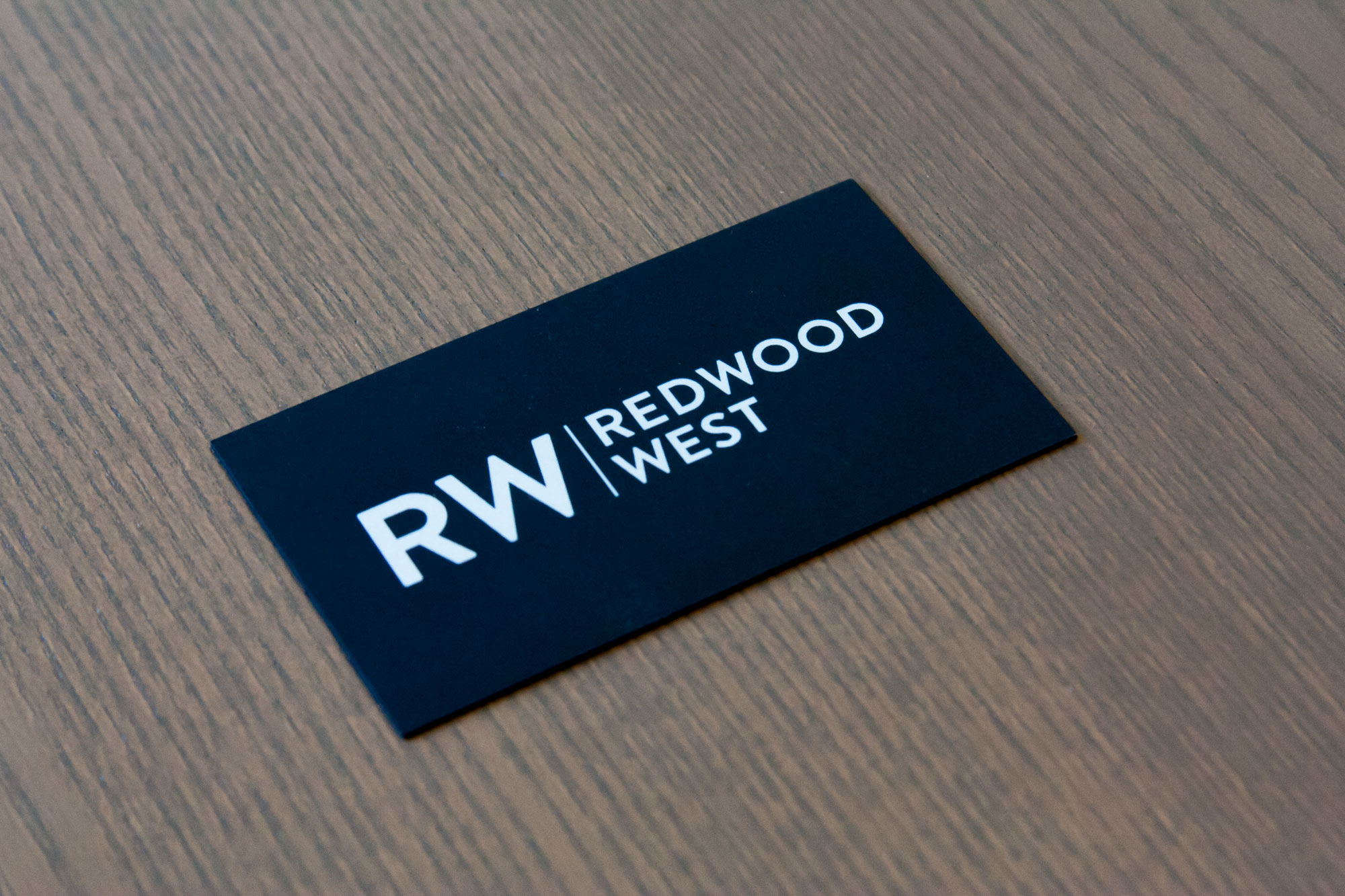
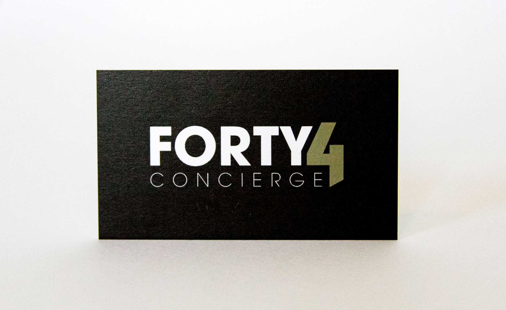
Designer: Mickey Kyle, Owner, Kyle Creations Inc. (interviewed)
About the Designer:
I’ve run Kyle Creations for almost 20 years now. Basically, we do a lot of small business branding (with some big businesses too), and digital marketing and consulting.
About the Businesses:
Redwood West is a commercial real estate company located in Newport Beach. They deal with a lot of high-end commercial properties and clients.
Forty4 Concierge is a premiere concierge service for professional athletes. They mostly they work with NHL hockey players, but are expanding it to all professional sports markets. They deal with very high end vendors for their clients that live these busy professional sports lifestyles. They want to build a profile where they can market to players who have families and children. Their product line is to help people manage their lifestyle basically.
What is being communicated:
For Redwood West, they wanted to be bold and minimalist. They wanted to use black and white as their colors, simple and clean with a lot of negative space. In their business,they have a lot of competition, so they have to kind of stand out, but also put across an image of professionalism and expertise.
For Forty4, they wanted a very minimalist look but wanted to also stand out as basically the service they’re offering.
Translating into a card:
The back of Redwood West’s card is a white logo on solid black. They went with a black colored edge to match it. sitting on a desk or a table it makes a bold statement for them. but also clean and basic.
Forty4 went with a gold and black color to represent the high-end theme, and wanted to keep it as clean as possible. There’s not a lot of extra design flourishes or anything like that.
We went thick with the cards to help them really stand out.
How people like them:
When either card gets handed to clients, they always get a reaction because of the quality and thickness of the paper.
7. Perry Maughmer
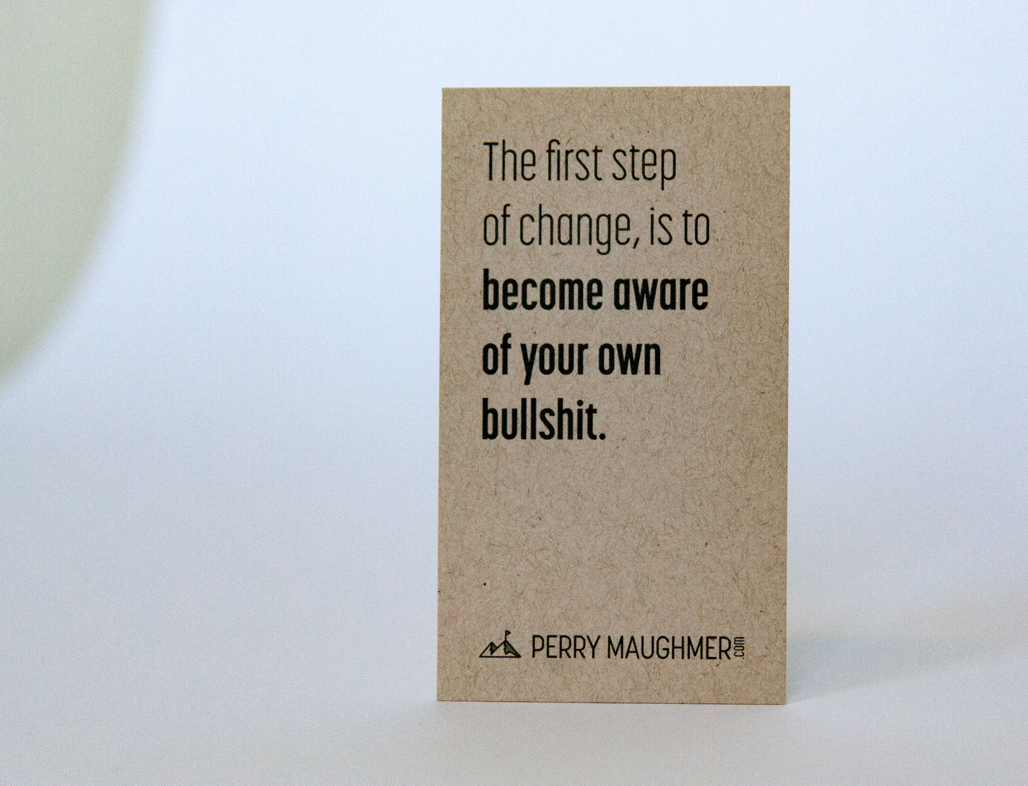
Cardholder: Perry Maughmer, Vistage Chair (interviewed)
Designer: Ryan Magada, Owner, Brave Little Beast
About the Business:
I’m a consultant; one of my things is that i’m a Vistage Chair. I put together groups of CEOs and business owners who meet monthly, and I also do 1 on 1 coaching with them.
What is being communicated:
In my line of work, I want to get to “no” very quickly with new people. I want people to decide either “yes I want to talk to you,” or “no, I don’t want to talk to you.” When I show up to meet with clients, I’m wearing shorts, flip flops, I have tattoos and a beard. I am who I am, not trying to fool anyone on the front end. I expect the same from them: if we’re going to get real work done, I want them to be real and authentic.
Translating into a card:
I wanted something that would speak to who I am. I guess you could call it utilitarian: low-key, functional, not really flashy. The texture almost feels like cardboard, it’s not the fancy type of thick card. I wanted to do something simple and conveyed that I’m not fancy or trying to impress anyone. I describe that I’m passionate, relentless and heretical; this card is relentless. It ain’t going to bend. You’re going to have to throw it away if you don’t want it. You put it into your pocket and it’ll come out the same way.
How people respond to the card:
This card gets a lot of smiles. I just did a speaking engagement with financial planners and bankers here in Columbus, Ohio. I walked into the planning meeting and they’re all there in suits and ties. I’m there in shorts, I threw my card down on the table, and you should’ve seen the number of smiles I got from people, it just instantly relaxes them. People come up to me at speaking engagements and tell me “I have to get one of those ‘bullshit’ cards!”
8. Escality
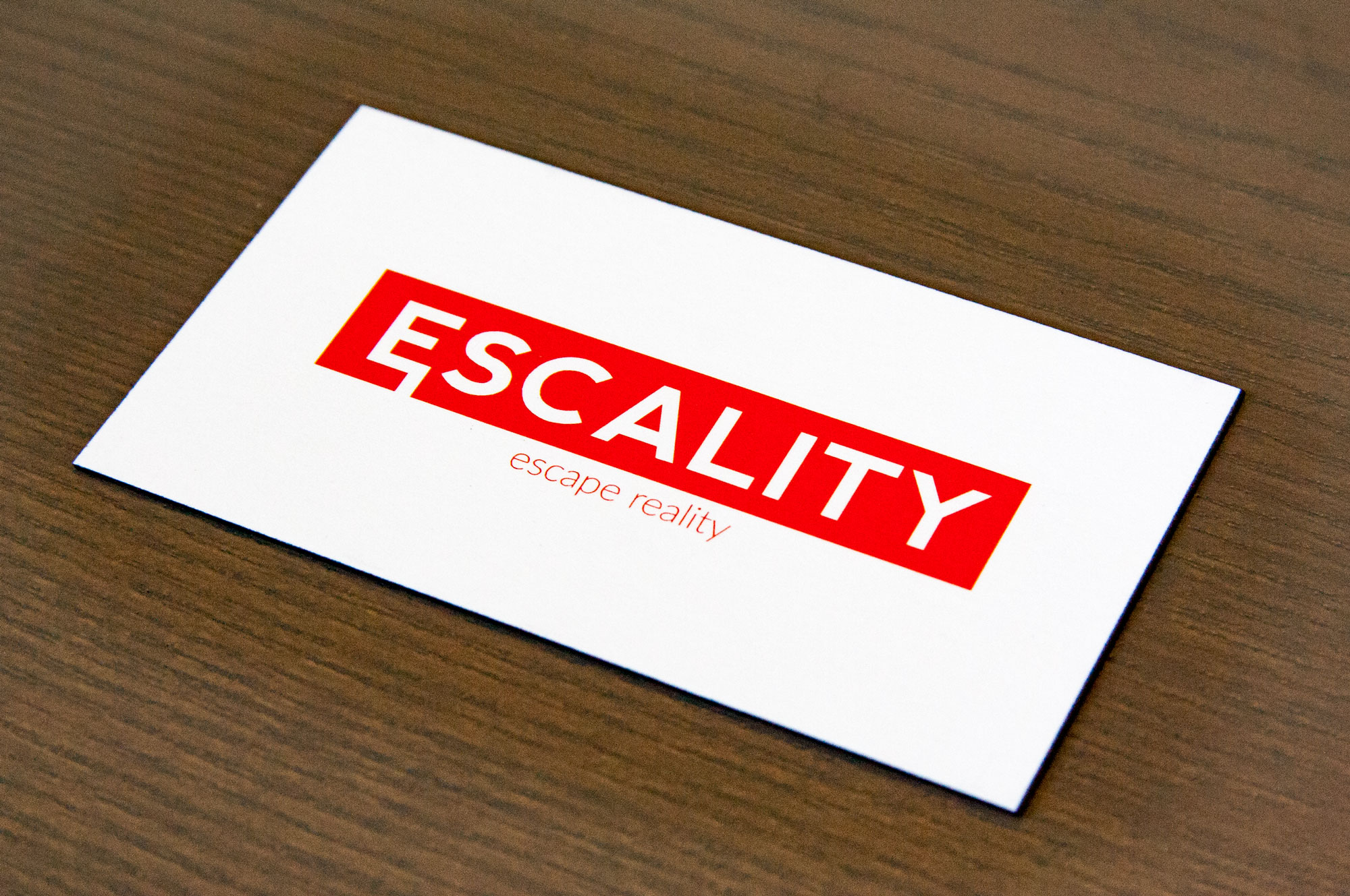
Designer/Cardholder: Kay Niu, Designer, Escality Games
About the designer:
Right now I’m a student at UCLA. I started graphic designing in high school. I’ve always liked the fine arts, but I decided I wanted to do something with computers. In my 2nd year of high school, I decided to learn some stuff with Adobe Creative Suite. Went from there, practiced a lot, applied to UCLA and got into their design and media program. Right now I’m in my 3rd year here.
About the company:
A couple friends and I were in UCLA Archery, and they were all computer science majors. We decided we wanted to make a game over the summer, and it sort of turned out to be a business.
It’s still in development, but we’re making virtual reality experiences; our current game is escape room stuff. You’re trapped in a room, you have to solve some puzzles to get out. We’re working on a few other projects.
The brand message:
I came up with the name and branded Escality Games. Escality means to escape reality. Our logo is based on an Exit sign… we put our name on it, added a small little graphic element under the E, to convey the escape happening. We get a lot of people actually wanting t-shirts, even though they don’t know us as a company.
Translating into a card:
I wanted to capitalize on our logo, which is why the front is just the logo. We got a lot of feedback that people liked the logo. I didn’t want to make the front too busy with anything else. I was taught by a friend and a mentor to keep it simple.
With the back, it’s basically an information hierarchy, what the company does. I made it red because our company’s color is red, and made the connection that we do VR immersive experiences. The name of the person is bolded for visibility, so it sets it apart from the rest of the information. The red line is basically the logo collapsed into the line. I needed a simple divider and I went with that.
Since we’re just a startup, we didn’t have much money to get them printed. But I made it clear to the team that we needed something that would stand out since we’re new and trying to get into the industry. I went to an event called VRLA a couple of months ago. We collected a bunch of business cards there, and I decided to give them to a few people and rank them. A lot of people would concentrate on how thick the card was. I decided to make our card a little thicker, not enough to break our bank, but something to set us apart from typical 11 point card stock.
How people react:
People say it’s really nice and thick, that it’s clean and professional. All really good feedback. I think I had a few people ask me to make theirs.
9. Casa De Pedro
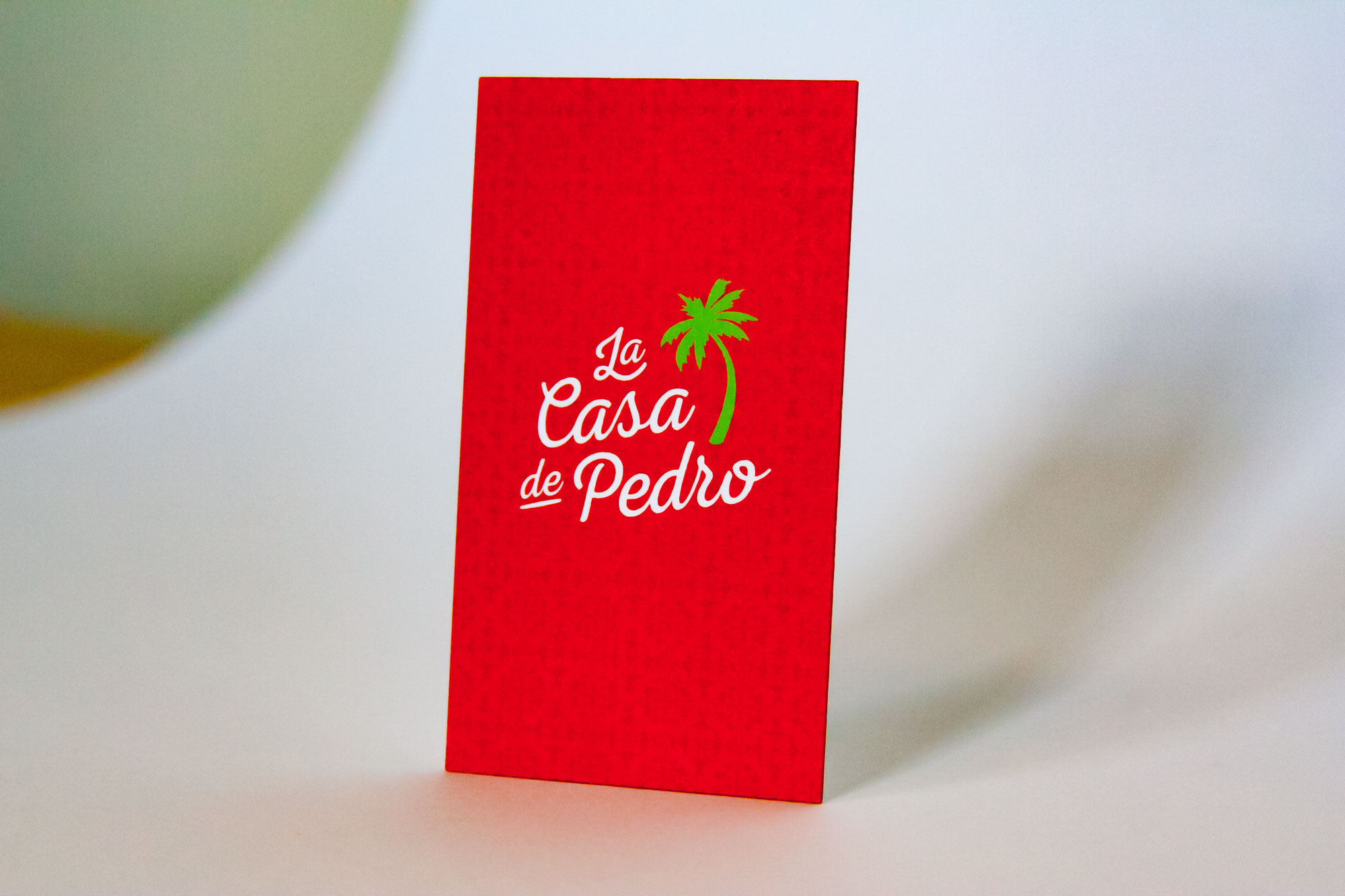
Designer: Taylor Luffman, Senior Designer, Marquis
Cardholder: Jason Ouellette, Bar Manager, La Casa de Pedro
About the designer:
I’m the Senior Designer at Marquis, and I’ve been here six years. I came from Nashville, which is where I’m from originally. I was working in advertising, but decided I wasn’t really interested in it. I was looking for a change and ended up here in Boston. I’m attracted to the smaller size of Marquis, as well as the people and clients I get to work with.
About the business:
La Casa de Pedro was a new business opportunity. Pedro, the owner, is from Venezuela. They opened a restaurant in Watertown (a suburb of Boston) years ago, and reached out to us because they decided to open up a second restaurant in the Seaport district of Boston.
The brand:
We worked pretty closely with the architecture firm that they had hired; branding was kind of a joint effort. The atmosphere and interior design is all very important for any kind of restaurant’s look and feel and overall brand.
They wanted an update to what they had at their existing location, but it was that typical problem; they didn’t really have a brand and they were using their logo in all kinds of different ways without any sort of consistency. They wanted something that felt very fun and festive. The interior of the space has a lot of colors, patterns, and foliage. Pedro has collected all kinds of stuff from Venezuela and South America over the years. Inside the restaurant there’s actually an old jeep and barbers chair. It’s things like that that help inspire the brand design.
Translating into a card:
The business cards were heavily inspired by the menus and the new logo. They ended up really liking the stacked script and palm tree mark. We really wanted the cards to feel festive and authentic. We were inspired by the colorful patterns you see on old ceramic tiles in South America. One of patterns we created is used on the backside of the business card, a subtle tone on tone design. We really wanted something simple and clean because there was a decent amount of information on the cards, including the addresses of both restaurants. One of the reasons we went with Thikit was because they have a very fast turnaround and the print quality is fantastic.
How people are reacting to them:
The little things like painted edges and a thick sturdy card make a difference. People hold it and appreciate it and say “Wow, I’ve never seen a card that thick or seen an edge like that.” You can see and feel the professionalism through the craftsmanship.
10. Novella Brandhouse
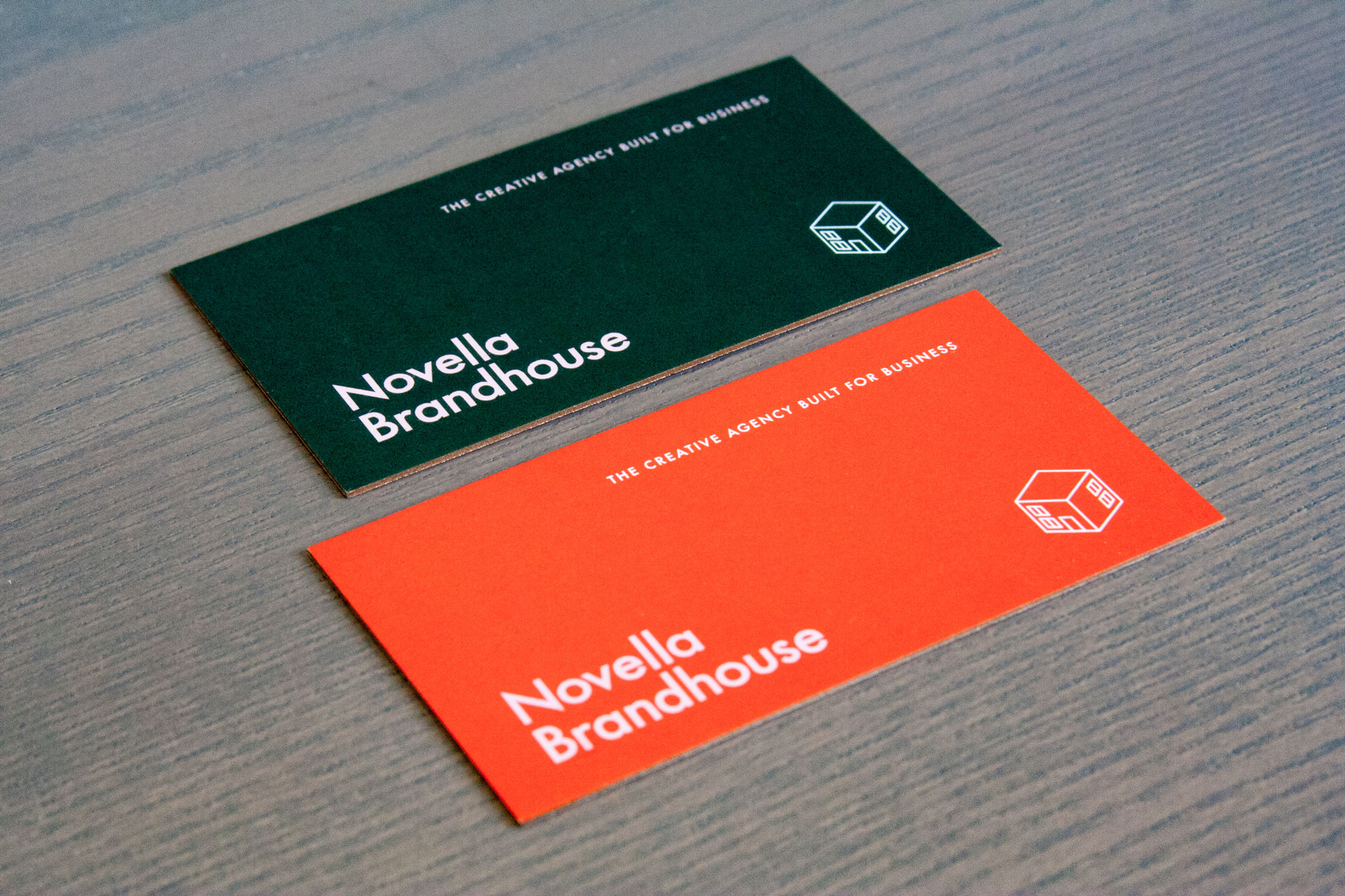
Designer/Cardholder: Clare McClaren, Principal/Creative Director, Novella Brandhouse
About the Business/Designer:
I’ve been doing this over 20 years. My current business partner and I formed Novella about five years ago to be a combination of high-end design and branding paired with her advertising background. We’re bringing those disciplines to small and medium sized businesses… social media and content strategy paired with high end design. You’ve got amazing design shops and ad firms, but finding that crossover is tough.
We were in a charming little storefront studio. When we moved downtown to the crossroads area in Kansas City is when we changed our look and business cards.
The brand:
Our brand tends to be simple and straightforward. We wanted something that looks bold and snappy and fresh to relate to our new space downtown.
Translating into a card:
I never thought I would go bigger than 8 point type on a business card. We wanted to add in a little luxury as well, so we went with the really thick card and painted edges… the little details are what help make it special. We got it printed with one of four ways with different colors, and it was still affordable for a small growing agency.
How people are reacting:
People love them. Especially if we’re in meetings where multiple people are handing out our cards, people love that they’re different colors. In my mind they’re not over-designed or distracting, they’re just quality, sophisticated and professional.
11. Lane Samata
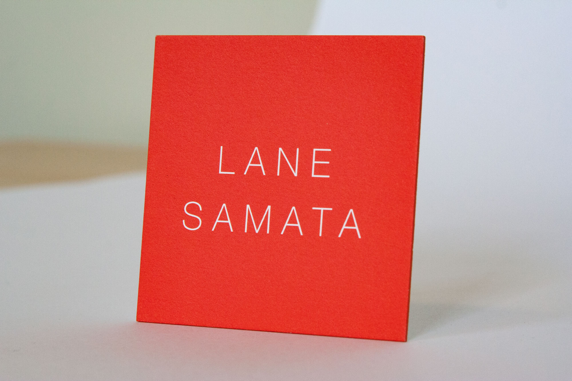
Designer/Cardholder: Lane Samata, Industrial Designer
About the Business/Designer:
I just finished up school as an industrial designer in NY. I went to Pratt, so I do have a background in design. Also, my parents are both graphic designers, so I grew up around graphic design my whole life.
The brand:
My brand imagery is just supposed to represent me as a person. The imagery carries through; I have a red square on my resume with the same type, on my website, on my portfolio. That same language carries through to all of it. I’m trying to convey that through the simplicity of it that I have visual sensitivity, that I can make something simple that still says something about myself
Translating into a card:
I wanted something more bold that could stand out. I wanted it more square than a rectangle. I wanted it a little bigger, oversized to make a statement. I chose red because it’s bold, but not in your face. It speaks a little more to people who are looking at it. That’s kind of what I was going for. I wanted it to be simple, I didn’t want it to have too much information on it.
How people are reacting:
Everyone seems to like it. Everyone seems to say that it’s really unique and it’s a cool card. The actual physical card has a good weight to it, and that it’s definitely more recognizable than some of the ones they’ve seen. A few people have said it’s a little too big, that they can’t quite put it in their wallet, but it definitely makes them remember me!
12. J.Schmid
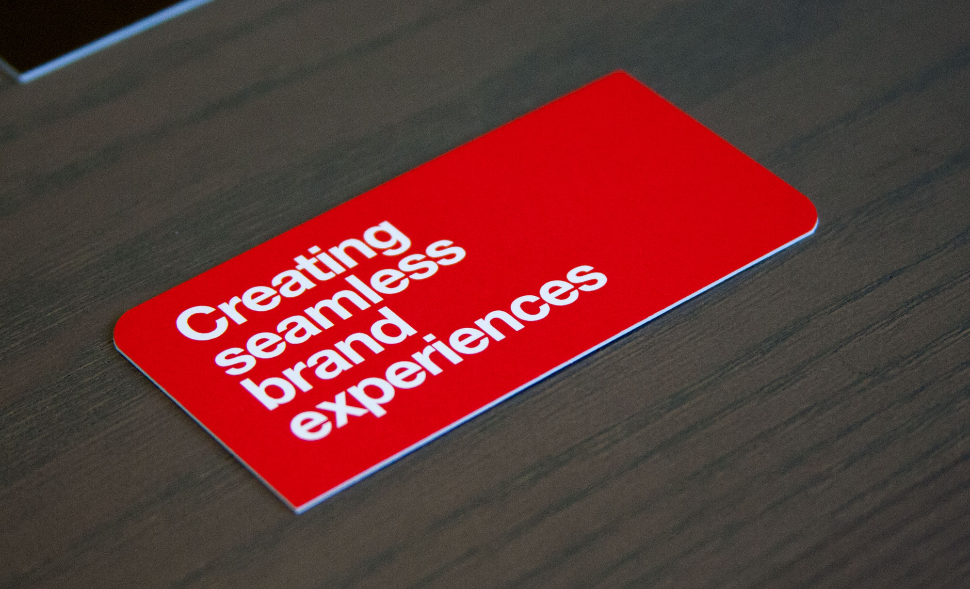
Designer/Cardholder: Brent Niemuth, President/Chief Creative Officer, J.Schmid
About the Business/Designer:
I’m a designer by trade. Even though I’m president of J.Schmid, I still have hands-on design responsibility when it comes to our own branding, identity, business cards and promotions.
We’re direct marketing experts, specializing in true multi-channel campaigns. We work with brands that sell through multiple channels—online, offline and retail.
The brand:
We’re in the IDEA business, and we want to communicate those ideas in a creative, memorable way. We want the brands we work with to stand out and be noticed. So we wanted our business cards to do the same thing.
Translating into a card:
We wanted an odd size, a unique shape and a color that stood out. Physical attributes were important; not many people hand out cards anymore for some reason. When we’re in meetings, we really like to hand out a physical card that creates a tactile experience.
How people are reacting:
Just about every time I hand out my card, I hear comments about the uniqueness of it; the size, the interesting trim, the rounded corners, and especially the weight of it, which is significant. I think people often try to save money on the weight of the card, and it ends up feeling flimsy. It leaves an impression of low quality. Everyone that handles our card comments on how much they like the heft and thickness of it. The quality of the card subconsciously translates to the quality of our company. Worth every penny!
THikit is a family-owned company of print specialists, artisans, problem solvers and creative professionals with a sharp focus on offering top quality 4-color printing on the widest variety of extra-thick paper stocks. If you are looking to stand out with a truly unique business card, wedding invitation or postcard, then you have come to the right place! Request a free sample kit today!

