When it comes to graphic designers, marketers and creative agencies marketing themselves, the cobblers children often go barefoot, right? You’re so busy taking care of your clients that marketing yourself is an afterthought.
But with a little extra time and forethought, practicing what you preach can reap great rewards. One area where that applies is with your business cards.
As we wrote in a previous blog post:
“Your card is sending an impression. whether or not you want,” said Dulye. “It’s going to be interpreted in a certain way by the receiver. Their biases may cause a first impression that you don’t want.”
In this blog post, we’re going to showcase seven designs from graphic designers, marketers and agencies that have made a big impression with THikit cards. If you’re interested in seeing what THikit is all about in person, order a free sample kit today!
1. Beth Herman Design
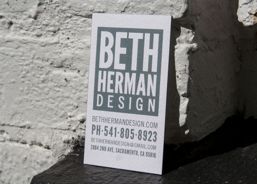
Beth Herman is a graphic designer and art director in Sacramento who has been working in the field since 2012. After spending time at a large creative agency working on global campaigns, she started her own freelance business where she works with both small businesses and as a hired gun for larger agencies in places like Portland, Brooklyn and San Jose.
Her design ethos?
“I treat all of my clients the same. Everything should be branded and intentional. Everything should be part of a larger campaign, whether it’s for a small business business card or a global project.”
Beth says that as a designer, one of the most challenging things to do is to brand oneself.
“I have to remind myself that [my brand] is ever-evolving, which can be challenging at times,” she says. “For my brand, I chose to use gothic fonts, as they’re bold and classic but still approachable. When I first started my business, I printed and stamped the cards myself. So with this latest run, it was important for me to maintain that tactile quality while investing in a card that can be produced on a larger scale as my business continues to grow.”
Both opted for a custom grey edge color to match the card face, and selected a felt paper with the help of a THikit sample pack.
“When you feel it, there’s something memorable about it,” she said. “The juxtaposition between the felt paper and the condensed sans serif font is a nice little brain tweak you have there. It’s unexpected.”
Her reasoning? She wants to be approachable to small businesses while maintaining a high-end feel for global clients.
“Business cards present an opportunity to show the more human aspect of a business. For me, it was important to not feel too corporate,” she said. “So far, people really like them.”
2. Clevyr
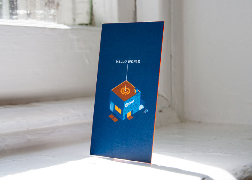
This is a first for us; thanks to an Oklahoma City-based software development firm named Clevyr, we learned that our cards work in augmented reality!
Clevyr focuses on web technologies using Javascript and node, and also does some C# development, but they’ve also been getting into augmented and virtual reality applications.
Timothy Nix, one of Clevyr’s founders, explained.
“The back of our business card is actually an augmented reality marker,” he said. “It’s kind of a parlor trick, we can demo some of the technologies that we’ve been working on with our clients. We had just hired an outside business development guy. Our business cards before were real geeky, and just had a QR code on the back of it. The only people who would really get that would be tech people overall. We wanted to appeal to the masses, and give our BD guy a conversation piece.”
Clevyr’s use of Unity technology allows their clients to print off their own augmented reality markers, which can then trigger different experiences and content within the apps they create.
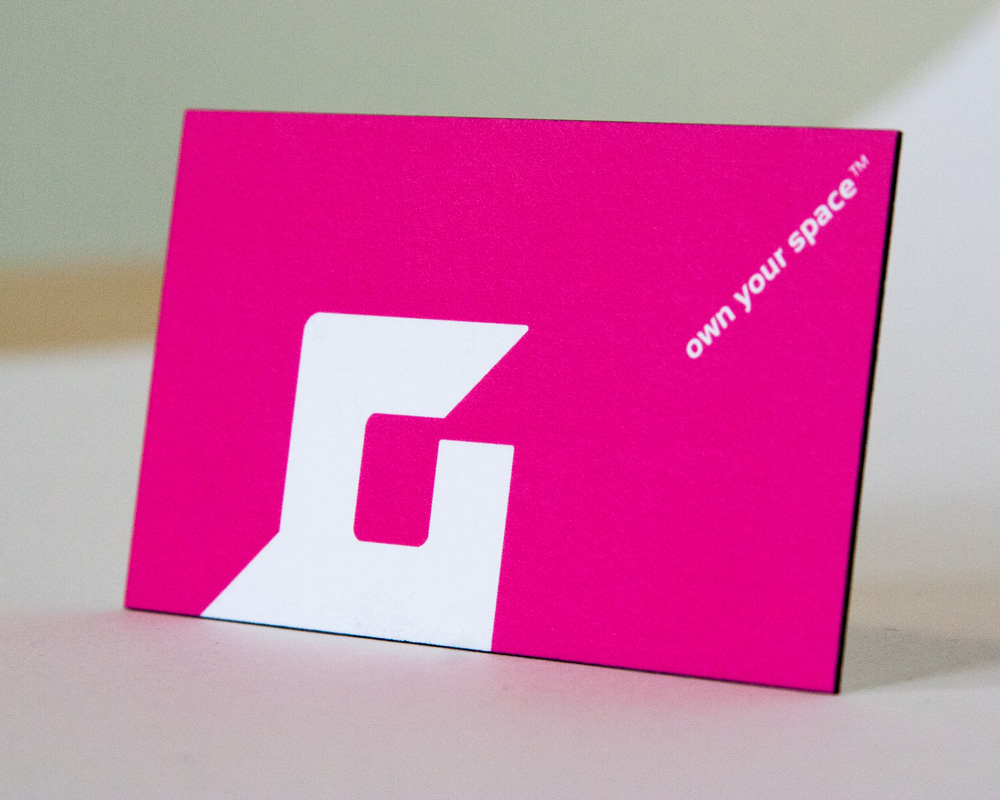
3. Goldforest

Michael Gold is a brand identity consultant in Hollywood Florida and the owner of Goldforest, which works with companies to develop product names, company names, visual identities and packages. His business card has always been an important part of his interaction with new business prospects.
“I have to have my own brand image in shape if I’m going to talk to other people about working with them on their brand image,” he said.
Historically, he’s used an embossed card with gold ink and illustration on it produced by a custom print shop; unfortunately, when he went to re-order, the shop was out of business, and the embossing dyes were gone. It would’ve cost several thousand dollars to re-create, and one of Michael’s designers suggested ordering a THikit sample kit.
“I thought wow, this is fantastic,” Michael says. “The unit cost is a little bit higher than a normal printer, but at modest quantities the pricing is very reasonable for what you get.”
His card starts with the firm’s name and logotype.
“There’s a very earthy identity with a golden acorn,” Michael says. “At the heart of our brand identity, which we carry across in all of the media where we put ourselves forward. It’s on our website, that idea of the forest and the golden acorn.”
That identity led Michael to choose a Crane’s textured paper for his card, with a warm ivory color.
“I was super impressed with the wide selection of papers available,” Michael said. “I have always loved the luxurious feel of Crane’s.”
A gold edge painting technique emphasizes the thickness of the stock and reinforces the Goldforest identity.
“It’s approachable, it seems fertile, it’s about growth and creativity itself,” he says. “It’s a solid brand identity that everyone feels good about.”
Michael says he’s been getting a nice response from the card, particularly at the recent Fancy Food Show in New York City.
“Branding is not easy,” he says. “Developing a brand identity takes a lot of thought, a lot of research, and a lot of analysis. My advice to others is to develop insights along the way and do your homework.”
4. Unanimous
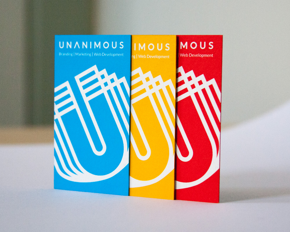
We covered Unanimous in a past blog post about geometric business card designs. They went with a three-card set that’s consistent with their overall brand colors; team members get to have a little individuality by selecting the color that represents them, but they’re still existing within the overall brand.
Their art director, Scott Claypool, told us:
“We wanted a sleek, minimalist, black one-sided card. When you see the black side, it’s nice and clean, but when you flip it over you’re engaged by the brand colors, presenting a different color within our brand palette. People notice that they all look the same.”
5. Syn3rgy
Syn3rgy is a full-service strategic marketing agency, and we also covered their card in our post about geometric business card designs. They went with a die-cut, square business card to go against the grain of traditional business cards.
“SYN3RGY Creative is about being big, bold and taking risks,” says their founder and CEO Steven Newlon. “We’re really about innovation and pushing boundaries all while making data-driven decisions… When you go to events, and they have a little fishbowl and you drop your card in there for a contest, and I can’t tell you how many times I’ve won. It stands out against the hundreds of traditional white business cards in there.”
6. Furniture Branding
Furniture Branding was also featured in our post about geometric business cards.
They’re a strategic and creative agency that focuses on B2B and B2C furniture businesses.
Their CEO and Creative Director Jason Pires, wanted to show off his new logo, which is an abstraction of the letters B and F, along with a profile of a moder-looking chair.
“We wanted something that said we’re a solid company, sturdy, strong, but we also have the right eccentricity and fashion sense to understand your brand,” he said. “We kept one side clean, to show that as an agency that we have a clean palate to work with.”
“When we chose the paper stock, we thought that a lot of people are doing matte finish, so we wanted something uncoated to project a higher-end feel for our brand,” he added. “Most of our services are digital so this printed piece is the only thing physical people will see from our brand. All in all the components coming together made this card a winner for us and our clients.”
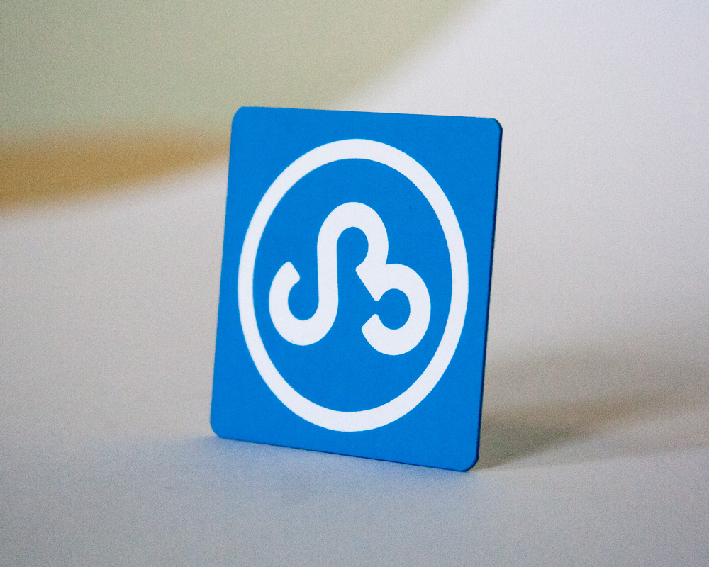
7. Square Munky
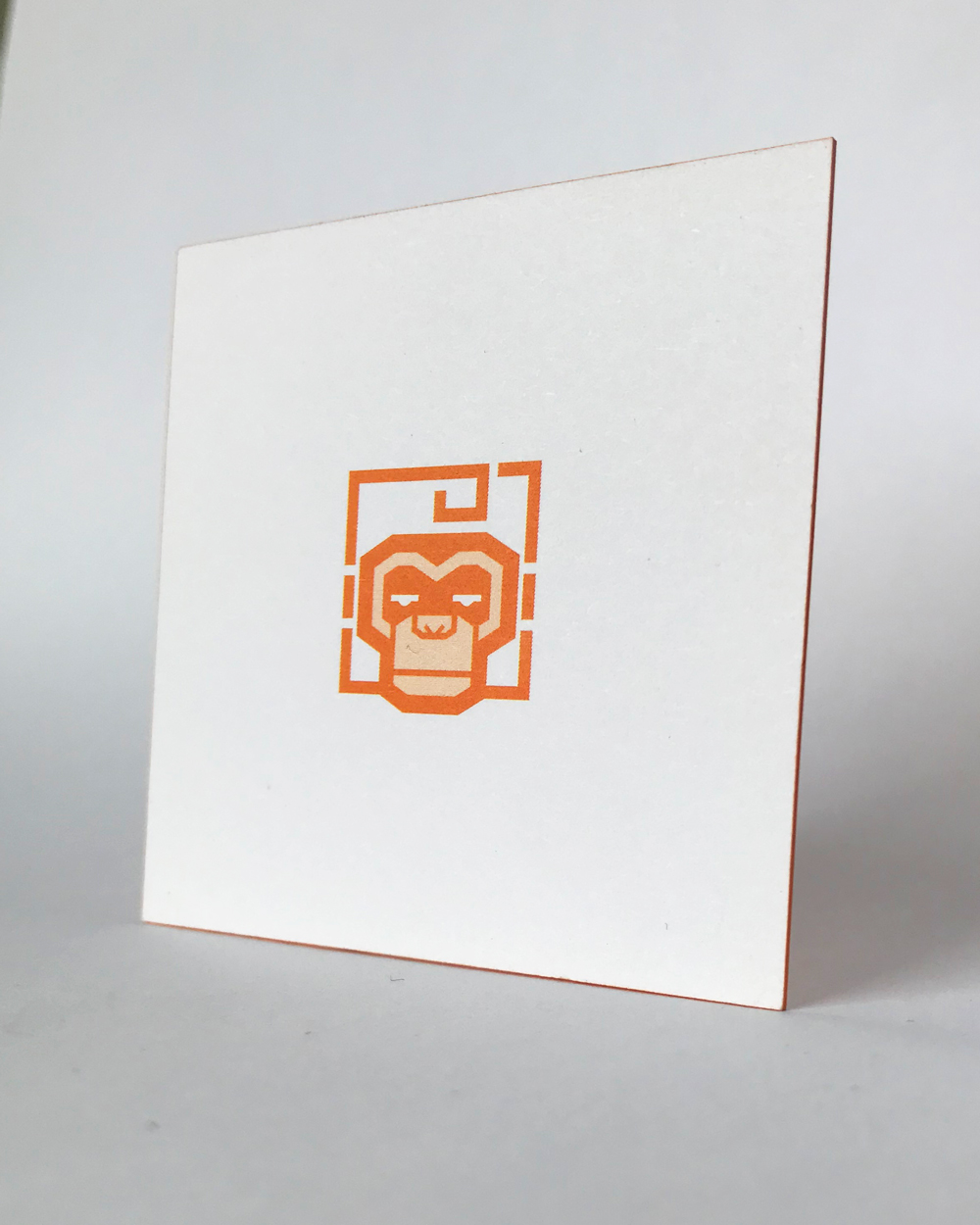
Square Munky, based in Phoenix, Arizona, was featured in our blog post about business cards that have animals in the design.
The owner, Brian Proud, said he wanted to combine a square, thick card with a simple design to stand out. When he hands out the card to potential clients, they tell him they’ve never seen anything like it.
“It’s very simple looking, but the thick cardstock gets people saying they don’t know that you could order cards that thick,” he says. “They want to go out and get something like that that makes a little more of a statement than when you go to a “churn and burn” card producer, where you get the same thing as everyone else.”