For tech and startup companies, the exchange of business cards isn’t so much about providing one’s contact information; it’s about conveying a sense of success, of a fully realized brand, of viability, and a value proposition. For such a big ask, many designers and companies are testing the limits of what business cards can do by experimenting with thicker card stocks, painted edges, soft touch business cards and even virtual reality.
To learn more about this, we interviewed four THikit customers from the startup world and photographed their cards for you, and also included some examples of startup/tech cards from past blog posts. If you’re curious about what a THikit card could do to put your startup’s best foot forward, request a free sample pack today!
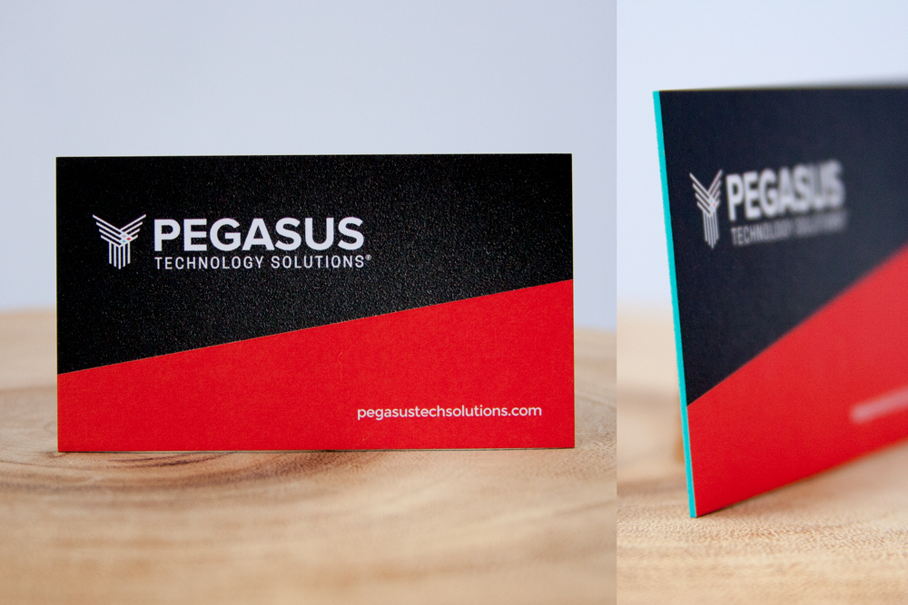
1. Pegasus Technology Solutions
Name:
Shannon Whitehead, Director of Marketing at Pegasus Technology Solutions
About the marketer:
“I have always been an in-house marketer, jumping across a few industries before landing in Tech with Pegasus. Prior to Pegasus, I was at a global commercial real estate firm, commercial construction company, and also restaurant marketing here in Dallas.”
About the company:
“We are a technology services provider, offering IT Integration, Professional Services and Managed IT Services. We listen to our customers and learn their business so they can always trust us to design the right solutions that deliver business value.”
About the brand:
“We worked with Matt Reiswig, the former creative director at Webolutions, to develop our brand.
It’s a challenge; we want to really balance the dichotomy of who we are. We’re very professional but also not stuffy. We have sophisticated Fortune 500 technology expertise, but we also have a strong concerted focus on our culture. We’re very relational and not transactional. We don’t take ourselves too seriously, but we take what we do very seriously. My challenge is to make sure we show both through all of our marketing efforts.
We also talk a lot about the elevated experience our customers receive. It’s the extra attention and time, thought, focus and care that makes Pegasus different. I want our materials to subconsciously convey that we go above and beyond, particularly with our business cards.”
Translating the brand to a card:
“We asked Matt to design the card to make a big impact and statement. I personally am not a designer, but I really love working with that whole creative process. I wanted it to be something that made a statement when you handed it to someone, but also stood out and had a shelf life in a big stack.
He delivered the design in an electronic format, but I asked his opinion on print production to see what else we could do to make sure that it would make a good first impression. I wanted it to stand out and be different. Making the cards thick and putting the secondary logo color around the outside was his brainchild. This way when someone is going through and put a big stack of business cards in their briefcase or desk drawer, ours stands out.”
How people are reacting to the card:
“All of the feedback that I receive is that it’s a memorable card and great first impression. It’s music to my ears that when someone gets the card, they comment on how unique and different it is.”
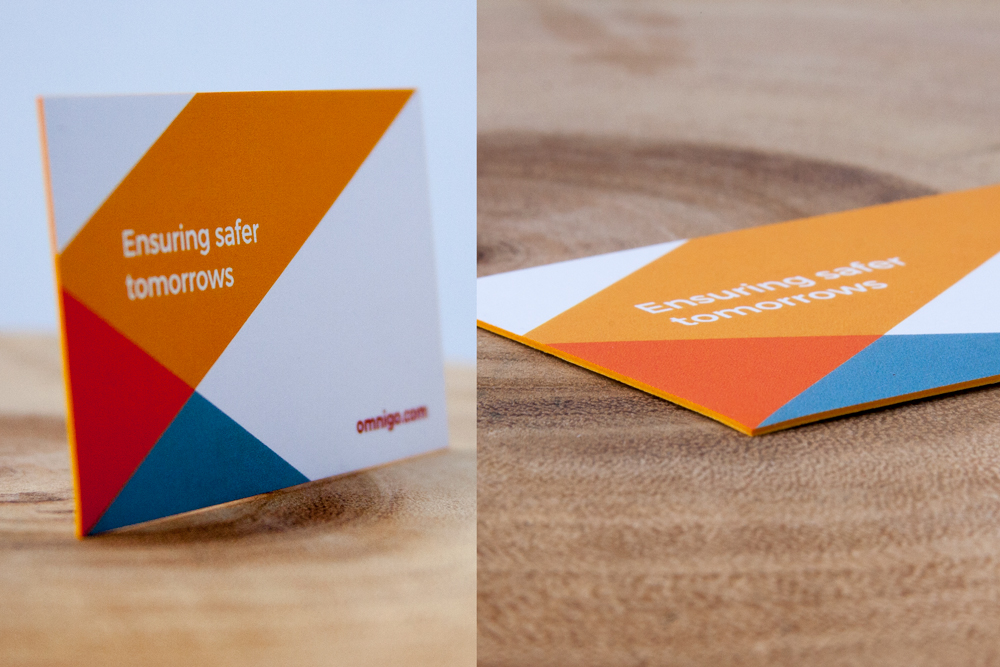
2. Omnigo
Name:
Phillip Wiggins, HR Manager at Omnigo
About Phillip:
“I am an HR guy, and I picked up ordering business cards as a part of my job. It’s something that a lot of new people need. I rely on my marketing team to design what we actually submit to THikit.”
About the company:
“Omnigo is a software solutions company. It’s relatively new, we’re just a couple of years old. We have a lot of history: we’ve been creating and delivering and supporting software solutions in the public and private security space for about 25 years. We work with law enforcement, private security companies and corporations. Our products enable communications, efficient use of resources, and our vision is ensuring a safer tomorrow. We take our responsibilities very seriously. We all understand how our individual contributions tie into making a safer world for tomorrow.”
Translating the brand to a card:
“We do a lot of trade shows, that’s where cards come in to play for us a lot. When you’re at a show, there are hundreds of cards flying around. It gives you a little bit of an edge and helps you stand out. It’s worth the investment. We order 24-point thick cards, which are solid and noticeable. People will hold it in their hand and feel the weight and thickness. I don’t think I’ve given out my card and not gotten notice for it; it just catches peoples eye and their attention.
How people are reacting to the cards
“They stand out, they give you a little more of an edge when you’re handing out lots of cards all day long.”
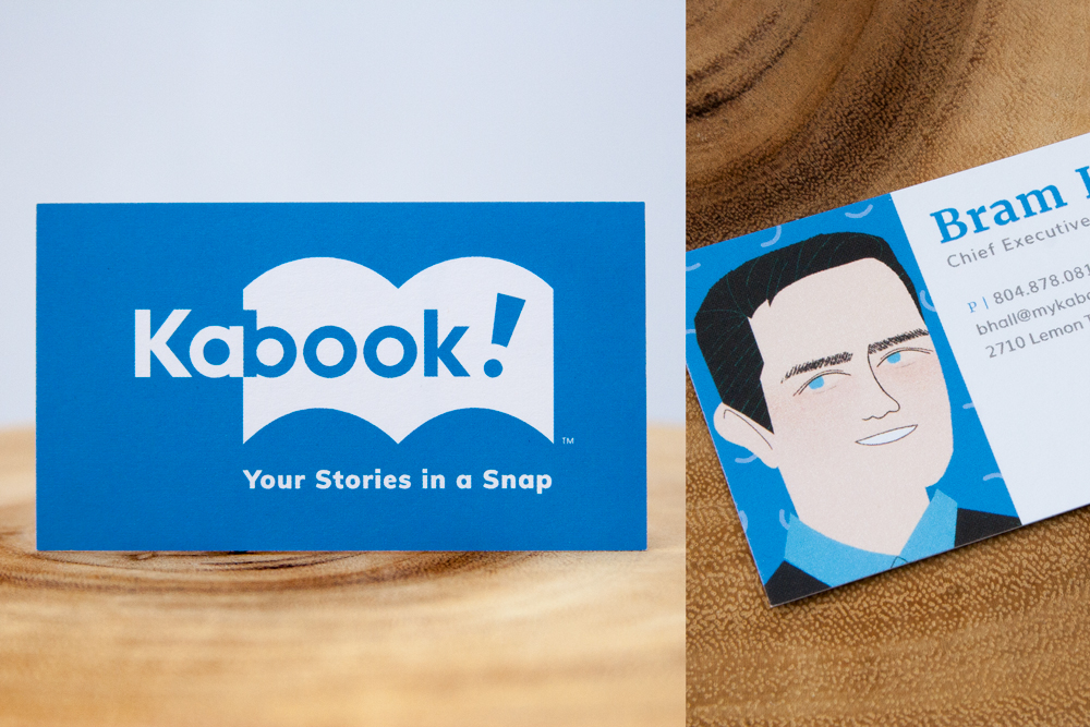
3. Kabook!
Designer name:
Joe Parrish, Chief Creative Officer at The Variable
About the designer:
“I spent my entire career at ad agencies, and started an ad agency several years ago called The Variable in Winston, North Carolina.
I got a little frustrated with the agency business model, and I wanted to come up with ways to leverage the creativity in the building to build institutional value instead of fee for service. It’s now a business accelerator where we work with partners who do things that are different from what agencies traditionally do. We marry what they’re good at with what we’re good at. Through that, we met someone who wanted to start a children’s book publishing company, and we tweaked the model and came up with Kabook.”
About the company:
“We wanted to create a direct to consumer brand for children’s books. The reason you’d go there is if there’s a level of customization and personalization over what you can get on Amazon. We created highly customizable books; not only is there text, but you can upload a picture, and it converts the picture to make it look like an illustration, and it makes you look like you’re actually in the book. The technology is called neural network processing.
Without question, our unique value prop is that we convert photos into illustrations. We want to make sure we message that at every touchpoint. Every communication, we try to take a picture and show what it’s look like when it transforms into an illustration.”
About the brand:
“First and foremost, we wanted it to be super playful. We didn’t want it to be too serious.
The book shape silhouette is associated with the brand, as well as the curves of the open book. We use the arches and turned them into little confetti pieces. It’s all of the books and all over every touchpoint of the brand.”
Translating the brand to a card:
“I think every startup suffers from a credibility gap. No one thinks you’re a real company. A business card can go a long way toward establishing that credibility. Getting a heavier stock is a touchpoint that communicates stability. It’s a tactile thing. It’s not like we went to Kinkos and printed off a cheap flimsy card. Also, having the illustration on the front was an important piece. If a card doesn’t help facilitate a conversation, it’s a waste of time. Everyone can get your contact info, so it serves your best purpose when you’re sitting across a table and it facilitates a conversation where you talk about your value proposition in an interesting way.”
How people are reacting to the card:
“People look at the illustration, and they’ll look up and say, wow, that looks a lot like you!
I can respond, “It is me, but it went through this neural network process to turn it into an illustration.”
They say “wow,” and you’re instantly in the conversation about Kabook’s value proposition.”
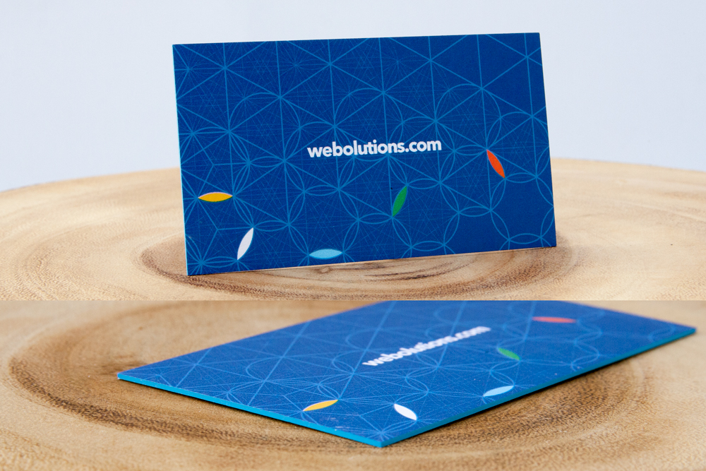
4. Webolutions
Designer name:
Matt Reiswig
About the designer:
“I studied video production and mass communications in school. I then joined a video production company long enough to learn that I hated it. One of the things I loved was working with the graphic designers on the team. I thought what they did was fascinating, but I had no technical skill.
I joined a pharma deliverables company as a producer there, and I happened to work in a department with a lot of nurses, and they had a great continuing education department. I used my CE budget to basically teach myself some technical tools, one of which was Photoshop, and the other was Dreamweaver. Those things hadn’t been around very long, and it was the beginning of the beginning of the online boom.
I was hooked. I loved the tactile nature of it. I loved that I wasn’t stuck in the office all day anymore. It clicked for me a lot more than video production. Since then, I’ve basically had an auto-didactic career, I’ve continued to teach myself more and more. In 2001, I started freelancing, and connected up with a startup. From there, I’ve had a career of working in agencies, doing everything from print to animation to web, to web-based software apps. I worked for Webolutions for about three years as their creative director, and left there about a year ago to pursue my passion in a different way, joining a software company called Pivotal.”
About the brand:
“When I came on board with Webolutions, they were due for a refresh. The branding goals were to say hey, we want to bring some long-term success to the brand. We had great success with a very warm, welcoming look, and we wanted to evolve the brand and give it new life. We wanted to represent opportunity, community, inspiration and cooperation.”
Translating the brand to a card:
“The main goal was impact. We decided to go with THikit for the thick card approach.
Webolutions is in a Class-A space. It had to be very professional, so to hand out a thick card was a really unusual practice. Here’s this very plain white business card, but it’s thick enough to have edge color, and has a very colorful and intricate design on the back, representing all of the new colors of our brand. The consistent approach was hey, let’s be conservative, we don’t want sideways cards or a square card. We want to be traditional, but within that, can we make it modern and represent a new brand.
I love tactile, If I get stuck in the digital world, I get itchy.”
How people are reacting to the card:
“Right off the bat, once we started handing them out, people were floored and excited, intrigued.”
5. Escality Games
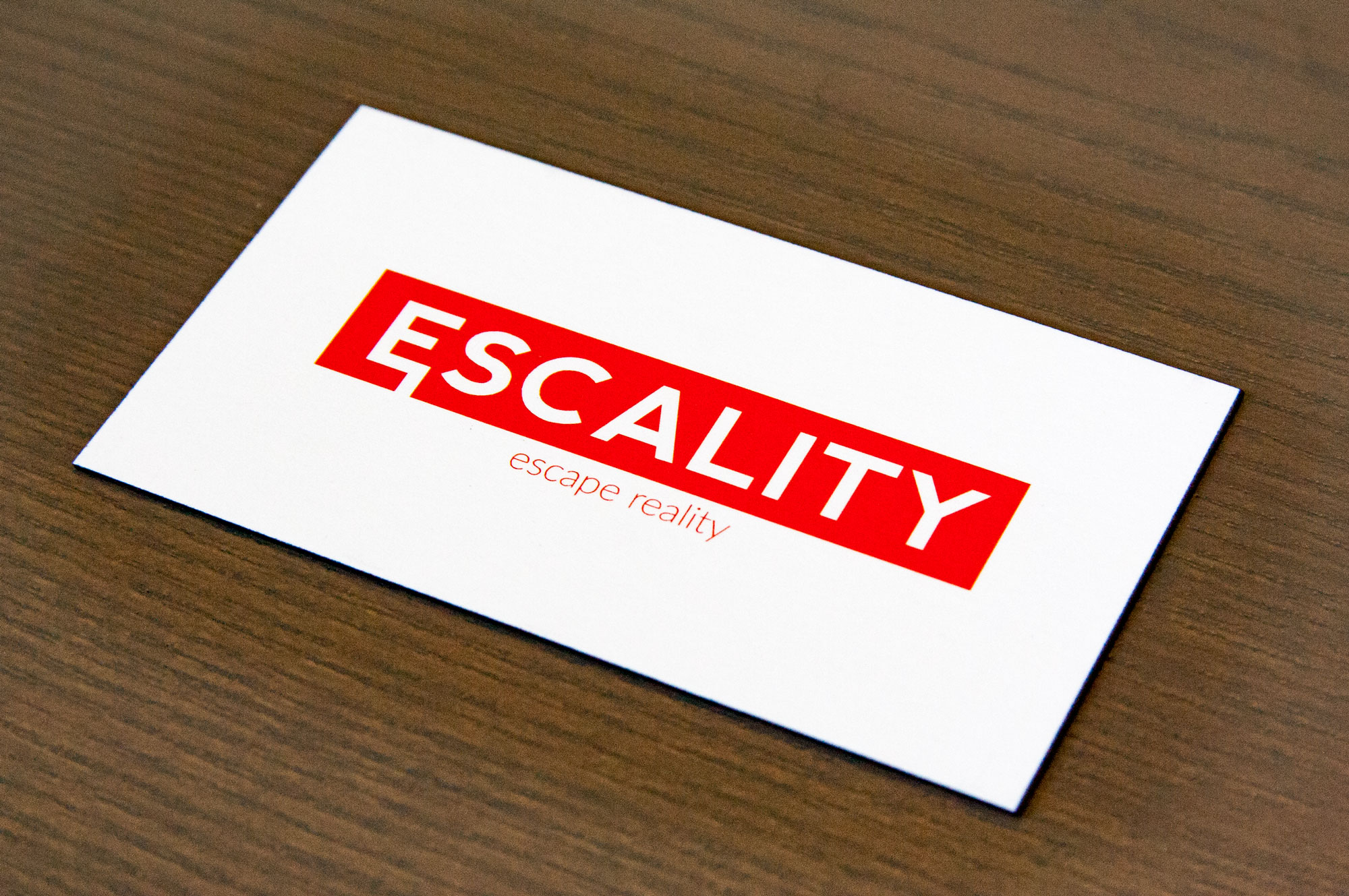
We wrote about Escality in our article about bold, typographic design.
“I wanted to capitalize on our logo, which is why the front is just the logo. We got a lot of feedback that people liked the logo. I didn’t want to make the front too busy with anything else. I was taught by a friend and a mentor to keep it simple.
With the back, it’s basically an information hierarchy, what the company does. I made it red because our company’s color is red, and made the connection that we do VR immersive experiences. The name of the person is bolded for visibility, so it sets it apart from the rest of the information. The red line is basically the logo collapsed into the line. I needed a simple divider and I went with that.
Since we’re just a startup, we didn’t have much money to get them printed. But I made it clear to the team that we needed something that would stand out since we’re new and trying to get into the industry. I went to an event called VRLA a couple of months ago. We collected a bunch of business cards there, and I decided to give them to a few people and rank them. A lot of people would concentrate on how thick the card was. I decided to make our card a little thicker, not enough to break our bank, but something to set us apart from typical 11 point card stock.”
6. Indisputable Labs
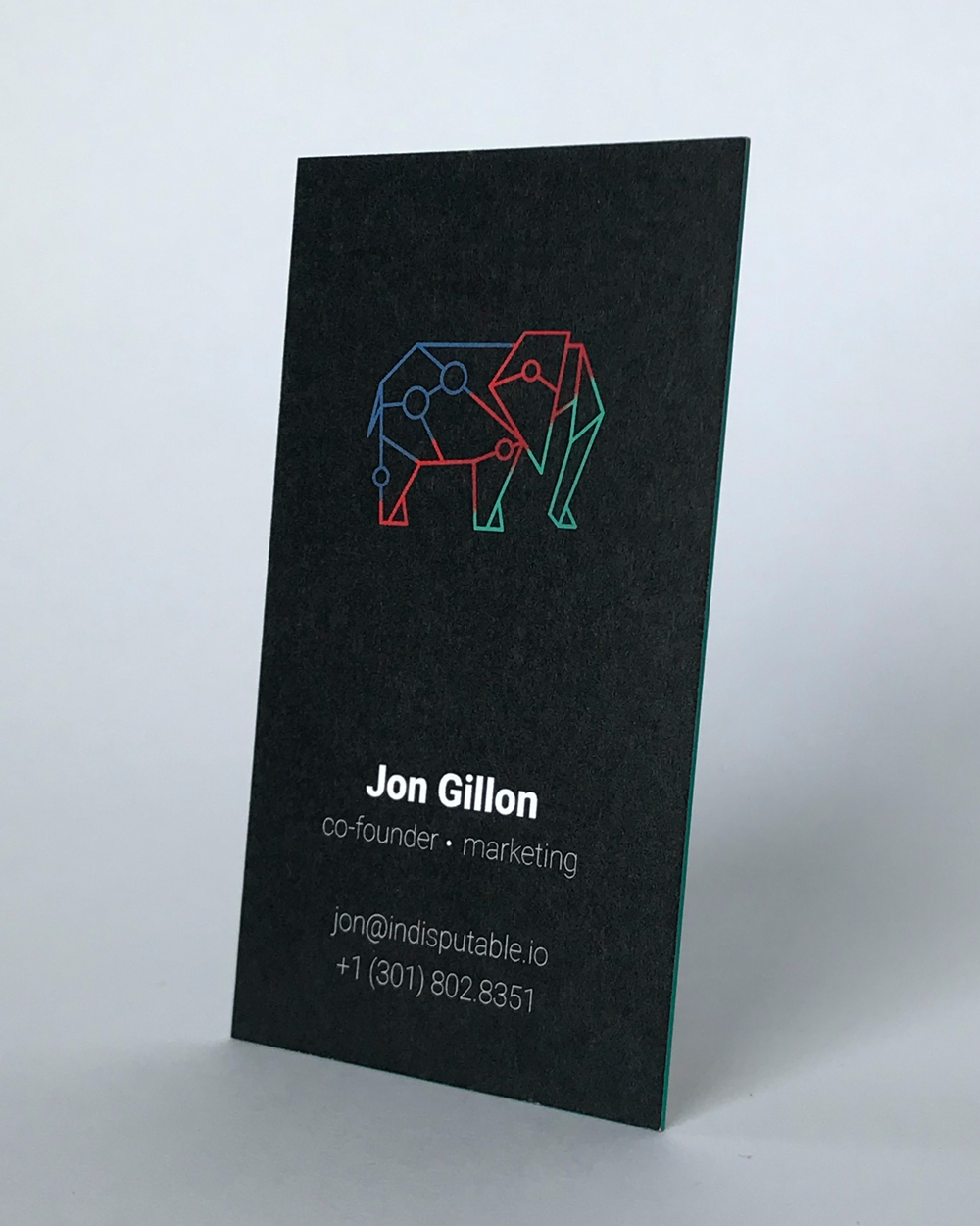
We wrote about Indisputable in our article about business cards that use animals in their design.
“We’re a high-tech firm, right? We build projects on the blockchain. We wanted our business cards to scream cutting edge technology, and I think they do. We wanted to go as thick as possible. We were making jokes about American Psycho, how it’s all about the card stock. We also wanted edge color to match one of the colors on the card.”
7. Clevyr
We wrote about Clevyr in our post about creative agencies using thick business cards.
“The back of our business card is actually an augmented reality marker,” he said. “It’s kind of a parlor trick, we can demo some of the technologies that we’ve been working on with our clients. We had just hired an outside business development guy. Our business cards before were real geeky, and just had a QR code on the back of it. The only people who would really get that would be tech people overall. We wanted to appeal to the masses, and give our BD guy a conversation piece.”
Want to make an amazing first impression with your business card? Request a THikit sample kit, or learn more about our premium business cards on the rest of our site!