The whole point of handing out a business card is to be remembered. When spending time in business and networking spaces, people can accumulate many business cards, and no matter how memorable or unique the interactions were, it can still be hard to match a business card to a person or a conversation.
Handing over a business card that makes a memorable first impression will help people remember you. Beyond the design, the shape of the card, the texture, the thickness, the quality of the printing and having color on the edge can all be factors that will help you stand out. Square business cards are one of the most popular ways that our clients stand out, and we talked to four of our business card printing customers on what makes their square business card designs special.
Interested in seeing our square cards in person? Request a sample kit today!
1. Wada Farms
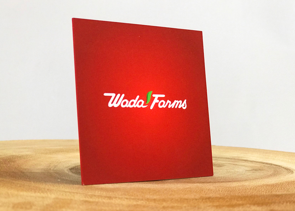
Name: Eric Wada, Director of Marketing for Wada Farms Marketing Group
About the business:
We are a grower and shipper of onions and sweet potatoes. We ship in both domestic and international markets.
I’ve been in the industry for about six years now, and we do a mix of in-house design and stuff that we outsource as well.
About the brand:
We had an established brand when I came on, and at that time, we were trying to bring better brand awareness to our label. Our business is more b2b than b2c.
My goal was to come in and determine what the power plays were and pain points for our customers, and to capitalize on the supply chain efficiencies we can offer to customers based on our vertical integration.
We really tried to push a one stop shop for our customers. In produce, you’re trying to optimize your freight efficiencies. There’s such a low supply of affordable transportation; we provide a way of consolidating several commodities into one ship-point location at a delivered rate that is very economical for our customers. That way, they don’t have to buy products with empty space on the truck. We have a lot of data analytics that we can provide to customers.
Translating the brand to a card:
We wanted something that definitely stood out and had a different appeal compared to what the rest of our market was doing. When you go to these trade shows and big conferences, you get a pile of these business cards. They’re all the same; eventually they all get lost. When we got a new business card, we wanted something different and unique. The quality when we did this last order; we wanted something in a not standard shape, thickness or feel.
When you get a stack full of cards, the square doesn’t fit, it sticks out. We know people sit there and bunch all the cards together, and the square one will sit outside the pile.
As for the thickness, it also feels different. It’s not as flimsy, it has a rigid feel to it, and it doesn’t have bend or give. We have a sensory audience. Everyone has this sensory input as to what a business card should feel like. It triggers your senses to feel “ooh, what’s that?” We’re triggering the sensory input to think differently.
How people are reacting:
This last trade show we went to… I can’t tell you how many compliments we got. It made a good first impression.
2. Roman Creative Marketing
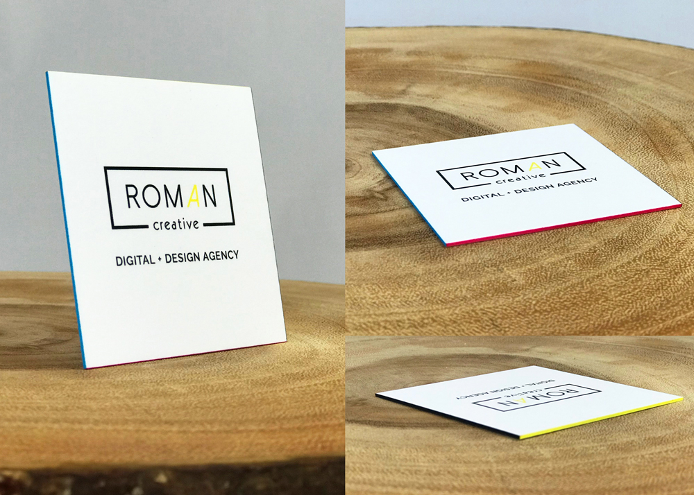
Name: Kendra Roman, Founding Partner, Roman Creative
About the business:
My husband and I started the company two years ago. We’re a local agency in a smaller town, about 30-40 minutes north of Grand Rapids, Michigan.
We started in the real estate niche, we were doing property real estate, 3D virtual tours, but we quickly realized we didn’t quite have the market for it in Michigan. We moved in a more of an agency direction, and we like making websites and doing digital marketing. We both worked in the hospitality industry, so we had a lot of connections in the community.
About the brand:
I like minimalism. At first, it was just going to be sticking to a black and white theme. When we’re branding for other companies, we use a lot of colors, but I wanted to keep ours kind of minimal. In the last three or months, we wanted to introduce some color into it.
As a designer I often use variations of the CMYK (Cyan, Magenta, Yellow and Black) palette which generated the idea to brand our colors with the 4 colors used in the printing process. The first introduction of these colors into our brand was used in our new business cards. Each edge of the square card is printed with one of the four colors.
We want to show that we’re modern and innovative. We want to embrace technology in our business and show other business owners what is possible or available to them.
Translating the brand to a card:
We wanted it to be unique, away from the traditional business card size. I went with square, but not an obnoxious size, so you can still easily put it in a wallet. On the sides, I wanted to add color. I like to embrace new things. When I give my card out to a potential client, I want them to say “I didn’t know you could do that.”
I want people to imagine what they can do with their business cards, and I’ve always been a geek for print material. That soft touch feel is just luxurious. I want to set my brand apart. I didn’t want thin business cards, I want to stand out. I want people to say “wow, that’s a nice business card.”
How people are reacting:
Most people kind of turn it over in their hands and feel it for a while.
3. Stencil Stop
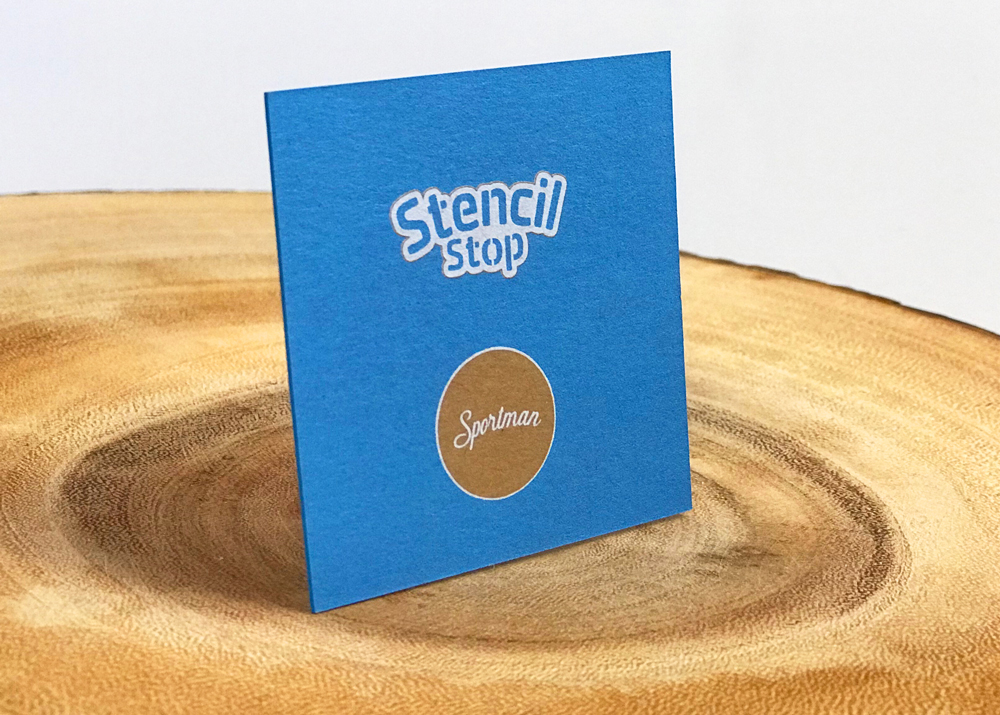
Name: Colin Mitchell, CEO, Stencil Stop
About the business:
I majored in packaging science in college, and I learned about structural design, graphic design, manufacturing, logistics and transportation. We worked with a lot of different materials across all types of packaging. I ended up going into packaging design for corrugated boxes. I fell in love with doing Adobe Illustrator stuff, and I taught myself how to do all of that stuff on the side, working on little projects.
I started Stencil Stop a few years ago, and that’s basically what the card is for. Our company makes stencils. You can send us your picture, logo, anything, and we’ll make it, ship it for you.
About the brand:
I put together the brand identity and designed the logo. I would work on it on the side back when I had a full-time job. All of the little design details and keeping the brand consistent throughout the business cards is important.
We’re trying to show that we’re unique. We can go ahead and take something that you have no idea how to do, we can send you a design and work with you on it. That’s not something that companies in the stencil industry have been built around. As far as branding goes, our logo is friendly and approachable. I try to treat the customer service and fulfillment side of things more like, “actions speak louder than words.” Making a friendly, approaching brand in appearance is important as well.
Translating the brand to a card:
These cards really hit.
Seeing white print on kraft paper is a rare thing, and I really appreciate that it can be done relatively easily with THikit. That’s something that helps us stand out. It’s thick, and we went with a painted edge as well.
I’ve gotten some square cards before from another company before. If I kept them in my wallet, they didn’t stand up to a lot of abuse. They’d fall apart in my wallet. I wanted something that had more support behind it, and even if I could get a billion business cards for $2 on Cyber Monday, you get what you pay for.
The white ink on kraft is unique, and even if someone knows nothing about design, maybe it’ll get through to them subconsciously that it’s unique. Square is also pretty unique. We want to do things in a unique way to stand out. It just looks cool. It’s definitely better to get a card that looks different from somebody, you’re way more likely to keep it.
How people are reacting:
People think they’re really cool. I’ve handed them out to people, and it’s the shape and thickness of them.
4. Betsy Mullen Interiors
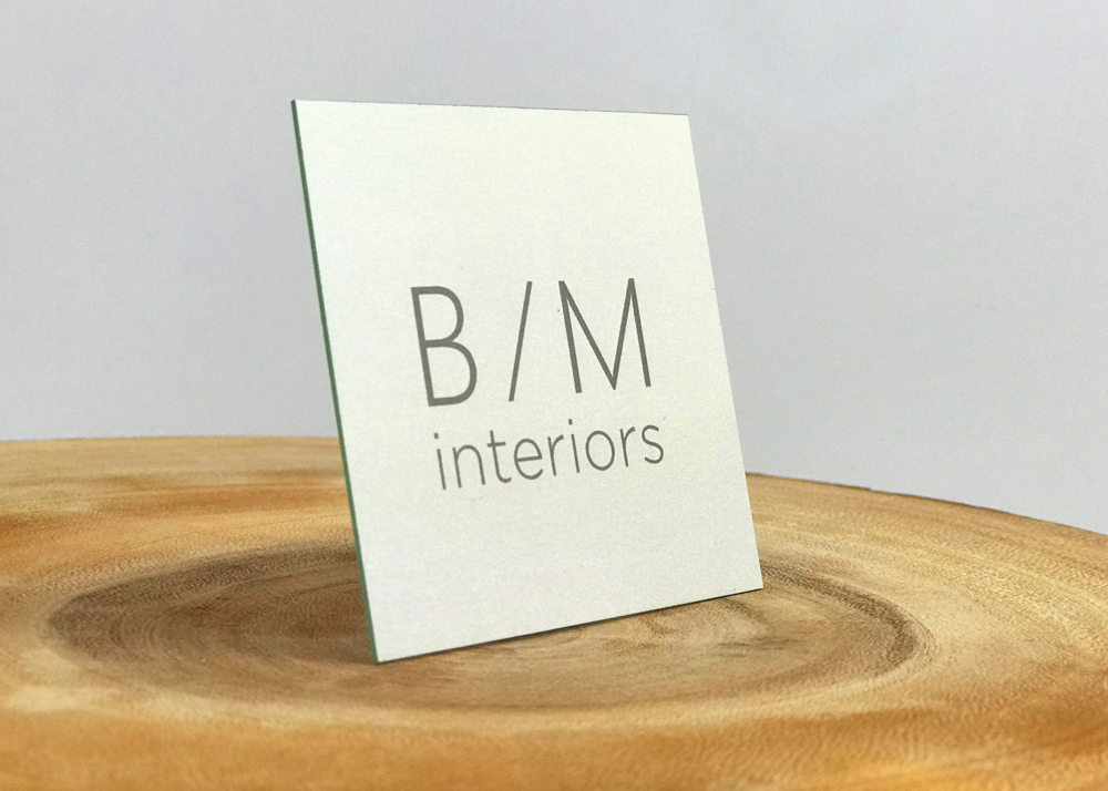
Name: Andrew Barfoot
About the designer:
I’ve been a financial advisor coming up on four years. Before that I was in sales and marketing. Even before that, I was in the commercial sign business. In those two jobs I got exposed to the design world a bit. I do marketing here at our financial advisory firm; one of our partners’ spouses is Betsy, and she reached out to get some business cards made for an interior design firm that she’s launched.
About the brand:
She kind of had her brand set when she came to me. She’s in her 60s and just getting started with a new career. She decided to start doing work for others in the realm of interior design. She needed something to hand out.
Translating the brand to a card:
She really wanted a square card, and we also suggested going a thicker route. My exposure to THikit came from my own firm. We had already had cards through THikit, and we saw that you could do a thick, square card with a nice edge color that could make a simple business card design stand out a little bit. Business cards aren’t all that that they used to be in terms of being a necessity. When you do present one, you want it to be something that can catch somebody’s eye. Something unique, especially in the design world that she’s working in. She’s trying to stand out as a touch above in her thought process, so it was a nice way of representing what she wants to do.
How people are reacting:
She’s used it a few times, and it sounds like it’s been well-received.