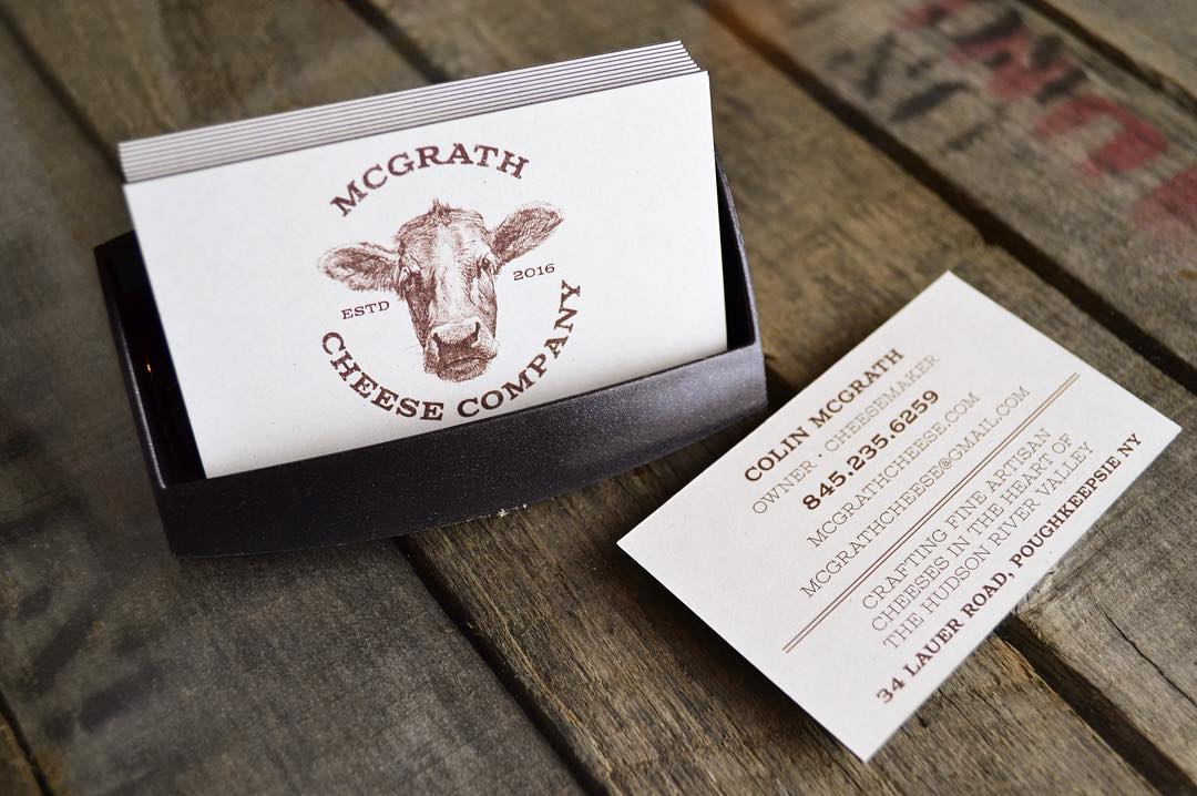
There’s something special about kraft paper business cards. The recycled, natural-looking paper gives an impression of craftiness, of being unvarnished and eco-friendly. It’s less refined by machinery, less processed, kind of like the original thing that it came from.
We interviewed eight THikit customers about their kraft paper business cards; how they chose the paper stock, what design decisions they made, and what brand qualities they wanted to show off with their cards.
If you’re curious as why so many designers are choosing THikit for thick, unique business cards, request a free sample kit today!
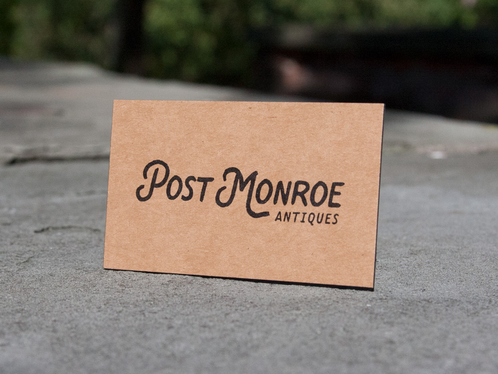
1. Post Monroe Antiques
Location: Quad Cities, IA
Designer/Cardholder: Mariah Danielsen, Owner, Wander Design Co
About the business:
I went to school for graphic design and marketing, and I quit my full-time job about five years ago to get into freelance graphic designing. My husband is an elevator mechanic, and we’ve always loved antiques and going to auctions. We found ourselves at a crossroads: we had a lot of antiques to sell. We opened up a store with my brother and sister in law; although we’ve closed the store we’re still doing booths at a few shows a year.
About the brand:
We really like raw, industrial design. There’s a lot of different motorycle-type or camping brands that inspire us, and a lot of their natural products. Anything army-green, dark wood, or sort of antique.
We wanted our branding to kind of match that look.
Translating to a card:
We wanted something substantial and not flimsy. I knew I wanted to do super thick cards, and I’ve always loved craft paper because it feels a little more natural. We also wanted to keep it simple, but for a little something extra we added the black edge-color.
How people are reacting:
People love the cards. When they pick them up, they think they’re actually grabbing two or three cards, but it’s just one. People always at shows comment at how nice they are so that makes me happy.
2. Heritage Boots

Location: Austin, TX
Cardholder: Patti Ryan, Co-Owner
Designer: Trish Richman
About the business:
My husband Jerry and I moved to Austin in 2006, and we wanted to start a western boot business. We had never done anything like that before. Jerry had always worn a western boot. He lived in London in the 70s and 80s, and came to the US to go to vintage stores and used clothing stores and look for cowboy boots, shirts, levis etc. and ship them back home.
We found a third-generation bootmaker, and have been working with him eight years. Everything is sold at our brick & mortar store; we do a have a website, and people can look at all the boots, but we don’t do e-commerce. We need to talk people to get them in the right boot with the right fit. We get very few returns because of that.
About the brand:
We’re old school merchants. Our brand reflects quality that we put in our products. It’s also about getting to know our customers, and we get to know people, so it’s about the relationship with our customers. Maybe we don’t sell as many boots as some of the bigger companies, but their business is on volume. Our business is smaller, on quality, building relationships person to person.
We hired a designer named Trish Richman for the logo about six years ago. She likes clean simple lines, and we try to keep the same look across the board on our business card and website.
Translating to a card:
It was very difficult to find the right kind of paper. I spent a long time looking. THikit was the only company that had a card that thick and was the correct color that we wanted.
By using the thick kraft paper, we’re trying to convey handcrafted. and also old school methodology. One of the things we try to convey is legacy-built. meaning our boots are built the old fashioned way by hand. With the very thick kraft paper, and a very simple, somewhat vintage logo, and just the font that we use, we try to convey that.
Our sales staff all have their own cards, and we like them to have cards to give to people so they can develop an ongoing relationship. We hand them out to customers when they don’t buy but they’re interested in a boot. We also have a card that’s blank on one side so we can write notes to give to people.
How people are reacting:
People love the cards. They feel substantial, and like our boots, they’re meant to last forever.
3. Chomps
Location: Naples, FL
Cardholder: Peter Maldonado, Owner
Designer: Matthew Fanelli, Owner, Shotwell Digital
About the business:
The idea came to me in 2011; I had been a personal trainer for about ten years and got pretty familiar with nutrition and fitness, reading food labels.
I remembered growing up and eating a ton of Slim Jims and gas station meat sticks. I loved eating those things, but when I got older I realized they were bad for me with all the artificial ingredients and stuff you can’t pronounce. I wished they were actually healthier, so I decided to create something myself.
We launched early 2012 strictly on e-commerce. In 2016, we rolled out to our first national distribution with Trader Joes, Target, Publix and a bunch of other regional retailers.
About the brand:
It’s shifted from the beginning. First, it was created for the paleo and Whole30 space. Very nutritionally focused people. We created the product to fit those people, and it was really niche, but it’s coming over to more of a mainstream product.
All of these different demographics of people were buying the product: moms, people with autism, people with diabetes, athletes, bodybuilders. The brand identity has kind of shifted. We’re not cornered in that paleo and Whole30 natural space; it’s still our biggest demographic, but we’re looking to be a little more mainstream now. it can sit right on the shelf next to Jack Links and Slim Jims.
We started originally like a metal-looking cow brand. The packaging actually had cowhide on it; it was supposed to look like what hardcore paleo dieters would want. Now, it’s focused on the word Chomps, more clean, with a nice crisp logo. It’s less focused on the animal, more focused on the product and benefits.
Translating to a card:
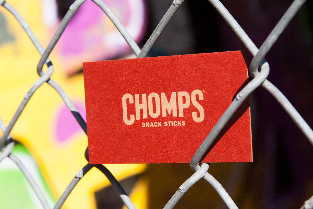
We still wanted to keep the natural look, so we liked the idea of doing the raw kraft paper on one side, and the thick cards are huge for us. We’re all about quality, and we don’t cut any corners to make our product, so we wanted to show that with the card and everything that we do. If I’m handing it out, it’s supposed to be the nicest business card they’ve ever seen.
How people are reacting:
I just did a pitch to Amazon and the NFL. I passed out 200 of them over the weekend, and every time, people were like, “Wow, this is nice.” You have one chance for a first impression, so that’s pretty important.
4. Mamahouse Bakeshop
Location: Fremont, CA
Cardholder: Kim Coenen, co-owner
Designer: Sean Patel, Owner, Sean Design
About the business:
I’ve lived in the Bay area most of my life. I retired from my position as a demo coordinator at Trader Joes to became a small business owner with my daughter just a year ago as a baker. We started a home bakery, and started selling at Farmers Markets right away.
We talked for years about doing some kind of business, we thought about a cafe or coffee/pastry shop. We love to bake, and my mom was an avid baker, so we got the gene. We probably talked about it at least for four to five years before we actually took the plunge.
About the brand:
We had an appreciation of seasonal/local produce, so we definitely wanted to give kind of an organic feel to our brand. We started talking about what that looked like, we didn’t want it to be too homey looking, but clean and modern looking.
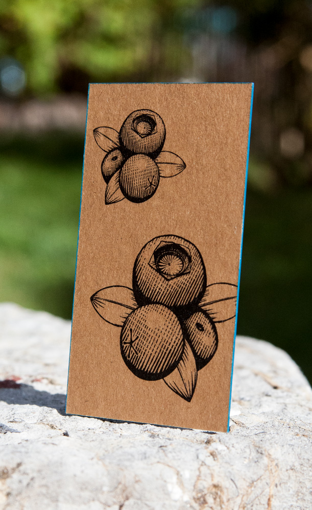
Working with our designer, we decided we wanted just the M for Mama House, because it’s nice and clean.
Translating to a card;
We value organic, things that kind of easily break down. We worked hard at finding the right paper for our business card that conveyed that we use and value earth friendly materials in our bakery. We were sold by the fact that the Neenah Environment Grocer Kraft is 100% recyclable. The cards change seasonally; we have different fruit for each season on the back.
How people are reacting:
We’re getting really good reactions. It’s pretty thick paper, so people keep saying, “Wow, it’s not a normal business card.”
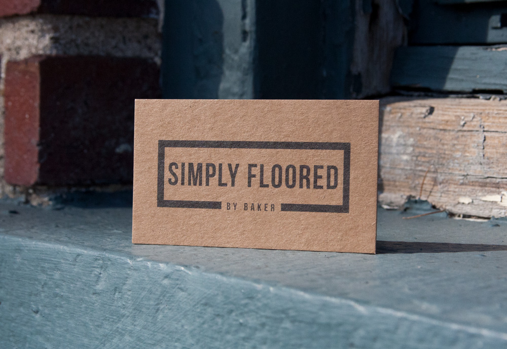
5. Simply Floored by Baker
Location: Altoona, IA
Cardholder: Robbie Baker, Owner
About the business:
We’re a residential and commercial flooring store. We do a lot of carpeting and vinyl and have been in business for three years now.
About the brand:
I guess it’s more of just a logo; Simply Floored just makes a statement. We’re big on quality and service. We usually can get to a job in a day or next day on the commercial side of things.
Translating to a card:
We’re trying to communicate the quality workmanship with the kraft paper card. We had cards before and they were just standard flimsy cards, so we wanted something a little thicker.
How people are reacting:
People love the cards. 90% of the time people say, “Man, that’s a nice card.”
6. O’Brien Landscape
Location: Wilmette, IL
Cardholder: Paul Knapp, Landscape Designer
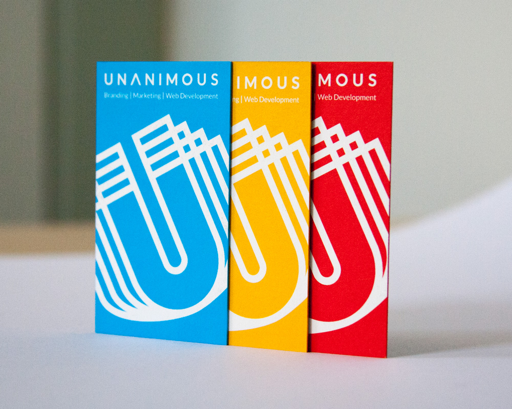
Designer: Scott Claypool, Art Director, Unanimous
About the business:
Jim O’Brien started O’Brien Landscape in 1992, and is still very much involved in all of the daily work. Prior to that he was a landscape architect/designer at another local landscape firm. Most of his time was spent hand drawing landscapes at a desk until one day he woke up and decided that he wanted to do more to be involved with nature. He told his wife Lisa, who also helped open up O’Brien Landscape, that he wanted to plant a tree.
About the brand:
Our logo has always been a shamrock. Needless to say it’s a fitting symbol for an Irish heritage landscaping company. It has undergone several changes over the years, but has always been the icon in which our clients identify our company. We aim to communicate to all of our clients that our brand is about designing and building natural, aesthetically beautiful, customized landscapes that merge our professional design skills, knowledge and tastes with their dreams and wishes for their property.
Translating to a card:
We wanted our business card to be natural, elegant, clear and concise. We also wanted it to stand out from the rest. In my desk drawer I have a hundred business cards I’ve obtained from over the years, all bundled together with a rubber band. They’re all paper thin, and none of them stand out. Some are flashy and some have way too much information, they get lost in the pack.
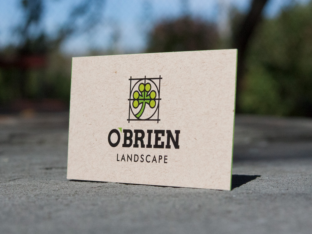
Our business card is different in that it’s thick, which may be it’s most prominent physical feature. The card is bordered by our company green and that beautiful green two toned shamrock centered with our company name in black below. The back of the card states our titles and contact information. It’s clean, it’s simple and it’s memorable.
How people are reacting:
I can’t tell you the number of times a client has complimented this card. We always take joy in hearing their reactions too. It really is an unforgettable business card that we are always proud to present to our clients.
7. Blackbird Presents

Location: New York, NY
Cardholder: Robert Rauffer, CMO, Blackbird Presents
Designer: Abbey Ley, Designer & Illustrator, Blackbird Presents
About the business:
We’re a concert production company; we put on tribute-type concerts, and they’re a dedication to a major featured artist. An example would be a tribute we put on for Merle Haggard. It would’ve been his 80th birthday, and it included Willie Nelson, Keith Richards, Toby Keith and Mariah Lambert. This October, Kenny Rogers and Dolly Parton are doing their last show together with us. We also have a tour called the Outlaw Music Festival.
About the brand:
The brand itself is non-descript in terms of whether it’s “young” or “old. “It’s a clean and simple look that can speak to everybody. We’re doing stuff for Merle Haggard, who’s an outlaw musician, to Kenny Rogers, who’s more of a pop star. We want our look to bridge the gap between multiple genres and generations.
Translating to a card:
Our colors are black and white, because we keep things very simple, less is more, in the way we approach things. It’s a very simple kraft paper card with our logo, and minimal information to keep it clean and simple. Easy to read. The thickness of the card is like a handshake. You either have a weak handshake or a strong handshake. When you’re handing a card to somebody, it’s thick, solid, really clean, which fits into our overall brand. It speaks to simplicity and strength.
How people are reacting:
People love it… they love the thickness and simplicity of it. It speaks for itself and fits directly in with our brand.
8. Muse Collective Jewelry

Location: Houston, TX
Designer/Cardholder: Melissa Ellis
About the business:
For 26 years, I had a childen’s-wear manufacturing business. I did that for 26 years, and recently retired. and started designing, along with my sister, contemporary fine jewelry. That’s what Muse Collective is. We source parts and pendants, and assemble it all here in Houston. Earrings, necklaces, bracelets, all made out of things like natural gemstones oxidized sterling silver.
About the brand:
We do what I call contemporary fine jewelry. It’s not too serious. I want people to layer it and wear it every day. It’s not inexpensive, but it’s also something you can wear casually. So our brand portrays something slightly whimsical, slightly organic, a little sophisticated, and it kind of fits all together.
As for the bird… I’m just kind of into birds lately. I love having a simple graphic. I collect bird art, I feed birds, I have a birdfeeder, so there’s something about the image that I liked.
Translating to a card:
I knew I wanted the card to be square, I wanted kraft paper. Someone referred me to THikit, and it was pretty simple once I saw that. I just liked the thickness and the kraft paper. I liked how natural and organic it looked. It was unusual.
How people are reacting:
The first thing people comment on is the size. It’s not your typical business card size… it draws attention. Hopefully it fits in their wallet and purse and they keep it. They also like the feel of it… people kind of gravitate toward it.
Want to experience THikit’s kraft paper cards for yourself? Request a free sample kit today!

