If a picture says a thousand words, a business card can say ten thousand about a person. Subtle choices ranging from the feel of the paper stock, to the durability and thickness of the card, to design and layout can all add up to being remembered.
As a printing shop that offers a wide variety of super thick card stock, we love helping designers and creative entrepreneurs turn their designs into reality. And one of the most eye-catching and elegant design styles is the geometric business card. If you’re looking for design inspiration, you came to the right place: we spoke to eight recent Thikit customers about their geometric business cards, and the things that they tried to communicate with their designs.
Want to experience our cards in person? Request a sample kit today!
1. La Nova Tile
Location: Houston, TX
Cardholder: Erick Calderon, President, La Nova Tile (interviewed)
Designer: Sami Kullab, Graphic Designer
About the business:
I started the business about 14 years ago after college. We’re an importer and distributor of technical tile products focusing on contemporary and minimalist materials.
The brand:
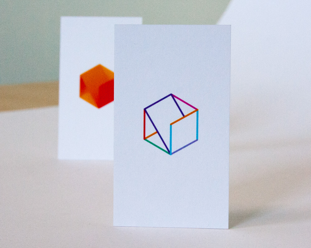
We went through different branding treatments, and worked with an amazing designer named Sami.
I feel like tile companies are overly serious. We’re a serious company, but I’m a little more light-hearted as a person. We like to be friends with our clients. When Sami created the branding for an upcoming collection, I asked if he wanted to give our re-branding a shot, using that same colorfulness and lightheartedness, which is what I’m after. A couple weeks later he came back with that, and the first time I saw it, I thought it was so perfect.
Translating the brand to a card:
Every time I see my business card, I feel like the happiest man ever.
Our clients are design-savvy people, and we needed this to be a strong foundation of our business. We wanted a design for cards that’s clean and crisp, and a thicker card is a little higher-end feeling, because our products are higher-end. The colorful logo shows we’re not the typical boring tile company.
How people like them:
People love our business cards. Everybody loves them. I think it’s difficult for me to hand them to someone where they don’t react positively to it.
2. Big Island Guide
Location: Kailua Kona, Hawaii
Cardholder/Designer: James Lear, Founder, Big Island Guide (interviewed)
About the business:
Big Island Guide is a brand new tour guide service for Hawaii, it’s going to be launched this winter. We moved over to Hawaii from Montana as a design agency, where we had a design agency called 45 Degrees North. We used Thikit to print our cards there too.
The brand:
We went through about 100 iterations, and want to show that we’re higher-end and into visually/aesthetically interesting experiences.
Translating the brand to a card:
Bad cards just get tossed. We’ve always looked at business cards as a little advertisement that we can get… if you spend thousands of dollars on a full color spread in a newspaper but don’t want to invest in your cards, it’s surprising.
We wanted the colors to look vibrant and got edge color, and we went with soft touch for a unique feel. Nobody on the island has that.
In Hawaii, you have 75% humidity and a lot of salt in the air, so it’s an interesting testing environment. Most things hold up really bad: clothes, metals, computers, things you do every day and value. Don’t order metal business cards in Hawaii.
How people like them:
I intentionally don’t hand them out, I just have them sitting out near paperwork, and people are always reaching for them. It’s best to let people inquire and sell themselves on a concept or a vision. They say it’s so cool, so vibrant. It’s a more fun experience than passing them out
You really should pay attention and invest in your business card. If you have a good card design, and do something unique, it’s huge from a business ROI point of view.
3. Furniture Branding
Location: Los Angeles, California
Cardholder/Designer: Jason Pires, CEO/Creative Director, Furniture Branding (interviewed)
About the business:
Furniture Branding is a creative and strategic agency for the furniture business; both B2B and B2C. We help businesses that are in the industry thrive through digital marketing, branding, influencer marketing, social media and overall creative content. We’re basically dedicated to the home furnishings industry.
About the brand:
We just rebranded; we created that logo that’s an abstraction of a B and an F, and a profile of a modern chair, so it really applies to home furnishings and can serve as a conversation piece. We really played into diagonal component of the line to create dimension.
Translating the brand to a card:
The thickness of the card was important to me. We had seen these Thikit cards before; we liked the fact that we could put color on the side. We’re in a really style-centric and fashion-centric business, so we wanted our identity to reflect that perspective. We wanted to help our brand connect into certain lifestyle segments.
We wanted something that said we’re a solid company, sturdy, strong, but we also have the right eccentricity and fashion sense to understand your brand. We kept one side clean, to show that as an agency that we have a clean palate to work with.
When we chose the paper stock, we thought that a lot of people are doing matte finish, so we wanted something uncoated to project a higher-end feel for our brand. Most of our services are digital so this printed piece is the only thing physical people will see from our brand. All in all the components coming together made this card a winner for us and our clients.
How people like them:
We felt that we accomplished quite a bit. The format that we chose really paid off… people are pretty simple about it, like “whoa, nice card.” It’s usually a positive reaction, or they say something about the thickness, because it is unusual.
4. Arash Saberi
Location: Canoga Park, California
Cardholder: Arash Saberi, Vice President/CFO, Sasha
Designer: Helia Jamali, Designer, Helianthus Creative (interviewed)
About the business:
Arash is one my good friends who started a solar power company here in Canoga Park.
About the designer:
I’ve been doing branding and graphic design to help companies get to a place where they need to be to be seen, and have been working with Arash for a long time.
Translating the brand to a card:
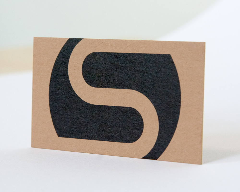
Since it’s a solar company that provides energy savings, the card has to be made out of recycled materials, of course. The first thing I did was find the right color of the recycled paper. I selected a darker recycled paper for the design.
He did have certain kinds of things that he wanted; obviously the name, phone number, but the backside was really important to me. The big S just expanding over the card, it represents the sun, the solar energy taking over, bleeding out of the borders of the business card. I just did what I thought visually looks right and translates the message of the work that he does and how passionate he is about bringing solar energy to more houses.
For the edge-color, I went with gold because it makes so much impact, and it’s like a ray of golden sunshine on the edge of the card.
How people like them:
Any time he gives it to someone, they ask who did it, and I’ve gotten a few design clients just from doing that business card. The gradient is great, the gold makes a big impact, the recycled paper is important. I think it makes a big impression on people.
5. Unanimous
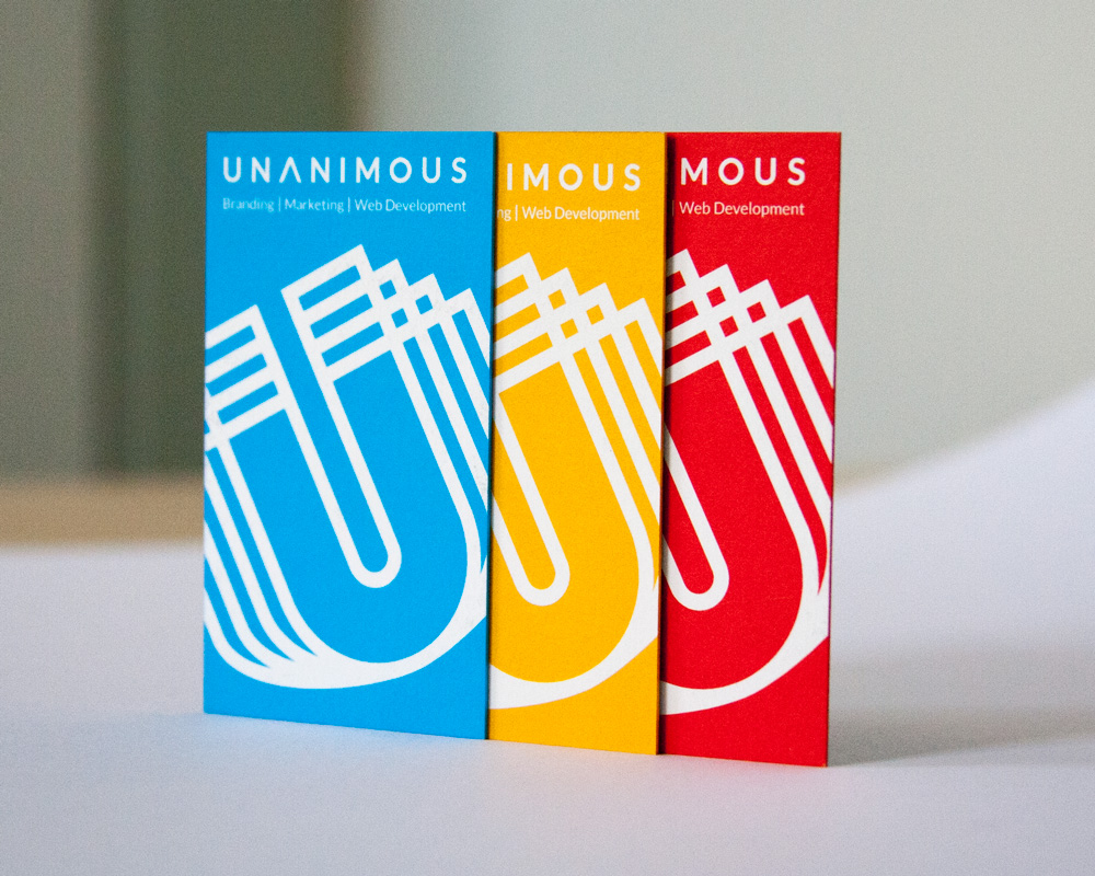
Location: Lincoln, Nebraska
Designer/Cardholder: Scott Claypool, Art Director, Unanimous (interviewed)
About the business:
Unanimous is a marketing agency that assists clients with branding, marketing and website design projects of all sizes and scope.
About the designer:
(From the Unanimous Website): As Art Director, Scott instills creativity within the team and is constantly motivating them to come up with fresh, innovative ideas. Scott has been instrumental in shaping the UNANIMOUS creative team.
About the brand:
We re-branded coming up on three years ago. Unanimous to us means we think with one mind, and we want to show continuity across our brand colors, which are gold, blue and red.
Translating the brand to a card:
I’m not kidding when I say this: I searched the country trying to find a vendor that could make a super ultra thick card with painted sides, that wasn’t laminated. Just a thick stock. I actually tried a couple of different vendors, and it didn’t quite do the trick for me. A business card, from a marketing perspective, that’s your handshake. I always say you should be able to hand a business card to somebody, while you’re staring at them in the eye. By the touch and texture of the card, they should be able to gauge the value of your company. As a creative director, I wanted a nice thick card that exuded craftsmanship, quality, and a high-end feel.
How people like them:
It is, by far, the #1 piece of my marketing kit that gets comments. “Man, your card is awesome,” or, “I could cut a steak with your card.”
We wanted a sleek, minimalist, black one-sided card. When you see the black side, it’s nice and clean, but when you flip it over you’re engaged by the brand colors, presenting a different color within our brand palette. People notice that they all look the same.
6. Kenyon.Co
Location: Los Angeles, California
Cardholder: Baldomero Fernandez, co-founder, Kenyon Co. (interviewed)
Designer: Jared Tomlinson, Graphic Designer, Blackrose NYC
About the business:
My wife (video production) and I (photographer) were living in New York for 24 years, and we just moved out to the West Coast. We had a vintage camping trailer sitting around for years in Rensselaerville. We had to do something with that trailer, so we brought it out here, gutted and renovated it and made it into a 21st-century vintage trailer. We tailored it like a VIP talent trailer, so if someone needs a green room or small production trailer that’s really stylish, they can rent it.
About the brand:
We came up with Kenyon Co. as our name, which is the name of the road that we lived on in upstate New York. We had a friend design the mark for us, it kind of harkens back to mid-century modern design that you’d see on IBM or something like that.
Translating the brand to a card:
The silver on the card goes with the polished aluminum of the trailer. The stock is nice and thick… it plays well to what we’re trying to do with a nice luxury product.
How people are reacting them:
It’s nice, whenever you hand someone the card, they’re like “oh, nice card.” It always reminds me of “that” scene in American Psycho.
7. Syn3rgy
Location: Oklahoma City, Oklahoma
Cardholder: Steven Newlon, Founder/CEO, SYN3RGY Creative
About the business:
SYN3RGY Creative is in the business of growing businesses. We are a full-service strategic marketing agency, but we’re more ROI-focused than what is typical in our industry. We specialize in marketing strategy, social media management, graphic and web design and video
production.
About the brand:
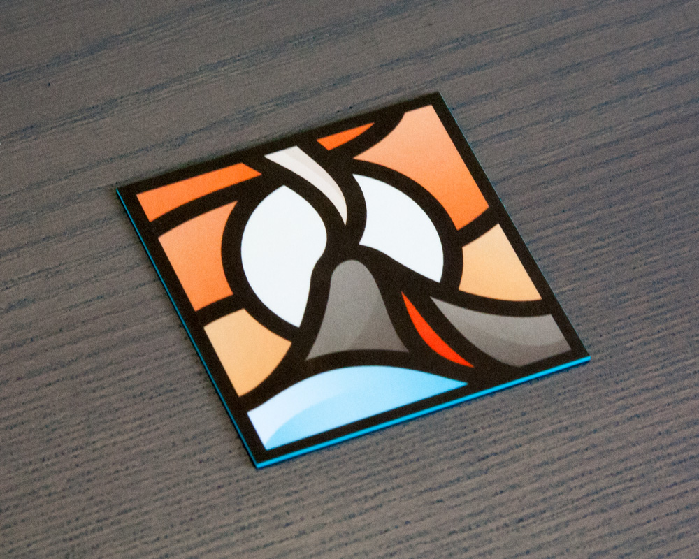
SYN3RGY Creative is about being big, bold and taking risks. We’re really about innovation and pushing boundaries all while making data-driven decisions.
Translating the brand into a card:
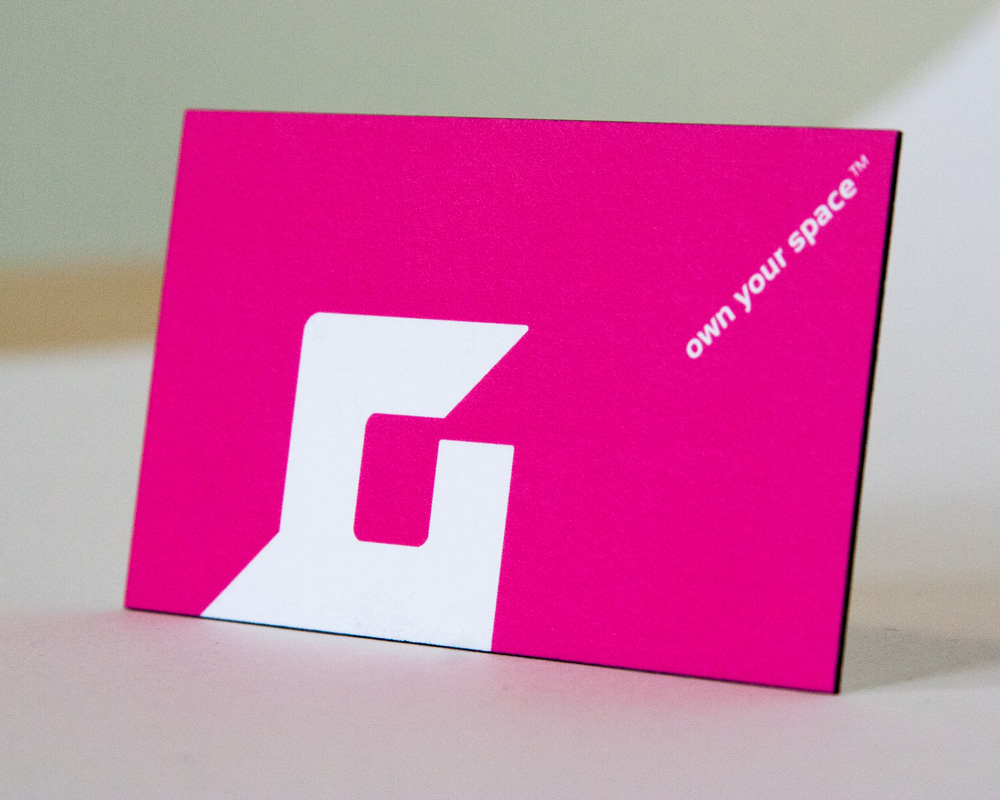
I didn’t want another boring traditional rectangle business card, so we came up with the idea of a die-cut shape, in this case a square. Instead of going with the traditional white background, we reversed it with our blue color to make it pop more.
How people like them:
When you go to events, and they have a little fishbowl and you drop your card in there for a contest, I can’t tell you how many times I’ve won. It stands out against the hundreds of traditional white business cards in there. People tend to hang onto it more because it’s a unique card. Typically, the first reaction is “Wow, cool.” They feel it, flip it over back and forth, feel the thicker texture of the paper. It’s a conversation starter.
8. Envoy There
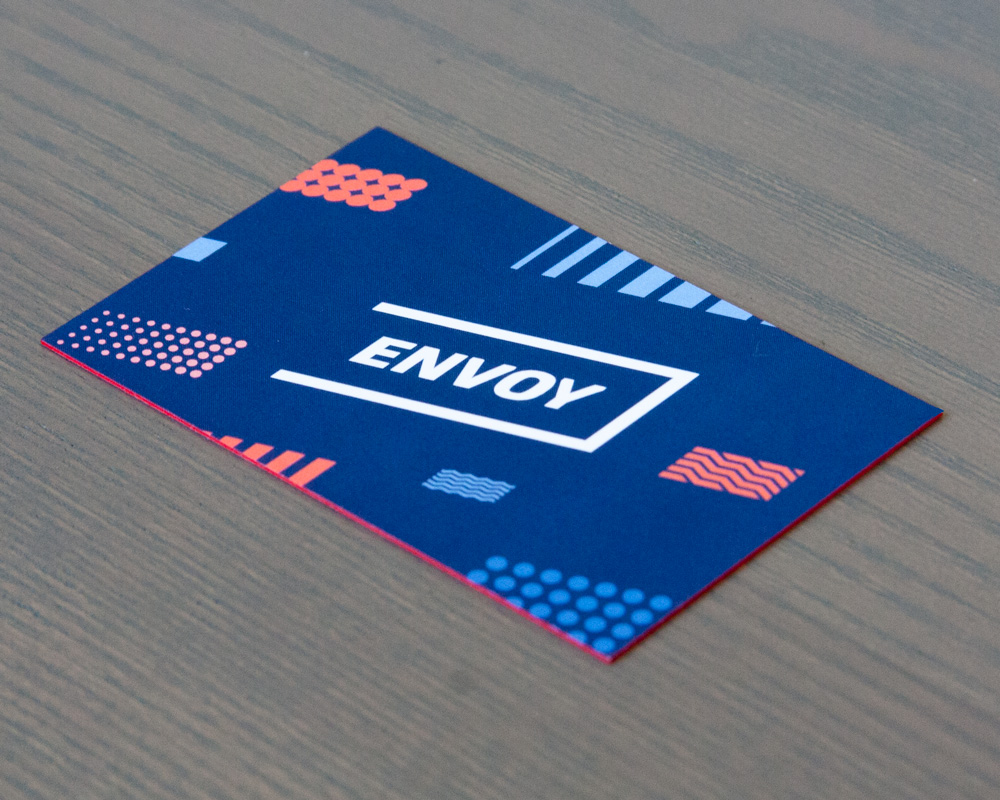
Location: Los Angeles, California
Cardholder: Aric Ohana, Founder, Envoy There (interviewed)
Designer: New Deal Design
About the business:
We provide vehicles as an amenity at properties that can be accessed through your mobile phone. Electric cars, scooters, etc. that are community-owned. You as a tenant or a visitor can access the vehicles. Apartments, hotels, communities.
About the brand:
New Deal Design did all of the branding from start to finish, based on what our company does. Our logo is a parking space and shows a lot of movement. It’s all about movement because we move people. The colors were part of different palates that identify with the brand.
Translating the brand into a card:
The feel and touch sensation was very important to us. We wanted the card to be felt and remembered. We also wanted edge-color; when you look at a stack of white cards with white borders, it doesn’t really stick out.
How people like them:
People love the cards on every level. We get a lot of very positive feedback.
THikit is a family-owned company of print specialists, artisans, problem solvers and creative professionals with a sharp focus on offering top quality 4-color printing on the widest variety of extra-thick paper stocks. If you are looking to stand out with a truly unique business card, wedding invitation or postcard, then you have come to the right place! Request a sample kit today!