We assign a lot of intangible human values to animals, so when it comes time to create a brand that communicates an idea, designers often consider using animals to help get the message across. We often see animal business card designs come through our shop, which specializes in thick business card printing with features like edge-color, square cards and soft touch business cards.
We interviewed seven of our customers about what into making their animal-inspired business cards, and how their customers are reacting to the cards in the real world.
Do you have a great animal business card idea? Request a free business card sample kit from us today to help make it a reality!
1. Who Rescued Who?

Location: Plymouth, Michigan
Cardholder/Designer: Amanda Adamchek
About:
I have another business that I run… it’s a small online boutique called Kiloh & Co. I’m always trying to give back, and I’m a huge animal lover. I had some business ideas for pet-related dog-related shirts and apparel, but it didn’t really fit within the existing brand.
Brand Identity:
I decided to make Who Rescued Who as its own brand that’s more focused on giving back. Some of the proceeds go back to local animal rescues, and each month we feature a new animal rescue. We’re trying to communicate awareness for the impact of animal rescues… not just giving back, but telling stories about what adopting a dog can do for you.
Translating the brand to a card:
I like to keep my business cards simple. I put my logo on one side to keep it nice and clean, and on the other side I have my contact info and the bit about proceeds going back to animal rescue. 9/10 times I’m giving my business cards along with the product, so it lets people know that there’s giving back happening.
I like simplistic design, and usually choose square design. I went small for economic purposes, and I think that people may not pay as much attention to rectangular cards anymore. I like to spend a little more time on these types of things because it’s a representation of my brand.
How people like the cards:
I always get good feedback for my cards!
2. Silver Fox Investment Advisors
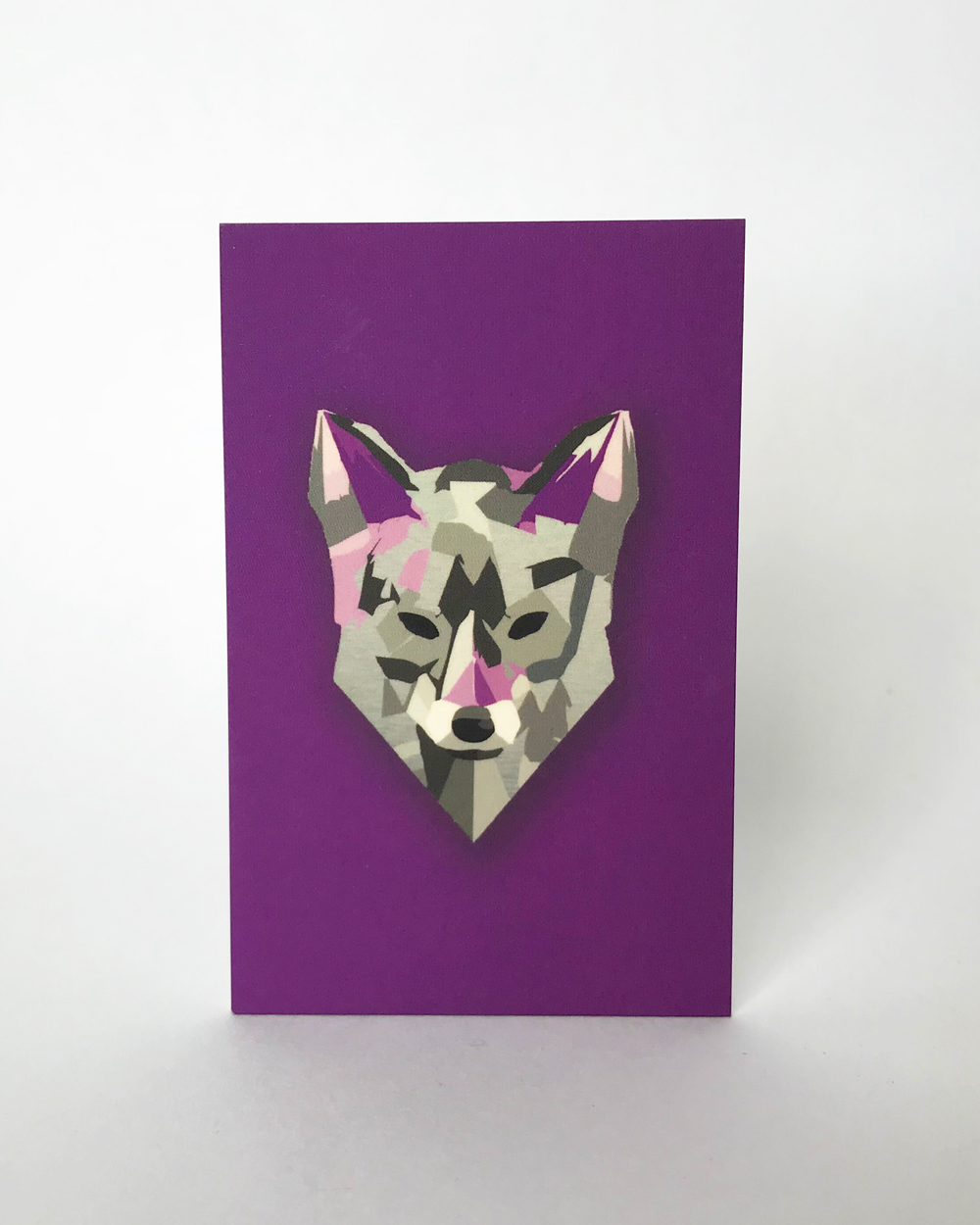
Location: Stroudsburg, Pennsylvania
Cardholder: Daniel Perich, CCIM
About the company:
Silver Fox is an investment advisory group that’s a spinoff of a commercial real estate firm. We are a division that works with large investors around the country.
About the brand:
I had the concept in my head from looking at all of these different designs of foxes. We were looking for something that was edgy and different… we gave our graphic designer four or five pictures that we found for reference, and he put it together.
Translating the brand to a card:
I had gotten a thick card from someone years ago, and it was an unrelated business that I didn’t really need, but instead of chucking the card, I held onto it because it was so cool. It was so unique. Our business is unique too, we want to stand out, so we want something that’s not quite going to fit in their wallet.
How people like the cards:
I’ve gotten tons of compliments on it. I give it to people, and they ask, “Jesus, how many cards did you give me?”
3. The Red Hen DC
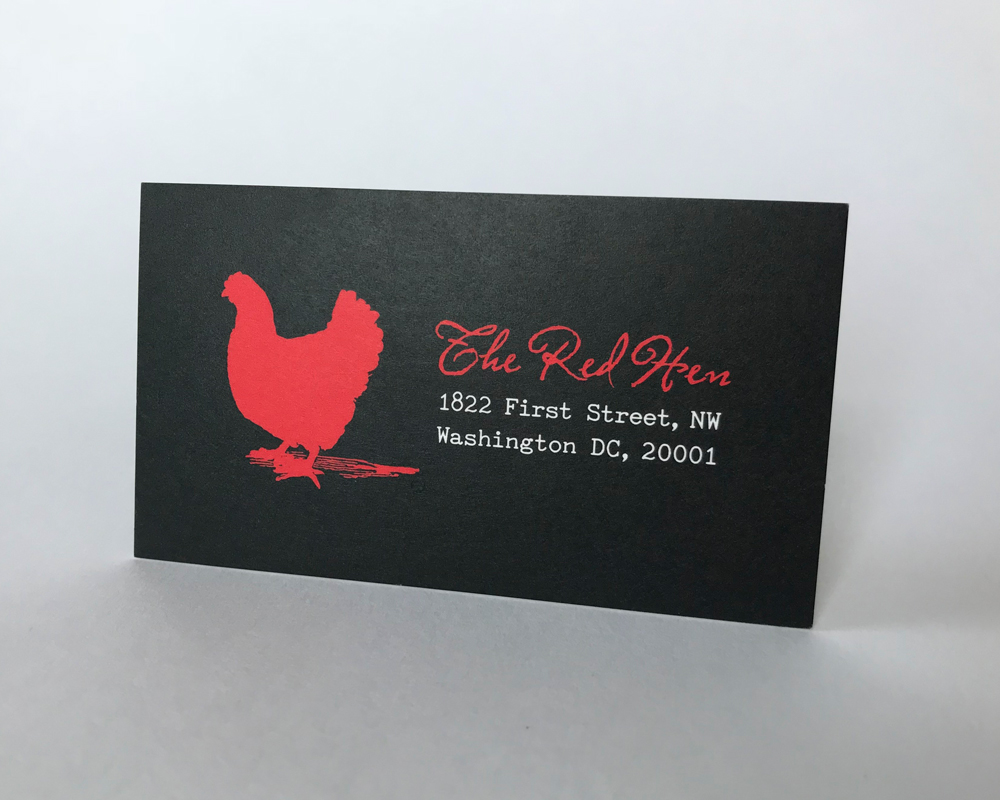
Location: Washington, D.C.
Designer: Jason Pasch
About the designer:
I’m a freelance designer… I’ve been freelancing for over five years after working in various studios in the DC area. I got into restaurant design early in my career and have gone from there. I’d say a majority of my work is web design, small scale print, business cards and postcards.
About the business:
I was connected to the Red Hen after working with some of the staff at another restaurant. The food was phenomenal, the space is amazing, and they’re some of the best guys in the DC restaurant scene.
About the card:
I wanted to give people a sense of what the place is like, as much as you can on a 3.5 by 5″ card. There’s a photo of the place on it, so you can see a little bit of the rustic feel. The typography is this old typewriter font that matches the website, and you have a big pop of red. The very cool thing about the cards is the red edge color that you can do to bring it all together.
How people like the cards:
Considering that they reorder them at a surprisingly fast rate, I think it’s an indication that they’re kind of popular. Overall, the client is extremely happy with them. The thick stock is very very cool.
4. Square Munky LLC
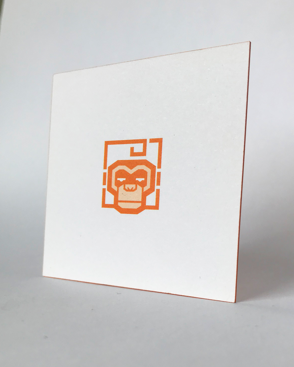
Location: Phoenix, Arizona
Cardholder: Brian Proud
About the company:
Square Munky started out as a side project. I was a promoter for World Wrestling Entertainment. I did the shows, was always been interested in web design, but I never had a lot of free time to pursue it. When I left WWE in 2012, I had free time, so I taught myself Wordress, taught myself how to build websites and that sort of thing while my son was napping.
About the brand:c
The story is really dumb. I used to do a lot of traveling when I was younger, with my mom and brother. In college, my friends gave me a little monkey. It’s shaped like a square, and I put it on my backpack. That monkey has traveled me to six continents, and when I had to come up with a name, I just went back to that square monkey. “Square Monkey” was taken, but my favorite band is Korn, and their bass player spells his name Munky.
I asked a graphic designer friend, “Hey, make me a logo for this name.” I told him I liked orange, and he made it orange. Honestly, that’s pretty much it. I’m not trying to portray anything. I always used that as my avatar on social media, it’s my Facebook picture, my LinkedIn image.
Translating the brand to a card:
With the card, I wanted to keep things simple, but also different. I wanted a square card, because of my name, and I like the thick cards, because not many people see cards like that.
How people like the cards:
I don’t give out too many of them, but people seem to carry the cards because they think they’re cool, which is unusual.
They just say they’ve never seen anything like it. It’s very simple looking, but the thick cardstock gets people saying they don’t know that you could order cards that thick. They want to go out and get something like that that makes a little more of a statement than when you go to a “churn and burn” card producer, where you get the same thing as everyone else.
5. Indisputable Labs
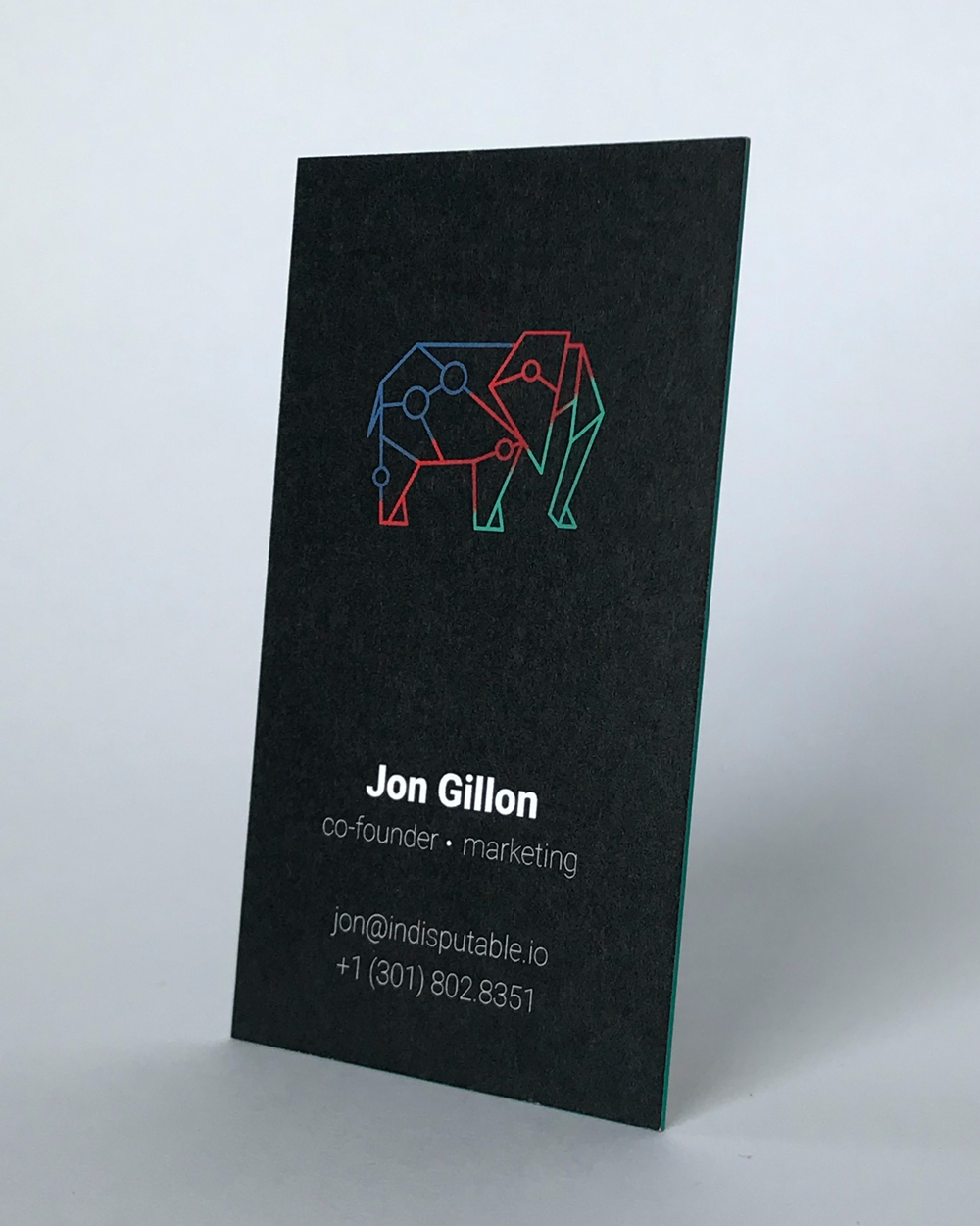
Location: San Francisco, California
Cardholder: Jon Gillon
About the company:
Indisputable started in July or so. We are an R&D lab that builds protocols on the blockchain to solve major global issues.
About the brand:
The elephant was created by one of our partners named Sean, and the branding was completed by another teammate named Jenny. The elephant brings the notion of steadfastness, intelligence, loyalty, trustworthiness and confidence.
Translating the brand to a card:
We’re a high-tech firm, right? We build projects on the blockchain. We wanted our business cards to scream cutting edge technology, and I think they do. We wanted to go as thick as possible. We were making jokes about American Psycho, how it’s all about the card stock. We also wanted edge color to match one of the colors on the card.
How people like the cards:
People love the cards. People have been asking where we got them from. Having a good business card in your hand gives a certain level of authority and confidence that you don’t get from a flimsy one. It shows that you’re kind of really serious about what you’re doing.
6. Corby Design
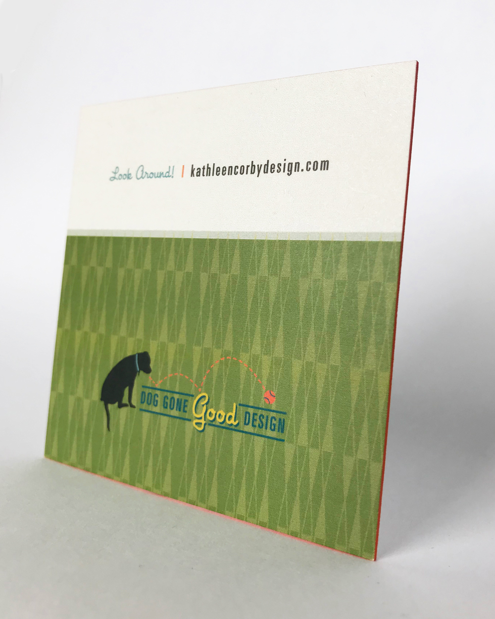
Location: Pine Plains, New York (Go Hudson Valley!)
Cardholder/Designer: Kathleen Corby
About the designer:
I’ve been doing graphic design longer than I care to admit. I started in Santa Barbara, working as art director in the gift and licensing industry and then moved into freelance working with all types of clients. My freelance clients included businesses such as Kinko’s Corporate offices and Teva sandals. I moved across the country to [upstate New York], and just started volunteering as a dog walker at the Dutchess County SPCA. I offered my design services to them working pro bono for the dogs, and I worked with them for 20 years, including the graphics in their new building, new logo, posters/signage. So began my “animal path” and I’m having a lot of fun working for something I’m passionate about.
I’ve worked for local clients such as the Astor Home and Mohonk Mountain House, but the majority of my portfolio is now mostly animal welfare such as Animal Farm Foundation, Chimpanzee Sanctuary Northwest. I also design for (and am the President of) The Unexpected Pit Bull; 100% of the net profits from our annual calendar and products go to animal shelters/rescues across the country.
About the brand:
I love 1950s atomic age, mid-century modern type things. I like kitsch stuff at times, a little bit of a fun retro feel, pinks and turquoise and blacks. My office is here in my home, and it’s very much a 1950s walk in the past. It’s something about who I am. It’s something about what I enjoy about design. When designing my brand I needed to include my dog too, which is a silhouette of my last little pit bull. She was my muse.
Translating the brand to a card:
I love print and paper and thickness and texture.
I found THikit, and said wow, this is exactly what I am looking for! I received their sample kit, and I was so in love with everything they did. I was like oh my god, they’re in Kingston (about 30 minutes from Pine Plains)!
You can bounce these cards off the wall, they’re so thick, they’re not going to ding. You can see and feel the quality instantly and this was as important to me as my design.
How people like the cards:
I had some friends come over. Two of them I had designed cards for, and they said, “you didn’t offer me a square card,” or “my cards aren’t as thick as this.” They were very impressed with the quality!
People are slightly speechless when I hand them my card, they’re turning it around in their hand, they’re looking at the card itself. They’re like wow, this thing is incredible! Everyone gets bombarded with so much information, you have one second to catch their attention. If you can give someone a memorable experience, hopefully they will remember you at the time they need your services.
7. Jamie Wong Tattoo
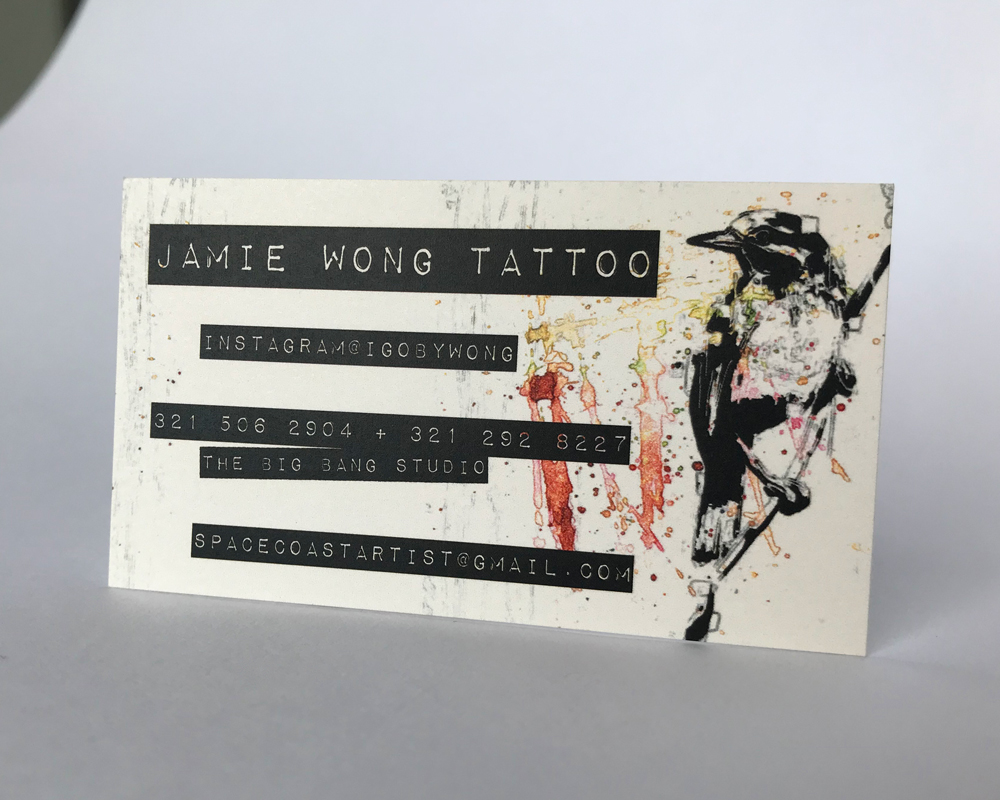
Location: Space Coast, Florida
Cardholder: Jamie Wong
Designer: David Books, Make Collective (Instagram)
About the artist:
I just started tattooing five or six years ago, kind of by accident. I had a kid and it was better for me to stay home than the other parent. I got into drawing a lot, drawing on my girlfriend with a sharpie. I got so bored, so I started making these little trinket tattoo machines in my house. I tattooed myself and my own leg, and I did an apprenticeship for a couple of years in Orlando, and started getting into tattooing. I’ve been fortunate enough to be pretty successful in my endeavors.
About the brand:
My main thing is communicating diversity, showing that I can do a little bit of everything.
Translating the brand to a card:
With my business cards, I went with an abstract approach, a thicker card stock. Cards get discarded a lot, get thrown away. My card has a presence to it, people think, “Oh, this guy knows what he’s doing,” right off the bat.
It’s kind of like a baseball card, it doesn’t bend. I did the bird on it with an app called Procreate on my iPad Pro.
If I could change one thing about my card, I think now I would take my contact information off of it. I want people to email me less and call me less, but to visit my website to book. It makes my life a lot easier.
How people like the card:
9/10 people say, “Oh, that’s a nice card” before they say anything about my work or business.